
WorkShelf
9.5
with
NeXuS
Components of
Winstep Xtreme
WorkShelf License and Warranty
The WorkShelf program and all included documentation are all Copyright 2000-2009 by Jorge M.R.Coelho - Winstep Software Technologies. All Rights Reserved.
THIS SOFTWARE IS DISTRIBUTED "AS IS," WITHOUT WARRANTY AS TO PERFORMANCE OR MERCHANTABILITY OR ANY OTHER WARRANTIES WHETHER EXPRESSED OR IMPLIED. BECAUSE OF THE VARIOUS HARDWARE AND SOFTWARE ENVIRONMENTS INTO WHICH THIS PROGRAM MAY BE PUT, NO WARRANTY OF FITNESS FOR A PARTICULAR PURPOSE IS OFFERED. GOOD DATA PROCESSING PROCEDURE DICTATES THAT ANY PROGRAM BE THOROUGHLY TESTED WITH NON-CRITICAL DATA BEFORE RELYING ON IT. THE USER MUST ASSUME THE ENTIRE RISK OF USING THE PROGRAM.
You can contact us with comments or questions by e-mail at support@winstep.net
WorkShelf is a component of the Winstep Xtreme suite of applications. You may try Winstep Xtreme for 30 days without charge. If you find Winstep Xtreme useful, please register it. If you decide not to register Winstep Xtreme, you must remove it from your system after the 30 day trial.
You are not allowed to reverse engineer or change the contents of the program files or included documentation.
Winstep Xtreme may not be sold nor be used in any profit-oriented endeavor without the express written permission of the author, with the exception that Winstep Xtreme may be distributed freely via media intended to make shareware available to the public for trial. All files, including the Winstep Xtreme applications and all others in the Winstep Xtreme zip file, must be included.
All trademarks used in this Document are the property of their respective owners and are used for explanatory purposes only.
Winstep Xtreme is a suite of groundbreaking shell enhancements for the Windows environment.
The purpose of this suite is to provide usability enhancements to the standard Explorer Shell while at the same time providing the user with unlimited flexibility.
NextSTART, Workshelf, NeXuS, Start Menu Organizer Pro and FontBrowser are all components of Winstep Xtreme, with more components forthcoming.
WorkShelf is a powerful, multi-paged desktop replacement and task organizer that can be used as an alternative or supplement to the normal Windows desktop. WorkShelf offers an incredible amount of flexibility so that the user can customize exactly as he or she wants it.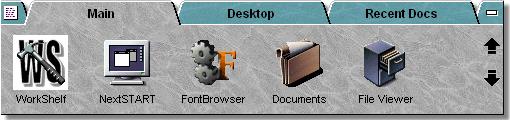
Powerful 'Tabbed Shelf' System
Rather than dealing with a random layout of icons spread all over your desktop, organize frequently used applications and files into their own tabbed groups and categories. The possibilities are endless - you can even display the entire desktop on a single page of it's own, among other pages holding frequently accessed files and directories, work projects, WorkShelf Modules, Internal Commands, and more!
Complete Desktop And Taskbar Replacement
WorkShelf features built-in task management to control running applications. Gain access to your running apps via the handy Tasks Tab. Best of all, you can choose the position of the WorkShelf itself. Attach it to either the top or bottom of your screen or leave it "floating"! When the shelf is unneeded simply hide it from view or collapse it down to a simple tab display.
Advanced Module Support
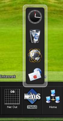
WorkShelf features useful "Modules" such as an Atomic Digital/Analog Clock with Audio/Voice Alarms that can synchronize your PC's clock with the Internet atomic time servers, an animated Recycler bin, a CPU activity Meter, a POP3 talking Email Checker, a Weather reporting module serving more than 5,000 cities in the world, a Network activity Meter, a Memory usage Meter and a fortune cookie teller. Other modules are planned and forthcoming...
Customizable Tabs and Theme Support
Not happy with the default WorkShelf look and feel? Would you prefer a configuration that better matched your own tastes and needs? Even a semi-transparent shelf? No problem...You can configure how the tabs and objects look and behave! Choose how icons and tabs are displayed, how item selection is made, and more! You can choose the font, the size, the colors (even use gradients and bitmaps!), 3D effects, custom icons and, still, more! In fact, thanks to the Theme support of the WorkShelf Preferences Manager you will be able to import and export themes based on the above options.
Drag And Drop
Use Drag and Drop to move/copy/re-arrange objects from one location to another, both inside and outside of WorkShelf. Drop data files onto WorkShelf Application Objects and have them automatically loaded. You can even change the icons used by WorkShelf Objects simply by dragging and dropping your favorite .ICO, .PNG and .TIF files on the chosen object.
Multi-Monitor Support
WorkShelf is fully compatible with multi-monitor systems... You can even have the shelf dock on a specific monitor edge or have it extending across all your monitors.
Theme Integration with other Winstep Applications
If you run other Winstep applications, WorkShelf integrates smoothly with them. For instance, WorkShelf's context menus will use the current NextSTART theme. Also, loading a theme in WorkShelf will automatically apply a matching theme to NextSTART, if one exists.
WorkShelf is a component of the Winstep Xtreme suite of applications. Winstep Xtreme is SHAREWARE. You may try it for a period of 30 days, after which you must either purchase it or remove it from your system.
Your purchase of Winstep Xtreme entitles you to one year of free updates for all components of the suite - including any new components that might be released in the mean time - with one year renewals costing only a fraction of the purchase price. Anything you download and install while your subscription is valid will be yours to keep - for life!
Click here to REGISTER ON-LINE WITH CREDIT CARD or DOWNLOAD THE ORDER FORM FOR CHECK/MO
System Requirements:
Windows9x/ME, Windows NT v4.0 (w/Service Pack 3 or higher), Windows 2000, 2003 Server, XP 32/64 bit, Vista 32/64 bit or Windows 7 32/64 bit.
Currently, there are 17 Shelf types available - some of them are set up by default when you start Workshelf for the first time.
The 'Regular' shelf type
This is the default shelf type and will probably be the most used - a standard shelf where normal Application and Data Objects can be dragged to and from. Objects may be added very easily to a regular shelf by dragging a file, executable or shortcut from a NextSTART menu, Windows Explorer (or other file manager), the Windows Start Menu or, indeed the Windows Desktop.
Let's try an example:
That's it! You now have a working object on the shelf which will launch the
'Notepad'
application. You may also change the icon displayed for any item quite simply by
dragging your favorite .ico or .png file onto the desired object.
Please note that it isn't only applications that can be added to a regular
shelf with this method - documents and folders may also be turned into shelf
objects in exactly the same way. Any document launched from a shelf will
automatically open with the default application associated with that type of
file.
In addition, objects may be moved between regular shelves simply by dragging an
item from the open shelf over to the the tab of the desired destination shelf -
the destination shelf will then open and the object may be dropped in the
desired position. Holding down the CTRL key whilst dragging an item between
shelves will cause the shortcut to be copied rather than moved.
There is another method to add items to a shelf. Simply right-click on a blank area - you will see a context menu with the following entry:
Insert Item:
Brings up the 'New Items Properties' panel. This allows you to browse and select an application for which you wish to add a launch icon, to add an Internet shortcut, to add a module (clock, recycler etc), to add an icon that will trigger one of Workshelf's many 'internal commands' - see the 'Internal Commands' section below for a complete list of the functions available - or to make a shortcut to one of NextSTART's hotspots.
The 'Desktop' shelf type
This type contains the objects/shortcuts as found on your normal Windows Desktop. It's important to keep this in mind when you modify an object on this type of shelf. Delete something from this shelf and it is also removed from your Desktop and placed in the Recycle Bin - likewise dropping an item onto this shelf type will copy that item to the Windows Desktop (this remains true even if you've hidden the standard windows desktop with the 'hide desktop icons option).
You will also find to extra objects at the beginning of this shelf, 'Hide/Show Desktop Icons' and 'Display Properties'. The first object will enable you to reduce desktop clutter by hiding desktop icons - you can then access desktop contents through WorkShelf's Desktop shelf. The second item allows you to access Windows Display Properties, since hiding desktop icons also de-activates your ability to right-click on the Windows desktop.
The 'Recent Documents' shelf type
This contains an automatically-updated listing of recently accessed documents. Note that under XP and above you can control how many recent documents appear here - the default is 15. This setting is located in the Global Preferences tab.
The 'Control Panel' shelf type
Displays those objects contained in your Windows Control Panel.
The 'Active Tasks' shelf type
This shelf displays those applications that are currently running, allowing you to switch between them. You can minimize a task by right clicking on it's icon and you can terminate it by middle clicking the same icon. If you press CTRL + SHIFT while right or middle clicking a task, the minimize or close action will be applied to all windows of the same class (thus, for example, enabling you to quickly minimize or close all your currently open Internet Explorer windows). Under XP and above, you can also display task icons as snapshots of the actual windows.
The following is a list of all the possible actions on task icons and the corresponding mouse and keyboard combination by default:
| Left Click | Brings an application to the front or restores it if it is currently minimized. |
| Middle Click | Terminates (closes) an application. |
| Right Click | Pops up the Task's context menu. |
| CTRL + Right Click | Pops up the Task's context menu (see below). |
| CTRL + SHIFT + Left Click | Restores all similar applications (e.g. all Internet Explorer windows). |
| CTRL + SHIFT + Middle Click | Closes all similar applications (e.g. terminates all currently running instances of Internet Explorer). |
| CTRL + SHIFT + Right Click | Minimizes all similar applications (e.g. minimizes all Internet Explorer windows). |
Note that the Left, Middle and Right Click actions (i.e.; what each click does) on task items are tied to NextSTART. NextSTART allows you to customize the actions for each of your mouse buttons, and the same settings are used in WorkShelf.
Ctrl-Right clicking a task icon opens that task's context menu, from there you can perform all of the above actions as well as Minimize and Restore all currently open applications, move and re-size windows, set the window's opacity level, change the default icon of a task and add or remove tasks from the Snapshot Exclusion list.
You can find more options to customize how the tasks shelf behaves in the Icon Preferences tab of WorkShelf Preferences. There you will be able to customize the icons displayed for each task, which applications should be excluded from appearing in the tasks shelf, and which miss-behaving applications should be excluded from having their snapshot taken. WorkShelf shares these settings with NextSTART and vice-versa, so any changes here will be automatically applied to the other program as well.
The 'RAS Connections' shelf type
This shelf displays the contents of your Windows 'dial-up networking' folder, allowing you to manage your internet / network connections.
The 'Drives' shelf type
Displays those objects contained in your Windows My Computer Folder.
The 'Startup' shelf type
Displays those objects contained in the Startup folder of the Start Menu. Useful as a quick way of adding and removing startup items. You can drag & drop items here, and add or delete them manually.
The 'SendTo' shelf type
Displays the targets usually found in the Sendto context menu. You can use drag & drop to send a file to most of the items in it.
The 'Printers' shelf type
Displays those objects contained in your Windows Printers Folder.
The 'Network Connections' shelf type
Displays those objects contained in your Windows Network Connections Folder.
The 'Templates' shelf type
Displays those objects contained in your Windows Templates Folder. Useful to open pre-formatted blank documents.
The 'My Documents' shelf type
Displays the objects contained in your Windows My Documents Folder.
The 'Recycler' shelf type
Displays the items contained in your Windows Recycle bin. You can undelete items directly from this tab.
The 'Show Folder' shelf type
Allows you to display the contents of any folder in your hard drive in a shelf. You can manipulate items here as you would in Explorer, including drag & drop operations. You should, however, avoid displaying extremely large folders as shelves due to performance reasons.
The 'Quick Launch' shelf type
Displays the items in your Quick Launch toolbar.
The 'Themes' shelf type
Displays your currently available WorkShelf themes for easy and quick theme switching. This shelf takes advantage of WorkShelf's ability to create thumbnails from image files, and, wherever possible, displays a thumbnail of the theme's screenshot for easy recognition. Note, however, that some of the older themes do not have a screenshot - in that case WorkShelf will display the default theme icon instead.
To apply a specific theme, simply click on that theme's icon. You can also right click on the theme icon and select 'Show Container' from the context menu to open that theme's folder in Windows Explorer - useful if you are a skinner and want to change some of the theme's bitmaps.
A new shelf may be created in one of several ways:
The easiest method is to right-click on the tab of an existing shelf - this will bring up a context menu with the following options:
Shelf Editor: Invokes the Shelf Editor, which allows you to Add/Delete and re-arrange the order of the shelves.
Tab Alignment: Allows you to set the alignment of tabs, either Left Justified, Centered, Right Justified or Full Shelf Width.
Add: Creates a new shelf at the extreme right-hand end of Workshelf.
Insert: Creates a new shelf at the current position.
Delete: Deletes the current shelf.
Rename: Enables you to change the name of the selected shelf.
Properties: Brings up the 'Shelf Properties' dialog. You can jump straight to this item (avoiding the context menu) with a shift-right click.
You may also right-click the far left 'mini-tab' of Workshelf. This will bring up a context menu from which you can invoke the Shelf Editor (below), which allows you to add/Delete and re-arrange the order of the Shelves. It will also allow you to change the titles and types of shelves present.
When you right click on a folder in a shelf, you also get a 'Create Shelf from Folder' option in the context menu that pops up. This option can be quite handy to quickly add a new Folder type shelf that displays the contents of the selected folder.
This panel allows you to add/delete and re-arrange the shelves.
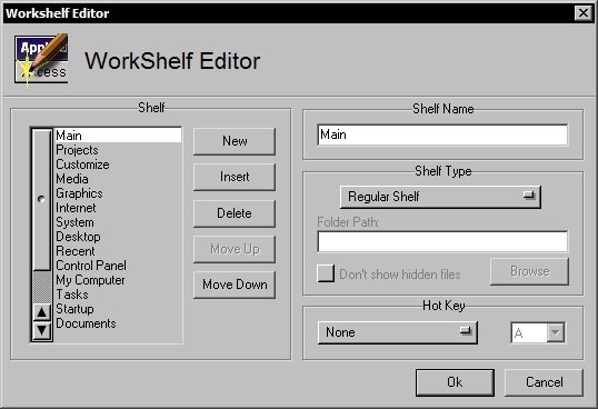
New: Adds a new shelf at the end of the list.
Insert: Adds a new shelf immediately above the currently selected position.
Delete: Deletes the selected shelf.
Move Up: Moves the currently selected shelf one position up.
Move Down: Moves currently selected shelf down.
Shelf Name: Enter/Rename the selected shelf.
Shelf Type: A drop down menu allowing you to select between 'Regular' and
other shelf types.
The mini-tab at the far right of WorkShelf is used to collapse and expand the shelf, so that it only uses as much screen space as needed. A collapsed shelf will typically show only the tabs, and clicking on any of them is all it takes to expand it. Note that there are options to make WorkShelf collapse automatically after a user-specified amount of time and expand automatically on mouse over or by bumping the associated screen edge with the mouse pointer (this later action also brings WorkShelf to the foreground, which is useful if the shelf is covered by other windows).
When Auto-Collapse is enabled, the shelf only collapses automatically when the mouse pointer is no longer over it. To prevent the shelf from auto-collapsing, right click on the right mini-tab when the shelf is collapsed and the shelf will remain open until you re-collapse it manually.
Left clicking the mini-tab at the left brings up the WorkShelf Preferences window. Right clicking on it brings up the left mini-tab context menu - essentially WorkShelf's main menu - from where you can perform several actions.
The Left Mini-tab context menu:
Right-clicking the the far left 'mini-tab' of Workshelf will bring up a context menu from which you can perform the following actions:
Preferences: Opens the main Workshelf Preferences window - see 'Configuring Winstep Workshelf' below.
Shelf Editor: Opens the 'Workshelf Editor' dialog as above. You can also jump straight to this item (avoiding the context menu) with a shift-right click on the left mini-tab.Appearance and Sounds: Opens a sub-menu with items related to WorkShelf's appearance:
Themes: Lists the currently installed themes for Workshelf, allowing you to switch themes 'on the fly' without opening the preferences panel.
Sound Schemes: Lists the currently installed Sound themes for Workshelf, allowing you to switch sound themes 'on the fly' without opening the preferences panel.
Voices: Lists the currently installed Voice themes for Workshelf, allowing you to switch voice themes 'on the fly' without opening the preferences panel. Voices are used by the speaking Atomic Clock and Email Checker modules to announce the time and number of unread messages.Enable/Disable Sounds: Turns on or off the sounds played when you collapse a dock or shelf, launch an item, etc...
Icon Size: Allows you to set the size of the icons used in WorkShelf, from 16x16 to 128x128. On XP and later systems we recommend an icon size of 48x48. Note that this sub-menu only lists the most common icon sizes.
Tabs Alignment: The tabs in WorkShelf can cover the full width of the shelf or only take as much horizontal space as required, in which case they can be centered, right justified or left justified.Effects: Allows you to turn on or off certain special effects, such as icon reflections, water ripple and mouseover effects. Available mouseover effects are Zoom, Bounce, Afterglow, Rock and Swing.
Show/Hide Frames around icons: Icons in WorkShelf can have a 'frame' surrounding them for a more 3D look. This is a purely cosmetic option. Note that some older themes might not look good with this option turned on.
Monitor: This option only exists on multi-monitor systems, and allows you to specify the monitor into which the shelf should dock.
Z-Order: Allows you to dictate the position of Workshelf in relation to the desktop and other windows:
Send to Top (always in front of other windows),
Send to Middle (will be covered by newer windows),
Send to Bottom (will be covered by all windows).
Dock to Top: Allows you to dock Workshelf to the top screen edge of the screen. When a shelf is docked, it will automatically resize itself so that it uses that edge's full width - unless the 'Full Width when Docked' option in the Global Settings tab is un-checked. If a shelf is later undocked, it will revert back to its previous size and position.
Dock to Bottom: Allows you to dock Workshelf to the bottom screen edge of the screen.
Undock: Undocks Workshelf and makes it free-floating.Invert: Flips the shelf vertically, so tabs are now at the bottom of the shelf or vice/versa...
Dock and Shelf Management: Allows you to create new docks and close the Shelf:
Create New Dock: Allows you to create a new, empty, NeXuS dock. NeXuS is a multi-dock system, so you can create as many docks as you want.
Close Shelf: Turns the Shelf off, leaving only desktop modules and any existing docks on the screen. Note that Shelf contents are not lost, and the shelf can be enabled again via the WorkShelf systray icon, the Dock and Shelf Management sub-menu of any open docks or through the Shelf Preferences tab by unselecting the 'Disable Shelf' option.
Desktop Modules: Opens a sub-menu with several actions related to the desktop modules.
Hide/Show Desktop icons: Hides or Shows your desktop icons to reduce desktop clutter. You can still access the contents of the Windows desktop through WorkShelf's Desktop shelf.
Backup: Makes a backup file of all your current WorkShelf settings. It is highly recommended that you perform a backup from time to time.Restore: Restores a previously backed up configuration. When WorkShelf runs for the first time it automatically makes a backup of the default settings.
Info: Contains links to this help file, to the Workshelf version information panel, to the 'Tip of the Day' dialog and also allows you to check the Internet for newer versions of WorkShelf.
Exit: Allows you to Log Out, Restart or Shutdown your computer and exit Workshelf.
In addition:
Shelf tabs can be quickly reorganized by left clicking on a tab and dragging it horizontally.
Left Clicking on the left-hand side 'mini-tab' will bring up the WorkShelf Preferences to allow you to change the look and feel of the entire application.
The far right 'mini-tab' will Collapse/Raise the Shelf.
Double-clicking a tab will make the shelf automatically expand so that all items in it are shown. Double-clicking on it again will collapse the shelf so that only one row of icons is visible. This last behavior can be changed by specifying a value other than 1 in the 'Rows' option available in the Shelf Preferences tab of WorkShelf Preferences. Changing this option allows you to always display at least that number of rows, unless you manually resize the shelf by clicking and dragging a tab up or down.
When not docked to a screen edge, the shelf can be moved by clicking on an empty space of the shelf body and dragging it.
The shelf can be resized horizontally by clicking and dragging the shelf's left or right edges, unless the shelf is docked and the 'Full Width when Docked' option is enabled.
Using Drag and Drop to manipulate Items
Drag and Drop can be used to move/copy items from one shelf to another, re-arrange them and even move/copy files and URLs from a shelf/dock to an Explorer window and vice-versa. You can also drag URLs from Internet Explorer windows into shelves (making it very easy to create special 'My Favorites' shelf types). Drag and drop can also be used to move items between WorkShelf and NextSTART. However, due to the diversity of shelf types, you should grasp a couple of concepts first:
There are basically two different types of shelves in WorkShelf: Regular shelves can hold any type of item. Folder type shelves, on the other hand, are shelves that display the contents of physical or virtual folders on your hard drive/system. This difference is fundamental in the way drag and drop works for each type of shelf. Some of the Folder type shelves can have items dropped into them, others not (in a similar manner to what happens with special system folders like Control Panel and My Computer, which cannot be changed).
To move an item from a shelf to another target, just click on the item and drag. To copy the item, you must press the CTRL key while you drag. To force a move operation press the SHIFT key while dragging. To cancel a drag/drop operation press the ESC key. Dragging an item over a collapsed WorkShelf makes it automatically un-collapse. Likewise, holding a dragged item over the tab of a non-active shelf for a small period of time will make WorkShelf automatically open that shelf. Shelves with more than one icon row can also be scrolled by holding the dragged item over the scroll arrows that appear on the right side when the shelf holds more items than are currently visible.
Note that dropping an object into an In-Shelf/Dock or desktop recycler module will delete that item.
To recapitulate:
Pressing SHIFT
while dragging moves the file/object.
Pressing CTRL while dragging copies the file/object.
Pressing ESC while dragging aborts the drag & drop operation.
Dragging with the RIGHT mouse button shows a pop up menu on drop from where you
can choose whether to copy, move or create a shortcut to
the dragged item.
Adding files in Explorer windows to shelves and docks
To drag a file in an Explorer window into a shelf or dock, simply click on the file and drag it to the shelf you want. If you want to drag the item to a shelf that is not currently active (open), simply hover the item over the target shelf's tab for a small period of time - WorkShelf will automatically open that shelf for you. Hovering an item over one of the scroll arrows will also scroll the shelf up and down. If the target shelf is a Regular shelf, you can choose the insertion point and WorkShelf will insert the item there.
If the target shelf is of Folder type and it can accept dropped files, then dragging a file or folder will actually move or copy it (if CTRL is being pressed) into the folder whose contents are being displayed by that shelf. Since the sorting method for Folder shelves is always alphabetic, in this case it doesn't matter if you choose a specific insertion point or not: the contents of the shelf will automatically re-arrange themselves according to the sorting method once you drop the item into it. To create a shortcut instead of copying/moving the file/folder itself, you should drag the item using the right mouse button - in this case WorkShelf will pop up a context menu that allows you to choose between copying, moving, creating a shortcut or canceling the operation.
If you drag a file into a folder on the shelf, then the file will be copied or moved into that folder, not onto the shelf itself.
Note that you can also add items to existing Regular shelves by right clicking on an item in an Explorer window and selecting 'Send to->WorkShelf' from the context menu. A dialog will pop up allowing you to select the target shelf.
To change the icon used by an item on a Regular shelf, simply drop an ICO or PNG file into the chosen object. If you drop a document onto an application on the shelf, WorkShelf will automatically try to open that document using the target application.
Copying or moving files from shelves and docks to Explorer windows
Dragging items from docks or Regular shelves into Explorer windows will always result in a shortcut to the target object. Press CTRL while dragging to copy the item instead of moving it from the shelf.
To move a file in a Folder shelf into an Explorer window, drag it into the target. When the file is dropped, WorkShelf moves the actual file into its new location and removes it from the original folder. To copy a file press CTRL while you drag. To create a shortcut drag using the right mouse button instead.
Copying or Moving items from a shelf to another shelf
To copy or move an item from a shelf to another shelf, drag the item you want (using CTRL to copy instead of move) over the tab of the target shelf. This will make WorkShelf automatically open that shelf after a brief delay. If the target shelf holds more items than are currently visible, you can scroll the shelf by holding the dragged item over one of the scroll buttons until you see the desired insertion point.
Re-arranging items in shelves and docks
You can re-arrange the order of Regular shelf items by dragging items and inserting them in the position you want. If you press CTRL, the item will be copied instead of moved (an easy way to duplicate shelf items should you ever wish to do so). Items in Folder shelves cannot be re-arranged because their sort order is always alphabetical.
A context-sensitive menu is a menu with options related to an highlighted object or item. Each item in a Shelf or Dock has a context menu, accessible by right-clicking on the item. Options available in contexts menu of file system items are basically the same provided by Explorer for that item type. WorkShelf, however, adds a couple of new options for folders:
When you right click on a folder object in a shelf, you also get a 'Create Shelf from Folder' option in the context menu that pops up. This option can be quite handy to quickly add a new Folder type shelf that displays the contents of the selected folder.
This option allows you to quickly navigate the selected folder and any sub-folders using NextSTART menus. Another way to browse a folder item in a shelf or dock is through something called 'Spring Folders': left click on the folder item and hold - after about one second a NextSTART menu pops up displaying the contents of that folder.
Note that NextSTART must be running for Browse in NextSTART and Spring Folders to work.
Non-folder, file items, in a shelf or dock also have two useful context menu options:
Browse Container with NextSTART
This option allows you to quickly navigate the folder containing the selected object, and any sub-folders, using NextSTART menus. Note that NextSTART must be running for Browse in NextSTART to work.
Opens an Explorer window displaying the contents of the folder where the file is.
WorkShelf allows you to specify system wide 'hotkeys' to launch items in docks and Regular shelves, open specific shelves, activate docks, and toggle desktop modules in and out of view. These hotkey combinations will work even if WorkShelf is not currently the foreground application. Hotkeys associated to shelves will automatically un-collapse the shelf, bring it to the foreground and open the associated shelf. Shelf hotkeys can be set in the Shelf Editor and/or Shelf Properties dialogs. Hotkeys associated to items will launch that particular item without raising the shelf or dock to the foreground. Item hotkeys can be set in that item's Properties dialog (right click on an item in a dock or Regular shelf and select Properties from the context menu). Note that Item Properties is NOT the same as File Properties: item Properties are related to the WorkShelf object while File Properties are related to the target object in the file system.
Arrow Keys: Navigate within a shelf.
Enter: Executes the currently selected item.
Alt-Enter: Opens the Properties window of the currently selected item.
Del: Deletes the currently selected item, automatically sending it to the Recycle Bin if it is a file object.
SHIFT + Del: Permanently deletes the currently selected item.
F2: Opens the Rename dialog for the currently selected item.
CTRL + F11: Opens the WorkShelf Preferences window. Note that this key combination can be changed in the Global Preferences tab.
F1: Opens the WorkShelf Help window.
Note that the above special keys (except CTRL + F11, which is system wide) will only work if WorkShelf is the currently active application.
Mouse and Keyboard Combinations
Pressing SHIFT while right-clicking on a Shelf item opens the Properties window for that item.
Pressing SHIFT while right-clicking on the left mini-tab opens the Shelf Editor window.
Pressing SHIFT while right-clicking on a tab opens the Properties window for that tab.
Pressing SHIFT while right-clicking on an empty space of the shelf opens the New Item Properties window.
Pressing CTRL while right-clicking on a task icon in a Tasks-type shelf will open a context menu for that task.
Pressing CTRL + SHIFT while middle-clicking on a task icon in a Tasks-type shelf will close that task and all similar tasks.
Pressing CTRL + SHIFT while right-clicking on a task icon in a Tasks-type shelf will minimize that task and all similar tasks.
WorkShelf is fully multi-monitor compatible. Workshelf and the Desktop modules can be positioned in any monitor, and a docked Shelf can be made to span all the available monitors.
To dock a shelf to a specific monitor, select the monitor from the left mini-tab context menu, or undock the shelf and drag it into the target monitor. It will now dock in that monitor.
NeXuS is a multi-level, multi-dock system. Multi-dock because you can create as many individual docks as you want, each with their own set of settings. Multi-level because each dock tile can have an attached 'sub-dock' (more about this below).
Docks can be attached to screen edges (i.e.; docked) or left floating (note that you can only have one dock per screen edge, however). When attached to a screen edge, docks can be left, center or right aligned, which specifies their position at the edge and in which direction they 'grow'.
Each individual dock has a 'control tile' from where you can control several aspects of the dock:
Double-clicking the control tile 'collapses' and 'un-collapses' the dock, i.e.; the dock either 'shrinks' into a single control tile or reverts to its former size.
Left-clicking and dragging the control tile icon itself initiates a drag & drop operation, which allows docks to be turned into sub-docks of other docks or the shelf itself (more about this below).
Left-clicking and dragging the edge of the control tile (i.e.; not the control icon itself), or pressing ALT while left clicking anywhere on the dock, allows you to drag a floating dock and position it anywhere else on the screen - note, however, that non-floating docks are anchored to a screen edge and cannot be moved unless undocked first.
Right-clicking the control tile opens the dock's main context menu, from where you can quickly change individual settings for that dock.
A new dock may be created in one of several ways:
When you create a new dock based on the contents of an existing shelf, the contents of that shelf are copied into the new dock. Note that you can only create docks based on the contents of Regular shelves - you cannot create docks based on other shelf types. This limitation is enforced to prevent the user from accidentally creating docks with so many items that they become un-manageable. Unlike shelves, docks do not scroll - if a dock becomes too big to fit on the screen at the current icon size, it will automatically decrease the icon size until it fits, but only down to 16x16.
Whenever you create a new dock, the Dock Properties dialog automatically pops up.
In the Dock Properties dialog you can specify many individual settings related to a dock. This dialog pops up whenever you create a new dock, and can also be invoked through the context menu of the dock's control tile or from the Dock Manager in Preferences.
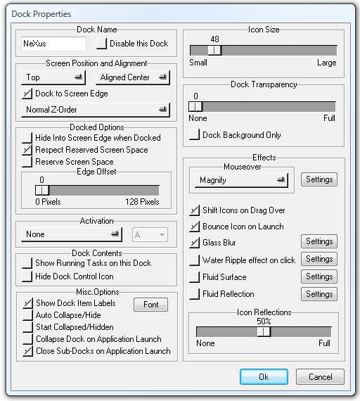
Dock Name:
Docks can be named for identification purposes, since WorkShelf supports
multi-docks. The name of a dock is displayed when you mouse over the control
tile.
Disable this Dock:
Docks can be temporarily disabled if necessary, which prevents the dock from being displayed on the screen while at the same time preserving its contents. Disabled docks can be later re-enabled via the NeXuS Common Preferences tab of WorkShelf Preferences.
Screen Position and Alignment:
Here you can choose the orientation of the dock when attached to a screen
edge as well as its alignment.
Dock to Screen Edge:
A dock can be 'attached' to the screen edge specified in the Screen Position
section above. A 'docked' dock cannot be moved by accident.
Z-Order:
Here you can specify if the dock behaves like other windows or is always on
top - or behind - other windows.
Hide into Screen Edge when Docked:
Docks can collapse in one of two different ways: they can 'shrink' so that
only the control tile is visible, or, when docked to a screen edge, they can
hide 'behind' the screen edge, just like WorkShelf does. A dock that hides this
way can be shown again by 'bumping' the associated screen edge with the mouse
pointer.
Respect Reserved Screen Space:
Reserved Screen Space is the area on your screen which has been reserved (by
the Startbar or the Shelf, for instance) and is not covered by maximized
windows. If this option is enabled, the dock can be docked to a screen edge
already occupied by, say, the Startbar, and it will sit on top of it rather than
overlapping it.
Reserve Screen Space:
Docks attached to screen edges can be made to reserved their own screen
space so they are always visible and not covered up by maximized windows.
Edge Offset:
This displaces a docked dock from the screen edge it is attached to by the specified number of pixels.
Activation:
A dock can be activated (i.e. un-collapsed if necessary and brought to the
foreground) through the use of keyboard shortcuts or screen edge mouse bumps.
Show Running Tasks on this dock:
Currently running tasks can be displayed at the end of a dock. The settings
for how running tasks are displayed (as icons or snapshots of the actual
windows, etc...) are shared with the Shelf and can be found here.
The settings for Mouse click actions on running tasks (i.e.; what happens when
you left click or right click on a task icon) are shared with NextSTART and controlled
by the later (see the 'Active Tasks Shelf Type' section here for more information). You can re-arrange running tasks via drag & drop and
customize a task's icon by dropping an .ICO, .PNG or .TIF file onto the task.
Hide Dock Control Icon:
The NeXuS dock control icon provides easy and quick access to many dock settings through its right click context menu. It can, however, be hidden, in which case these settings can also be accessed via the NeXuS entry that exists in the context menu of each dock item.
Show Dock Item Labels:
Item labels are shown when you mouse over an item. Here you can disable this
function or set the Font and Font sizes used to display the label.
Auto Collapse/Hide:
A dock can be set to automatically collapse into the control tile or
auto-hide into a screen edge after a specified period of time has elapsed with
no mouse activity on that dock. Docks use the same auto-collapse delay as the
shelf.
Collapsed docks are useful because they take up as little screen space as possible when not in use. You can manually collapse a dock by double clicking the dock's control tile.
Start Collapsed/Hidden:
When this option is enabled, the dock will always appear collapsed/hidden
behind a screen edge when WorkShelf runs.
Collapse Dock on Application Launch:
If this option is enabled the dock will automatically collapse after
launching a dock item.
Close sub-docks on Application Launch:
This will cause all open sub-docks to be automatically closed after
launching a dock item.
Icon Size:
Here you can specify the size of the images used for this dock. Note that
the dock might automatically shrink this size, if necessary, to make sure all
the items on the dock fit on the screen.
Dock Transparency:
Defines the opacity of a dock. Note that this requires Windows 2000 or
later.
Background Only:
If this option is enabled, only the background of a dock will be
semi-transparent. Dock icons will be fully opaque.
Mouse Over Special Effects:
No Mouseover Effect:
No special effect is applied on Mouse Over.
Magnify:
Dock items magnify as you mouse over them.
Flat Magnify:
The whole dock magnifies at once when you mouse over it.
Zoom:
Dock icons zoom as you mouse over them.
Bounce:
Dock icons bounce up and down when you mouse over them.
Afterglow:
Dock icons 'glow' as you mouse over them.
Rock:
Dock icons rock back and forth as you mouse over them.
Swing:
Dock icons 'swing' as you mouse over them.
The Settings button is related to the currently selected effect. For the first two magnification effects, it allows you to specify the maximum icon size used for magnification (up to 256 pixels), how many items are affected by this effect and how smoothly the dock zooms in and out. For the other effects, it allows you to specify the magnitude and duration of the effect.
Note that the mouse over magnification effects are only available on Windows 2000 or later.
Shift Icons on Drag Over:
Items are automatically shifted to make room for a new item whenever you are
performing a drag & drop operation.
Bounce Icons on Launch:
The icon bounces up and down when an item is launched.
Glass Blur:
When running under Vista or above, causes semi-transparent dock backgrounds to automatically blur whatever is visible behind them, i.e. apply the same effect Windows Vista does to window borders when Aero is enabled.
Although you can apply the Glass Blur effect here to an individual dock, you should use the global Glass Blur setting in the Theme Management tab of WorkShelf Preferences when you want to apply this effect to all docks and/or other WorkShelf objects.
Water Ripple effect on click:
A 'water ripple' effect is applied to the dock whenever you click on it. The
speed, size and distance traveled by each ripple can be set by clicking on the
Settings button. Note that the water ripple effect settings are shared with other docks and the
Shelf.
Fluid Surface:
This is a special effect which 'animates' what would otherwise be a static dock background. With the right dock background (e.g. Nx-Lawn, Nx-Fire and Nx-WaterBath themes) this can make the lawn look like it is blowing in the breeze, the fire raging and the water gently rocking back and forth. The Settings button allows you to specify how strong the effect will be.
Fluid Reflection:
This too is a special effect which 'distorts' and animates icon reflections (see below) in real time so they appear to be reflecting into a fluid surface. The Settings button allows you to specify how strong the effect will be.
Icon Reflections:
Icons in the Shelf and docks can have a reflection below them. Here you can set the size of the reflection for the icons in this dock, from 0% (disabled) to 100% (the whole icon is reflected). Double-clicking the Reflection
handle will set the reflection size to 50%.
Note that some of these effects might tax your system a bit. Try them out to see if your system can cope easily with them.
Various types of items can be placed on docks: applications, documents, folders, URLs, virtual shell objects, modules, internal WorkShelf commands, dock placeholders and NextSTART hotspots.
There are several different ways to add new items to a dock:
The simplest way is to drag & drop a new item into the dock. Like the Shelf, NeXuS accepts items dragged from almost anywhere: Explorer, Start Menu, Control Panel, the Shelf, NextSTART menus, etc...
Another way is to right click on an empty place of a dock tile/background (or even the icon itself) and select 'Insert Item'. If you choose this last method, besides shortcuts to programs, folders and files, you are also able to add in-dock modules, Internal WorkShelf Commands, Dock Place Holders (blank separator tiles), URLs and even items that activate specific NextSTART hotspots.
To remove items from the dock, you can simply drag and drop them into the Recycle Bin module (note that dropping items into the Windows Recycle Bin will NOT work since Explorer will not recognize Winstep items). Alternatively, you can right click on an item and select 'Delete' from the context menu.
Arranging, Moving and Copying items
Through drag & drop you can move, arrange and copy items from a dock into itself, other docks, WorkShelf, NextSTART menus and even to Explorer windows. To copy an item rather than moving it you must press CTRL while dragging.
If you drag a file, folder or URL dock item into an Explorer window, a shortcut will be created at the location you dragged your item to.
To rename an item on the dock, right click on the item and select 'Rename' from the context menu.
Changing Icons/Customizing Items
You can quickly change the image used to represent an object in a dock by dropping an ICO, PNG or TIF file directly on top of the item. Alternatively, you can right click on the item, select Properties in the context menu and then click on the 'Change Icon' button in the Item Properties dialog.
A dock and all its contents - including sub-docks - can be deleted by right clicking on the dock's control tile and selecting 'Delete Dock' from the context menu.
Alternatively, you can drag the dock's control icon and drop it into the Recycler Bin module.
Docks, including their sub-docks, can be 'cloned' by right-clicking on the dock's control tile and selecting 'Duplicate Dock'.
A floating dock (i.e.; one that is not docked to a screen edge) can be moved around by pressing ALT and left clicking anywhere on the dock - or without pressing ALT by left clicking on the edges of the main control tile - and dragging. Note that if you are NOT pressing ALT then you cannot click on the control icon itself since this will initiate a drag and drop operation instead.
To move a dock attached to a screen edge you must first turn it into a floating dock (undock it from the screen edge).
Sub-docks allow you to categorize items in docks - you can have a 'Graphical Programs' sub-dock, a 'MS Office' sub-dock, etc... In a way, sub-docks are like the shelves in WorkShelf, with the parent tiles being the tabs. The difference is that even the parent tiles are able to launch applications when clicked on.
Each tile (or 'button') in a dock can have an associated sub-dock. A sub-dock is like a normal dock, but it doesn't have a control tile and is usually hidden until you click on the sub-dock indicator of the parent tile. You can have as many sub-docks as you want, and sub-docks themselves can be parents of other sub-docks, with no practical limits on how many nested dock levels you have.
 |
When a dock tile has an associated sub-dock, a small sub-dock indicator appears close to the icon. The sub-dock indicator arrow always points in the direction in which the sub-dock will open.
The indicator 'lights up' when you mouse over it, so you know you can click it to open the associated sub-dock. Note that clicking on the icon instead of the sub-dock indicator will launch whatever application is associated to that dock item, not open the sub-dock.
There are two basic ways to create a sub-dock: either by right clicking on any dock item and selecting 'Insert New Sub-Dock' from the context menu, or via drag & drop. In the former case, a Dock Placeholder item is created and automatically associated to an empty sub-dock - you can then drag & drop items into this empty sub-dock to fill it up. You can click on the Dock Placeholder item to open your new sub-dock.
To understand how to create a new sub-dock via drag & drop, however, you must understand first how drag & drop works on docks and learn about dock orientation. Docks can be vertical or horizontal, something which can be controlled through the Screen Position sub-menu of the dock's main context menu. Vertical docks can be left oriented or right oriented, while horizontal docks can be top oriented or bottom oriented. This orientation is important because, among other things, it defines which bitmaps will be used to display the dock. It also defines in which direction sub-docks will open to.
A vertical, left oriented, dock is associated with the left screen edge, and sub-docks open to the right of the dock. Likewise, an horizontal, top oriented, dock is associated with the top screen edge and sub-docks open downwards.
When dragging an item over a dock tile, what happens will depend on which edge of the target dock tile the item being dragged is closer to. For instance, for an horizontal, top oriented, dock, when you drag the item over the left or right edges of the target tile, a blank tile is automatically inserted at that point. Dropping an item there would add it to the dock. To customize the image of a dock item, you can drag an ICO or PNG file, which must be dropped directly ON TOP of the actual item icon (rather than at the tile edges). Now, if you drag over the TOP or BOTTOM edges of the tile (as opposed to the left and right edges, or even the icon itself), NeXuS will interpret this as an intention to add that item into or as a sub-dock of the target tile.
A visual cue has been created to help the user distinguish between all these type of situations: when the item being dragged is going to be added into a sub-dock a bouncing arrow appears indicating the direction in which the new sub-dock will open:
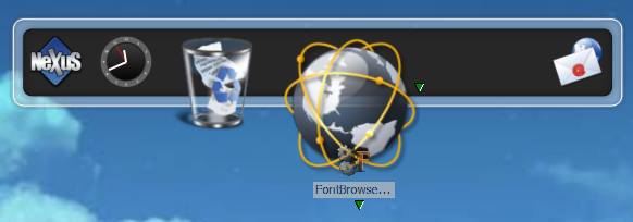
Note the small arrow below the FontBrowser icon being dragged. This arrow bounces up and down to attract your attention and serves as a visual cue that the item will be added to a sub-dock (creating one if none exists already). Note also the blank space at the right of the main dock item - dropping the Font Browser item there would add it to the main dock instead.
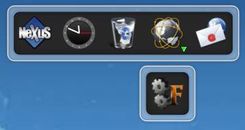
Clicking on the sub-dock indicator will then open the sub-dock with our newly created Font Browser item:
Note that which tile edge you select to drop your item to is actually VERY IMPORTANT. If, in this case, you had dropped the FontBrowser item on the top edge instead of the bottom, then the Internet item would be moved into the new sub-dock and Font Browser would take its place in the main dock.
Sub-Dock indicators, the Magnification Effect and Dock Placeholders
To open a sub-dock you need to click on the small sub-dock arrow indicator. This works great when the magnification effect is disabled since the indicator remains stationary, but, on a magnifying dock, actually hitting the sub-dock indicator might not be as easy as it sounds: unless you move the mouse pointer from outside the dock and straight onto the indicator, the magnification effect might actually 'shift' the sub-dock indicator as your mouse pointer travels over the dock, turning it into a moving target.
This is where Dock Placeholders can be very useful! A Dock Placeholder is nothing more than an 'empty' dock item that is NOT associated to an application, i.e.; clicking on it does nothing. Apart from this, Dock Placeholders behave and can be manipulated just like any other dock items. Dock Placeholders can be used as 'blank' items to separate application groups within the same dock, but where they become truly useful is as 'giant' sub-dock indicators: if a sub-dock is attached to a dock placeholder, then you no longer need to chase after the small sub-dock indicator on magnifying docks - clicking the placeholder itself will open the sub-dock.
Dock Placeholders, unlike Item Separators in WorkShelf which are just 'empty' spaces, can have an associated image/icon: when you insert a Dock Placeholder in the dock, it will first display itself as an 'empty' space (or will be represented by a separator bitmap if the theme provides one). Drop an ICO or PNG file into it, just as you would to change the image of any other dock item, and presto, you have a descriptive icon. Now all you need to do is to attach a sub-dock to the dock placeholder as described in the section above - the difference is that you no longer need to chase after the small sub-dock indicator, clicking on the large dock placeholder image itself will open the sub-dock.
Note that there are two ways to insert a dock placeholder into a dock:
1) Right click on an existing item (i.e.; outside the icon) and select 'Insert New Dock Item' from the context menu. In the Item Properties dialog that pops up, change the item type to 'Dock Place Holder' and press Ok.
or
2) Drag and drop *something* into the intended place holder position, then right click on it and select Properties. Now change the Item Type to 'Dock Placeholder' in the Properties Editor dialog.
Note that simply inserting an image file, like an ICO or PNG file, via drag & drop into the dock will NOT make this new item behave like a dock placeholder: instead it will be treated like any other document (jpg, txt, doc, etc...) and opened with the associated application when clicked on.
Sub-docks can be detached from the parent dock, and turned into full docks themselves, by right clicking on the item associated to the sub-dock and selecting 'Detach Sub-Dock' from the context menu.
The sub-dock will appear on the screen next to the parent dock with a dock control tile.
Just like you can detach a sub-dock and turn it into a full fledged dock itself, as you've seen above, you can also turn a dock into a sub-dock. To do this you drag the dock's control icon and hold it over another dock's tile like you would if you were creating a new sub-dock:
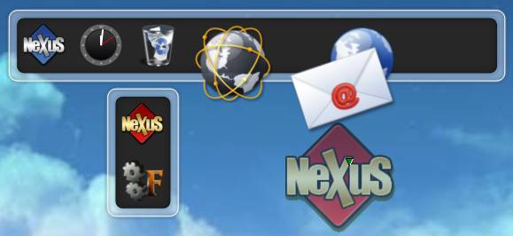
Here we are dragging the red control icon from the vertical FontBrowser dock over the bottom edge of the other dock. Note the bouncing arrow under the semi-transparent red control icon, indicating that the source dock will be added as a sub-dock of the email item.
Creating and Manipulating In-Shelf Docks
Docks can also be turned into in-shelf docks. An in-shelf dock exists as a control tile in a shelf, which, when clicked on, will expand onto a dock. To create an in-shelf dock from an existing dock, just drag the control tile of the source dock into a shelf:
Here we are dragging the control icon of the dock above into the shelf (notice how the shelf automatically inserts a new space for it). When the control icon is dropped, the original dock disappears and a control tile is placed on the shelf. You can now click this control tile to expand the new in-shelf dock:
Just like sub-docks, in-shelf docks can be turned back into docks by right clicking the control icon in the shelf and selecting 'Detach dock from Shelf'.
Docks have three major source of styles, or 'themes'. The first are 'native themes', which are NeXuS or Winstep Xtreme theme packs made exclusively for Winstep applications, and which usually take advantage of every skinning possibility, such as dock overlays and endcaps (notice how part of the grass in the following theme actually overlaps the icons, and how the vegetation starts and ends smoothly at the dock edges):

The second are external 'dock backgrounds', which are simple backgrounds made for other dock applications (such as ObjectDock, RocketDock, MobyDock, Y'Z Dock, etc...) but which can also be used directly by NeXuS:
The third and final theme style is accomplished through the use of 'tiles', which are simple square bitmaps applied as backgrounds for each dock item:

Native NeXuS themes are stored together with the themes for other Winstep applications in the <Public Documents>\Winstep\Themes folder, external Background themes are stored as sub-folders of the <Public Documents>\Winstep\NeXus\Backgrounds folder and external Tile themes are organized by category and stored in sub-folders of the <Public Documents>\Winstep\NeXuS\Tiles folder. Note that you can find a shortcut to the Winstep user data folder inside <Public Documents> in the 'My Documents' folder.
While native NeXuS themes are applied through the Theme Manager tab in Preferences or theme shelves and/or menus, external themes are applied using the Dock Style Editor.
The Dock Style Editor is invoked through the dock's control tile context menu and allows you to select a theme for a single dock. You can then select either 'Tiles', 'Backgrounds' or 'Themes' from the pull up menu at the top right.
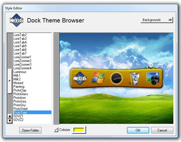
When you select 'Themes' from the pull up menu, native NeXuS themes are displayed on the preview panels. You can install native NeXuS themes through the Theme Management tab in WorkShelf Preferences.
To add external Tile and Background themes, so they can be previewed in and applied by the Dock Style Editor, you must place tile bitmaps in sub-folders of (Public Documents)\Winstep\NeXuS\Tiles and backgrounds and their configuration files in sub-folders of (Public Documents)\Winstep\NeXuS\Backgrounds.
The 'Open Folder' button opens the folder where the bitmaps of the currently selected theme, background or tile are stored.
You can also colorize a dock background from here, a very useful feature that gives you quick access to thousands of different color variations on the same theme. Note that you should use the global colorize setting in Theme Management instead if you wish to colorize the whole theme and not just a specific dock.
Left Clicking the left-hand side 'mini-tab' will being up the Workshelf Preferences window which allows you to change many other aspects of the application.
The preferences window can be invoked in many ways: by clicking on the left-hand side 'mini-tab', by right-clicking the left 'mini-tab' and selecting 'Preferences' from the context menu, by double clicking on WorkShelf’s tray icon, by right clicking on this icon and selecting Preferences or with the keyboard by pressing CTRL-F11. This latest key-combination can be changed, if necessary, in the Global tab of the Preferences window itself. If you manage to get yourself into a corner by disabling all these access options, there is still one other way to access the preferences window: by running WorkShelf with the 'setup' command line argument ( e.g.; 'c:\program files\WinSTEP\WorkShelf.exe setup' ) .
The Preferences Window Command Buttons
The row of buttons at the bottom of the preferences window perform the following actions: The OK button applies and saves any changes you made and closes the preferences window. The Preview button allows you to preview changes without saving. The Cancel button reverts all changes made and also closes the preferences window. The Restore button cancels all changes made but keeps the preferences window open. The Help button opens this help file. Finally, the Exit button exits Workshelf. A dialog will ask you to confirm that you wish to close Workshelf.
Note that Workshelf's internal help file browser depends on Microsoft Internet Explorer being installed on your system. If IE is installed, Workshelf will display this HTML help file with its internal browser. If IE is not installed, then Workshelf will try to open the help file in your default web browser, and report an error if this fails.
The various 'tabs' within Workshelf's Preferences window can be selected with the vertical row of buttons at the right hand side.
This tab allows you to configure how Workshelf functions.
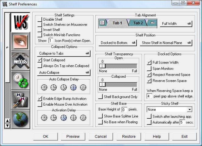
Shelf Settings
Selecting 'Disable Shelf' will effectively turn the shelf off, leaving only desktop modules and any existing docks. You can also toggle the Shelf on and off via any dock's 'Dock and Shelf Management' sub-menu of the NeXuS control tile.
Switch Shelves on Mouseover allows you to switch tabs without actually having to click on them. The amount of time the mouse pointer needs to hover on top of a tab for it to be automatically selected depends on the Activation Delay settings below.
If Invert Shelf is selected then the tabs position will become inverted (i.e.; instead of being displayed at the top of the shelf they will be displayed at the bottom). This also affects how WorkShelf collapses when docked, i.e.; if the tabs move up/down or stay fixed.
The Switch mini-tabs Function allows you to switch the left and right mini-tab functions and icons to best suite your needs (e.g.; if you prefer the collapse function on the left).
In Rows you can specify how many icon rows are visible by default. This is extremely useful if you want WorkShelf to always display 2 or more icon rows instead of the default single icon row when un-collapsed.
Collapse Options
There are several options to allow you to adjust the behavior of Workshelf's collapse option (normally done by clicking the far right hand 'mini-tab'). You may set the shelf to 'collapse to tabs' (the default) which will leave just the tabs and the base area (if one has been specified, see Shelf Base below) showing when collapsed. You also have the option to 'collapse to frame' which will leave just a tiny part of the top edge visible when collapsed.
If you select Start Collapsed then WorkShelf will always start collapsed when you run the program. WorkShelf can also be set to be always on top of other windows when collapsed, independently of the open z-order settings - this will ensure that when WorkShelf is collapsed the tabs cannot be covered by other windows.
You also have the option to make the shelf auto-collapse (or auto-hide) whenever you're not using it or when you launch an application. The delay before auto-collapse may be set using the five clock symbols, rightmost clock being the largest delay. Re-activation will occur in one of three ways: when you hover the mouse pointer over the tabs if Enable Mouse Over Activation is selected, by clicking on the shelf or by bumping the screen edge WorkShelf is docked or associated to. You can also set the delay before mouse over re-activation.
WorkShelf can be quickly un-collapsed and/or brought to the foreground by bumping the bottom or top screen edges (depending on whether the shelf is set to dock at the top or at the bottom) with the mouse cursor. De-selecting Enable Edge Bump disables this feature. The amount of time the mouse pointer needs to remain at the screen edge for the shelf to be activated depends on the Activation Delay, which is shared with the Mouse Over Activation option. An higher delay prevents accidental bumps to the screen edges from automatically un-collapsing WorkShelf, which can be a nuisance.
Shelf Transparency
Provided you are using Windows 2000 or above, you may apply a level of transparency to Workshelf when it is open. Tip: Be careful! If you set full transparency (slider all the way to the right) you will not be able to see Workshelf at all! Don't panic - right-clicking on the Workshelf icon in the system tray (or pressing CTRL-F11) will allow you to bring up the preference panel again in order to change this setting.
You may also set collapsed transparency, which allows Workshelf to become transparent (or partially transparent) when collapsed. Moving the slider further to the right increases the degree of transparency.
Shelf Base
Shelf base height allows you to set a blank area below your applications in WorkShelf that can be used to hold the NextSTART system tray, NextSTART task buttons or possibly even the floating Workshelf desktop modules (which must all be set to 'Always on top' for this to work as intended). A base will always be visible even when WorkShelf is collapsed. If you do not wish this base to be visible when WorkShelf is undocked, just select 'No Base when Floating'. If Show Base Splitter Line is enabled WorkShelf will display a splitter line between the shelf body and the shelf base.
Shelf Position
In this section you can decide which screen edge (top or bottom) you wish Workshelf to dock to, or turn it into a free-floating launch bar. Note that you may also quickly toggle the docking/free-floating status of Workshelf by using the Dock/Undock options in the left mini-tab context menu. A free-floating shelf can be dragged into the desired position by clicking on any empty space of the shelf (or the left mini-tab) and dragging. Once you have selected a position, Workshelf may be re-sized by dragging the right or left edges of the shelf.
Here you can also set if WorkShelf should be displayed always on top so that other windows cannot cover it, always at the bottom of the screen (just like the Windows desktop) or in the same plane (z-order) as other windows.
Docked Options
The Full Screen Width option makes Workshelf extend to the full width of the edge its attached to when in docked mode. Undocking it makes Workshelf revert to its previous free-floating position and size. If the 'Span Monitors' option is selected on multi-monitor systems, a docked shelf can be made to extend across all monitors.
WorkShelf can be made to Respect Reserved Screen Space when docked. This is a particularly important function since without it the Windows taskbar or the NextSTART startbar would partially cover WorkShelf if both were docked to the same screen edge. With this option turned on, WorkShelf will dock just above the bar instead of at the very screen edge.
WorkShelf itself can be made to reserve screen space when docked, so that maximized application windows do not cover its tabs when collapsed... you can even specify an additional 'gap' between the top of the collapsed WorkShelf and the bottom of the maximized application window.
Sticky Shelf
Here you can define a 'Sticky Shelf' which is automatically switched to after a specified number of seconds with no activity elapse and/or after launching a program through WorkShelf. This is useful if you want, for instance, the tasks shelf always visible without having to worry about clicking on it every time you temporarily switch to another shelf.
The Shelf Content Preferences tab
This tab allows you to configure settings related to the contents of Shelves. Changes made are immediately visible in the Preview window at the top left.
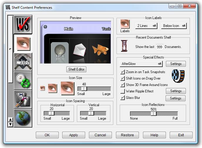
Icon Size
You can define the size of icons used by the Shelf from a minimum of 16x16 up to a maximum of 256x256 pixels. Non-standard sizes or sizes not supported by the operating system may make some icons look stretched or blocky, but remember you can always customize the icons of items in Regular shelves by dropping an .ico, .png or .tif file of your choice on them.
Icon Spacing
Here you can adjust the spacing between icons, both horizontally and vertically. The lesser spacing the more icons you will be able to fit in the same area, but at the cost of less space being available for icon labels. Note that double-clicking on an Icon Spacing handle will restore the default spacing.
Icon Labels
Here you can choose whether to display icon labels or not, where to display them (above or below the icons, or intercalated to maximize readability) and how many lines should be available for the labels.
Recent Documents
In this section you can specify how many documents are displayed in the Recent Documents shelf (XP and above only). The default is the last 15 documents.
Special Effects
The 'Special Effects' section allows you to individually toggle specific effects and animations:
The 'Zoom Icons on Selection' effect will make the icons grow a little when selected and shrink back to their original size when de-selected. It's a nice effect that can be turned off if you prefer the classic highlight method.
If you enable 'Zoom in on Snapshots', WorkShelf automatically zooms the size of a task snapshot in the tasks shelf to 128x128 when you mouse over it. This helps you to recognize the window by allowing you to see more details of its contents.
The 'Shift Icons on Drag Over' effect will make WorkShelf shift icons around to make room for a new item when you are dragging an object over the Shelf.
You can toggle the grid around shelf icons on and off by changing the 'Show 3D Frame Around Icons' option. Note that some older themes, made before the 3D frame feature was added, do not display this grid - you can still force it on via the 'Appearence and Sounds' sub-menu of the Shelf's left mini-tab context menu.
The 'Water Ripple' effect will make the Shelf behave like a liquid surface when you click on it: a circular ripple will spread across the surface. You can also customize the size, strength and distance traveled by the ripple by clicking on the Settings button
When running under Vista or above, the 'Glass Blur' effect causes semi-transparent shelf backgrounds to automatically blur whatever is visible behind them, i.e. apply the same effect Windows Vista does to window borders when Aero is enabled. Here you can apply the Glass Blur effect only to the shelf, but you can use the global Glass Blur setting in the Theme Management tab of WorkShelf Preferences when you want to apply the effect to all WorkShelf objects.
If you want, each icon in the shelf can have a reflection below it. Here you can set the size of the reflection, from 0% (disabled) to 100% (the whole icon is reflected). Double-clicking the Reflection handle will set the reflection size to 50%.
Note that some of these effects might tax your system a bit. Try them out to see if your system can cope easily with them.
The NeXuS Common Preferences tab
This tab allows you to manage your docks and configure settings common to the Shelf and NeXuS.
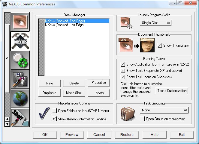
Dock Manager
The Dock Manager lists all your existing NeXuS docks and allows you to create new docks, duplicate (clone) docks, copy the contents of a dock into a new shelf, delete docks, and edit their settings directly from Preferences. Note that all these actions are also available in the context menu of each dock's control tile.
If you are unsure which of your existing docks is currently selected in the Dock Manager, you can always click on the 'Locate' button: the relevant dock will be brought into the foreground and a giant bouncing arrow will point at it.
Miscellaneous Options
Enabling 'Open Folders as Menus' will make WorkShelf launch the folder you click on as a NextSTART menu instead of opening it in an Explorer window. Note that the same action can be accomplished on demand by left clicking and holding on a folder item for about one second.
Un-checking 'Show Balloon Information Tooltips' will disable the detailed information - such as the complete name, file size, etc... - that is displayed after a small delay when you mouse over an item.
Launch Programs With
Items in shelves and docks can be launched with a single or a double mouse click. When single click (the default) is set, icons in shelves are automatically selected when the mouse pointer passes over them. To select an icon in the Shelf when in Double Click mode, you must click on it once.
Document Thumbnails
When 'Show Thumbnails' is enabled, Workshelf displays a preview thumbnail for image and video files instead of the regular icon, making it much easier to identify individual files at a glance.
Running Tasks
An 'ActiveTasks' shelf displays a list of the currently running tasks on your computer, just like the Windows and NextSTART taskbar. Currently running tasks can also be displayed on NeXuS docks by selecting the apropriate option in the dock's Properties dialog. The settings in this section apply to the tasks shelf as well as to any docks currently displaying a list of running tasks.
Task icons are provided by application windows, and usually come only in only two sizes: either small (16x16) or large (32x32). This is because these icons are intended to be used by the Windows taskbar only, which always displays tasks using 16x16 icons. WorkShelf, on the other hand, can display icons all the way up to 256x256 (although icon sizes larger than 48x48 are not normally used unless you are running Vista because this is the largest size supported by Windows 2000 and XP). In practice, this means that when you have the Shelf set to display 48x48 icons, the icons displayed on the Tasks shelf are stretched up versions of either their 32x32 or, worse, 16x16 versions, which can make them look pretty blocky. To get around this, you can tell WorkShelf to display the associated application icon instead - which usually provides at least a 48x48 version - by selecting the 'Show Application Icons for sizes over 32x32' option.
Under Windows XP and above, instead of displaying running tasks as icons you can actually display reduced snapshots of the windows by enabling 'Show Task Snapshots'. Note that these snapshots, although updated frequently, are not 'live' as in Windows Vista, and that you cannot get snapshots of minimized windows. To get around this limitation, WorkShelf always 'remembers' the last good snapshot taken before you minimize an application.
By default, snapshots display a little task icon at the bottom left of the snapshot to help identify the task. You can prevent this by disabling the 'Show Task Icons on Snapshots' option.
The 'Task Customization' button opens a dialog window where you can choose different task icons to represent your applications (note that you can also customize the icon used in a specific task by dropping an .ico, .png or .tif file into that task), prevent specific applications from appearing in the list of running tasks, and exclude troublesome applications from having their snapshot taken (for instance, Windows Media Player is excluded by default because the action of getting it's snapshot causes the video overlay window to come to the foreground even when the player itself is hidden beneath other windows). You can select an application either by filename ( e.g. 'workshelf.exe' ) or by providing a word that exists in the application's window title ( e.g.; 'WinWord' ). If you are running NextSTART, it will also adopt any customization options chosen here.
Note that tasks recognize 3 types of mouse clicks: left clicking on a task icon will restore/bring forward the associated application, right-clicking will open the task's context menu and middle-clicking will close the application. If you SHIFT-CTRL-Middle click on a task icon, you will kill all related instances of the same application (e.g.; all currently opened Internet Explorer windows). Likewise, SHIFT-CTRL left or right clicking on a task icon will restore or minimize all related instances of that application.
Task Grouping
New tasks are added by default to the end of the list of running tasks but in this section you can also have WorkShelf sort the tasklist by similar tasks (i.e.; always display documents opened by the same program together) or represent similar tasks by a single task icon. The latest option minimizes the space used to display the list of running tasks, which can be important if you have many windows open at the same time - for instance, if you have four different text documents open in Notepad, their four task icons will be replaced by a single icon named 'Notepad'. Clicking on this grouped task icon will make a menu pop up listing the four different notepad documents. A grouped task icon also displays the number of tasks grouped into that item (e.g.; using the latest example, '4' would be displayed in the lower right corner of the 'Notepad' task icon).
As the name suggests, selecting 'Open Group on Mouseover' prevents you from having to click on a grouped task icon to display its associated documents.
This tab allows you to configure the ever-growing list of modules that come with WorkShelf. You can select which module you want to configure on the drop menu at the top right corner of this preferences tab. Clicking on the color well below the preview window allows you to change the window's background color.
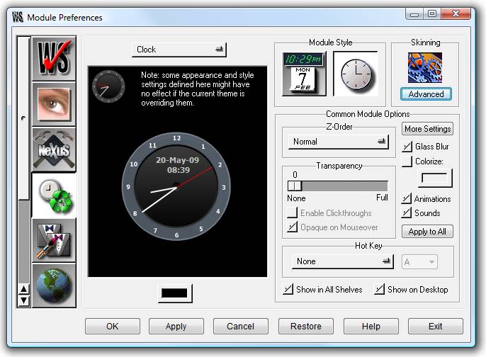
WorkShelf comes with an impressive, ever-growing, list of modules. Modules are little 'add-on' utilities that can be turned on or off according to your needs. Modules also come in two flavors: as In-Shelf/Dock modules (i.e. as icons in the shelf or in a dock) or as free-floating desktop modules. The advantages of the desktop modules is that, residing outside docks and the shelf itself, they can be always present on your desktop, have any shape and size you want, and can optionally be captured into the NextSTART Startbar. The following is a list of currently available modules:
Clock: Shows the current time, keeps your system clock accurate to the millisecond by periodically obtaining the time from Atomic Time servers on the Internet and is able to tell you the current time in English.
Recycler: Allows you to delete files and shelf items by dropping items into it, reflects the current status of the Recycler (full or empty) and gives you the number of files currently on the recycle bin plus the space they are using.
CPU Meter: Shows current CPU activity and allows you to see which applications are currently hogging the CPU, as well as a list of the most active programs in the last minute.
RAM Meter: Shows current memory usage and displays various memory statistics.
Net Meter: Shows the number of bytes currently traveling in and out of the Network Card you selected (usually the one associated to your Internet connection), provides various TCP/IP statistics and allows you to see which applications are currently using your Network Connection (very useful to spot any stealth Trojans that might have inadvertently found their way into your computer).
Email Checker: This multi-account email checker is able to show - and even tell you in plain English - the number of pending messages in your various accounts and can optionally launch your email client of choice whenever new messages arrive. It supports POP3, IMAP and SSL connections.
Weather Module: Allows you to monitor the current weather conditions at a location of your choice. It supports over 39,000 cities all around the world.
Wanda: Displays a fortune cookie at the selected interval or on request. It can also retrieve fortune cookies from an Internet database holding over 50,000 different cookies and store them in a local file.
To control the features of each module, you first select the relevant module from the pull up menu at the top of the 'Module Preferences' panel. The functions available are:
Module Style:
Module styles apply to In-Shelf/Dock modules and usually only affect desktop modules if 'Advanced Skinning' for that module is disabled. Modules always feature two possible styles, the styles available being dependent on the module. The clock module allows you to choose between Analog and Digital displays, the Recycler, Weather, Email and Wanda modules allow you to choose between two different looks, and the meter modules allow you to choose between bar (current activity) or histogram (past and current activity) ways of presenting information.
Module Options:
The 'Z-Order' pull up menu allows you to specify if a Desktop module is always on top of or always behind other windows, or if it is bought to the foreground by clicking on it (Normal Z-Order). You can also tie the Z-Order of a Desktop module to the shelf, so that the module is automatically brought to the foreground whenever the shelf has focus.
Show in all shelves: In-shelf modules only - shows the module at the beginning of every shelf.
Show on desktop: Toggles display of the desktop module.
Animations: Toggles any module animations on or off.
Sounds: Sound toggle for that module.
When running under Vista or above, the 'Glass Blur' effect causes semi-transparent desktop module backgrounds to automatically blur whatever is visible behind them, i.e. apply the same effect Windows Vista does to window borders when Aero is enabled. Here you can apply the Glass Blur effect to individual desktop modules, or you can use the global Glass Blur setting in the Theme Management tab of WorkShelf Preferences to apply the effect to all WorkShelf objects.
You can also colorize desktop module backgrounds from here, a very useful feature that gives you quick access to thousands of different color variations on the same theme. Note that you should use the global colorize setting in Theme Management instead if you wish to colorize the whole theme and not just a specific module.
If you are using Windows 2000 or above, you may also set the transparency level of the desktop module with a slider, allowing the desktop module to become partially transparent. Having a semi-transparent module also enables you to take advantage of the 'click through' feature, in which mouse clicks on the module 'pass through' onto the windows underneath. This allows you to keep your semi-transparent desktop module always on top of other windows, without it actually getting in the way - but note that you will have to disable this option to be able to move the module again or access its context menu.
Having transparent modules also allows you to use the 'Opaque on Mouseover' effect, in which a semi-transparent module fades to opaque when the mouse pointer is over it and back to semi-transparent when the pointer moves away from it. Note that because of the way 'Enable Clickthroughs' works, these two functions are exclusive of each other.
Desktop Modules can also be toggled on and off view through a 'hot key'. This can be very useful if you don't want the modules appearing or taking up space on your screen until you actually need them.
The 'Apply to All' button will apply the current z-order, transparency, glass blur, colorize, animation and sound settings to all the modules at once.
The 'More Settings' button opens the Module Settings panel specific to the currently selected module (see 'Configuring Desktop Modules').
Advanced:
Desktop modules only - opens the settings panel for the free-form skinning of the currently selected desktop module (see 'Working with Themes').
This is where you load and import new themes, or save out and export your own newly created themes.
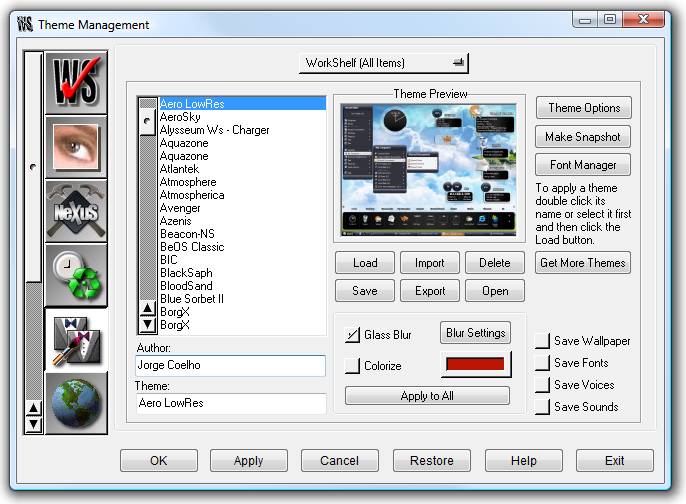
At the top of this panel is a drop menu that allows you to select whether you are dealing with a WorkShelf theme, a NeXuS theme or a theme for one of the modules (clock, recycler, etc.). Any changes made when saving themes will be saved only for the selected item, except if 'WorkShelf (All Items)' is currently selected, in which case changes are saved for all items (except Voices and Sounds, which must be explicitly saved by selecting the appropriate check boxes). Same applies for loading themes.
The list at the left is where you make a choice from the number of pre-installed themes which come with Workshelf. Once you have created your own themes, or imported new ones, they will also be listed here. To load a theme, double click its name or select it from the list and click on the top diskette button - the theme will be immediately applied. You can also select a theme and then click on the OK or Preview buttons at the bottom.
When you get tired of the themes that come with WorkShelf, you can download hundreds more from the Internet by clicking on the Get More Themes button. This will take you to the Themes page at the Winstep web site where a list of all the sites that host Winstep themes is available.
When running under Vista or above, the 'Glass Blur' effect causes semi-transparent backgrounds to automatically blur whatever is visible behind them, i.e. apply the same effect Windows Vista does to window borders when Aero is enabled. You can also Colorize backgrounds from here, a very useful feature that gives you quick access to thousands of different color variations on the same theme.
Note that the Glass Blur and Colorize settings relate to whatever object is currently selected in the pull down menu at the top of this dialog. If you wish to apply the same Glass Blur and Colorize settings to every WorkShelf object, do not forget to click the Apply to All button after modifying your settings.
The Import Theme button shows a dialog box from where you can import Winstep themes you have downloaded from the internet. You should browse to the directory containing your downloaded theme and press the Import button once you have selected your file - alternatively you can also Drag & Drop the .zip or .xtreme file to the filename text box. Older themes were stored in zip files and needed to be imported through the Themes Manager tab - newer .xtreme theme packs can be automatically imported and applied by double clicking on the theme pack file.
If you placed all your newly downloaded themes in the \winstep\autoinstall folder, WorkShelf detects their presence and Autoinstall will show up in the text box. Pressing the import button will then install all the themes you have in this directory.
WARNING! Theme pack files stored in the Autoinstall folder will be automatically deleted after installation. Theme packs stored in the Autoinstall folder will also be automatically installed when WorkShelf runs.
If you are updating an existing theme, you will get an Overwrite warning. Checking the Always Overwrite Files option in the warning dialog will prevent Workshelf from issuing an overwrite warning for each matching file in the theme.
The Delete button allows you to delete the currently selected theme and all its files, but not without first prompting you for confirmation. The theme folder and all its files will be moved to the Recycle bin, where you can retrieve it from later if you change your mind.
The Save button allows you save your newly created theme, or indeed any alterations you may make to the defaults as loaded by other themes. Before saving a theme you should type your name in the Author box and the name of the theme in the Theme box. You should also check the Save Wallpaper option if you want your current wallpaper to be part of a Workshelf theme. If the wallpaper is a bitmap in BMP format, it is a good idea to convert it to JPG before exporting the theme, since this will drastically reduce its size. Workshelf automatically converts JPG wallpapers to BMP when loading because some OS versions do not support wallpaper bitmaps in JPG format. If your theme uses any special fonts, checking the Save Fonts option will make Workshelf copy the fonts used in the theme to the theme's folder. It is always a good idea to check this option since WorkShelf will NOT copy common fonts, i.e.; those that are installed by default on all versions of Windows.
Please note that (as mentioned above), changes made when saving themes will be applied only to the item selected in the drop menu at the top of this tab unless 'WorkShelf' is currently selected.
Before saving your theme, you might want to make a Theme Preview Snapshot, which will be saved together with the theme. For this you should re-arrange your desktop in a manner that shows off your theme and then click on the Make Snapshot button. WorkShelf will automatically hide the Preferences window and take a snapshot of your desktop. Note that the Theme Preview snapshot is shared by both NextSTART and Workshelf - there is no need to make one for each application.
The Export button is a useful option if you plan to distribute your themes to others. Once a theme has been selected on the list box at the left, you can, by simply pressing the Export button, automatically export it to a .xtreme theme pack file which will take the name of your theme and place it in the export directory (or on a directory of your choice). The export process will compress all the files and sub-folders contained in the theme directory.
Clicking Open will show the contents of the folder holding the bitmaps and configuration file of the currently selected theme. Useful when you want to manipulate the individual theme bitmaps or other configuration files.
The Font Manager button opens a dialog listing all the fonts used by the currently loaded theme. From there you can quickly swap one font for another and even install any fonts that exist in the theme folder but were not previously installed.
The Theme Options button leads to a dialog that allows you to set options related to loading themes:
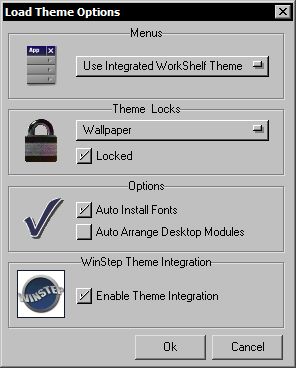
You can specify if WorkShelf context menus use the appearance of the current NextSTART theme (which can be different from the current WorkShelf theme), the current WorkShelf theme regardless of the current NextSTART theme or the default NeXT style theme.
You can also prevent changes to your current wallpaper and individual module themes (clock, recycler, etc...) when loading a new theme.
Some themes come with fonts - disable the Auto Install Fonts option if you wish do not wish fonts to be automatically installed on your system. Disabling this option is not recommended however, as the theme will not look as intended by the theme creator.
The size of desktop modules varies wildly from theme to theme, therefore an arrangement that works for one theme might result in overlapped or partly off-screen desktop modules when another theme is loaded. When you load a new theme and the Auto Arrange Desktop Modules option is selected, WorkShelf will automatically re-arrange the desktop modules on the right side of your screen so that they do not overlap each other and are fully visible.
You can also select if theme integration with NextSTART is active or not (if active , changing a theme in WorkShelf will automatically change the theme in NextSTART to match - providing, of course, that you are running NextSTART and that there is a matching NextSTART theme).
There are many theme designers constantly making new themes for NextSTART and Workshelf. Users who do not wish to do so can either use one of the many themes that come by default with Workshelf or they can download hundreds of new themes from sites such as those listed at http://www.winstep.net/themes
The Global Preferences tab allows you to configure various elements of Workshelf.
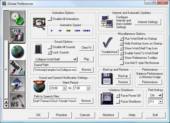
Animation Options
Here you can globally turn off animations (such as the collapse/un-collapse shelf animation) and set the animation speed (larger arrows mean slower animations).
Sound Options
This is where you globally control the sounds produced by WorkShelf. You can disable all sounds so that WorkShelf is always silent even if, for instance, a theme provides sound schemes or the clock tries to announce the current time.
Locking Sounds prevents themes that have their own sound schemes from changing your current sound scheme.
There are several events to which you can associate a particular sound to. The full list of events is the following:
Collapse WorkShelf
Expand WorkShelf
Switch Tabs
Mouse over's
Select Item
Execute Item
Scroll Up or Down
Open Preferences
Clock Chime
Clock Tick
Email Checker Chime
Fortune Cookie Popup
Empty Recycle Bin
Drop Item into Recycle Bin
To add or change a sound to an event, you first select the event from the drop menu and then either type in the name of the sound file you wish to associate with it or select it from your hard disk by clicking on the Browse button. If you wish to clear the list of sounds associated to events click on the 'Clear Fx' button. Once you have selected a sound, you can listen to it by clicking on the 'Play' button.
Sound and Speech Notification Settings
Here you can specify a 'Silent Period' in which WorkShelf will NOT sound any announcements (such as saying the time, announcing you have new mail or playing chimes). This is useful to, for instance, prevent the speech feature of the WorkShelf clock from waking you up, and the members of your household, at 3 o'clock in the morning.
You can also specify the folder holding the current voice files. If you wish to put together your own Voice theme for the clock and other voice using modules, the pre-defined filenames are as follow:
Wave files used for the voice pack:
0.wav
1.wav
10.wav
100hours.wav
11.wav
12.wav
13.wav
14.wav
15.wav
16.wav
17.wav
18.wav
19.wav
2.wav
20.wav
3.wav
30.wav
4.wav
40.wav
5.wav
50.wav
6.wav
7.wav
8.wav
9.wav
AM.wav
PM.wav
Oclock.wav
TheTimeIs.wav
YouHave.wav
NewMail.wav
NewMessages.wav
NoMessages.wav
Backup and Restore
Here you can backup and restore all your current WorkShelf settings to and from wbk files.
Performance
WorkShelf is optimized for speed by default. Speed is usually achieved by caching specific bitmaps in memory instead of retrieving them from the file system every time they need to be used. If, however, you have a system with very little RAM, you can click on the 'Performance' button to selectively disable some of the speed optimization features in the dialog that pops up. This releases some memory back to the system. Changes are immediate and you are informed how much memory was returned to the system when exiting the dialog. The impact on performance - and memory usage - that changes in this section make is heavilly dependent on the current theme and on how powerful your system is.
Internet and Auto Update Settings
This section is where you define the communication settings for all the modules and functions that use the Internet to retrieve information (such as the Atomic Clock, the Email Checker, the Weather module, Wanda online cookie retrieval and checking for updates). If you are behind a Proxy, WorkShelf will automatically use the Proxy settings defined in the Connections tab of Internet Explorer, or you can manually specify a Proxy server and port.
The 'Wait for Connection' checkbox should be checked if you do not have a permanent connection to the internet - the module will then wait until you are on-line before attempting to communicate with an internet server. The 'Alternative Detection' checkbox selects an alternative option to detect an internet connection and should be used if you are unable to connect or are having problems with the normal method (e.g.; WorkShelf clock never connects or thinks the user is always connected).
WorkShelf can regularly check to see if newer versions are available (note that this requires an active Internet connection). Here you can disable this function or have WorkShelf silently check on the background and only notify you when new updates are available.
Miscellaneous Options
This area consists of several settings:
Run WorkShelf on Startup: enabling this will make Workshelf auto run next time you reboot Windows. With this option selected you do NOT need to place a shortcut to Workshelf in your Startup folder.Hide Desktop Icons on Startup: makes WorkShelf automatically hide icons on the windows desktop when it starts.
Show WorkShelf Tray Icon: disabling this will prevent display of the Workshelf icon in the system tray. This is not recommended however, since it is a fail-safe function that will always allow you to access WorkShelf preferences. The WorkShelf tray icon pop up menu also allows you to disable Edge bumping activation, show the WorkShelf User Guide and exit WorkShelf.
Enable Send to WorkShelf: selected by default, this setting allows you to quickly send items in Explorer windows to a Regular shelf by right clicking the file and selecting 'Send to->WorkShelf' from the context menu. A dialog will then pop up from where you can select the target shelf.
Show Preferences Tooltips: un-checking this will disable the tooltip help given by Workshelf that explains the actions of the graphical buttons in the preference tabs.
Use NeXT File Browser: here you can toggle between using the built-in NeXT style file browser in WorkShelf or the standard Windows file dialogs.
Troubleshoot button
Displays a dialog from where you can reset WorkShelf settings, Docks and Shelves back to their installation defaults.
Windows Shutdown
Force power Off / Force Shutdown: these are options you might want to try if WorkShelf's 'Shutdown Windows' and 'Restart Windows' items in the Shelf's context menu don't work for you.
Preferences Hotkey
You can define the key combination that invokes WorkShelf Preferences using the keyboard, or even disable this option (although this is not recommended). It is very useful for quick access, specially if you decide to hide WorkShelf's systray icon. The default key combination used is CTRL-F11.
The Appearance Preferences tab
This tab allows you to set the location of your theme's bitmaps folder, to change the colors, fonts, arrows and tab shapes used in the theme and (via a sub-panel) to enable Advanced Skinning for your theme. For a fuller description of theme-building and a list of the bitmaps and icons used see 'Working with Themes' .
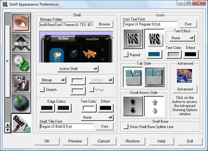
The shelves in Workshelf are made up of several parts, each customizable in several ways. These parts are the tabs themselves (both active and inactive versions), the shelf body, the icons on the left and right 'mini-tabs' and the graphics used for the scroll arrows. The default path for the graphics may be set in the 'Bitmaps Folder' edit box at the top left of the panel. Below the path selection box are the rest of the options for 'Standard' skinning. Both Active (top) and Inactive (lower) shelves may be skinned with solid colors, gradients or bitmaps. Note that this options have no effect if the shelf is currently set to use 'Advanced Skinning' (see 'WorkShelf Advanced Skinning' ) ! When using bitmaps, the predefined filenames for each part must be used - the bitmap for the active shelf should be called wsbacka.bmp, the inactive shelf bitmap should be named wsbacki.bmp. Select the 'Stretch' checkbox if you want the bitmap/s to stretch with the shelf size - otherwise they will be tiled. Edge colors enables you to select the highlight colors for the edges of the shelves and you can also change the font, text effect and colors used for the shelf titles. Text effects can be none, shadow and outline.
The next section (top right) enables you to set the typeface, effect and colors for icon text on the shelves. There are two options for highlighting the selected icon. One is a 3D effect using the colors set in the 'Edge color' options, the other is a solid block color which can be selected. Below this are options for changing the shape of the shelf tabs and the style of the scroll arrows. The 'Shelf Base Splitter Line' option draws a 3D-effect line at the position set in the 'Shelf Base Size' options on the Shelf Preferences tab.
The 'Advanced' button allows you to access the
Advanced Skinning Options window (see 'Working
with Themes' ).
The NeXuS Appearance Preferences tab
This tab allows you to configure dock themes. For a fuller description of theme-building and a list of the bitmaps and icons used see 'Working with Themes' .
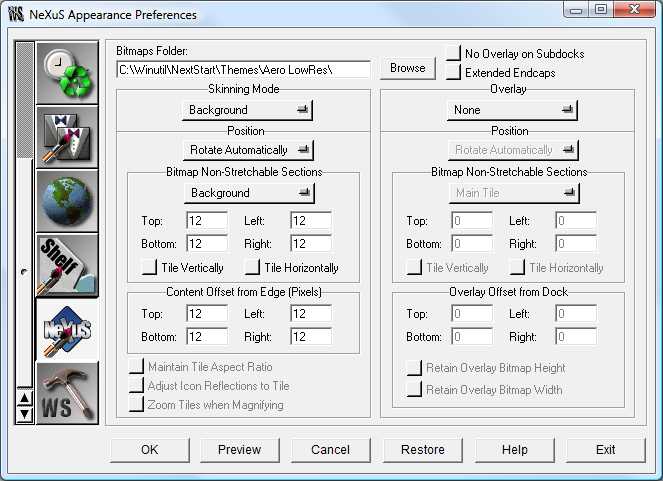
Because this tab is related uniquely to skinning, it is best described HERE.
WorkShelf modules are configured in the 'Module Preferences' tab of WorkShelf Preferences or by clicking on the 'Settings' item in each module's context menu.
There are two Module types available within Workshelf. The In-Shelf/Dock module is designed to occupy a position within a shelf or dock (or even on all of your shelves) in the same way as an application icon and is therefore limited to a certain range of sizes and styles. The Desktop Module is free-floating and can be freely skinned to be almost any shape or size that you can imagine!
A In-Shelf/Dock module may be added very simply by right-clicking on a blank area of the shelf/dock and selecting 'New' from the pop-up menu. This will launch the 'New Items Properties Editor'. Select 'Module' from the 'Command' drop menu and then select the module you want to display from the 'Module' drop menu. You can then drag the In-Shelf/Dock module to the desired position on the shelf/dock in the same way as an application icon.
A desktop module offers much the same functionality as the In-Shelf/Dock module, with the additional feature that it is free-form skinnable and can be placed anywhere on your desktop. It can also be 'captured' into the NextSTART Startbar if NextSTART is currently running.
Common Entries in Module Context Menus
Right-clicking on a Desktop or In-Shelf/Dock module will pop up that module's context menu. This context menu has settings which are common to all modules and are therefore best described here:
Show On Desktop: In-Shelf/Dock module only - displays the desktop version of the module on the screen.
Z-Order: Desktop module sub-menu only - allows you to specify if a Desktop module is always on top of or always behind other windows, or if it is bought to the foreground by clicking on it (Normal Z-Order). You can also tie the Z-Order of a Desktop module to the shelf, so that the module is automatically brought to the foreground whenever the shelf (or any other item tied to it) has focus.
Lock/Unlock Position: Desktop module only - prevents or allows the desktop module to be moved from its current screen position.
Attach to/Detach from NextSTART: Desktop module only - captures or releases the Desktop module from the NextSTART Startbar. NextSTART must be running.
Desktop Modules: Opens a Desktop module management menu from where you can open/close individual modules (or all of them at once), temporarily Hide or Show all active modules, bring all the currently active modules to the foreground, and manage module positions on the screen.
Settings: Opens the preferences panel for that module.
Advanced Skinning Settings: Desktop module only - opens the advanced skinning settings panel for that module.
Theme: Allows you to quickly select and apply a skin, for that module ONLY, from a menu displaying a list of currently installed Workshelf themes. Through this option, each module can have its own independent theme.
Lock/Unlock Theme: Prevents or allows the current module theme from being changed whenever you switch the current global theme.
Style: In-Shelf/Dock module only - allows you to change the module's style (e.g. from Digital to Analog clock or from bar meter to histogram, and vice-versa).
Remove: In-Shelf/Dock module only - Deletes the module from the shelf or dock.
Properties: In-Shelf/Dock Clock only - Opens the 'Properties Editor' panel for that item.
Close: Desktop module only - hides and disables the module.
The clock module has the ability to 'speak' the time (with selectable voice themes) at pre-determined intervals and to check the time against an internet time server (atomic clock). By default, the clock module synchronizes your time once every 24 hours.
There are two clock styles available: Analog or Digital.
The Clock Context Menu
Right-clicking on the clock module will bring up a standard module context menu with the following clock module specific settings:
Check Atomic Clock: Forces the clock to check itself against the Internet Time server - you need to be connected to the internet for this to work.
Say the time: The clock voice module will speak the current time.
Date and Time Settings: Opens the default Windows date and time settings control panel.
Regional Settings: Opens the default Windows regional settings control panel.
Voices: Permits you to switch between any of your currently installed voice themes.
Sounds: As above - allows you select the sound theme you wish to use (ticking noises, etc).
This panel allows you to alter general preferences for both desktop and In-Shelf/Dock clocks.
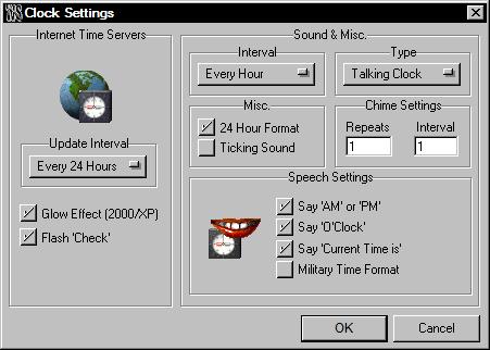
Internet Time Servers: The drop menu allows you to set an update interval for checking the atomic clock on the internet. This interval can be set to 'never', which disables the internet time server function or for a range of intervals from 1 to 24 hours. Note that Internet communication settings for the modules that retrieve information from the Internet can be found on the Global Preferences tab. While WorkShelf is accessing the internet time servers, the desktop clock can be made to 'glow'. This effect is only available on Windows 2000 and above systems, however, which is why you can also use the flash 'check' method, where the word 'check' is displayed on and off over the digital time when Workshelf is accessing the internet time servers.
Sounds & Misc: The Interval drop menu allows you to select the interval at which you want a voice or chime to announce the time. There is also a 'Never' setting which disables voice/chime sounds for the clock. The Type drop menu allows you to choose whether to hear the voice or the chime. You may also turn the 'clock ticking' sounds on and off, select 12 or 24 hour formats and alter the number of repeats for the clock chime.
Speech Settings: Allows you to toggle on/off the following functions for Voice mode only:
Say 'Current Time is...'
Say 'AM' or 'PM'
Say 'O'Clock'
Use Military-style Time Format.
In the Global Preferences tab you can also specify a 'Silent Period' in which WorkShelf will NOT say the time or play chimes. This is useful to prevent the speech feature of the WorkShelf clock from waking you up, and the members of your household, at 3 o'clock in the morning.
If you wish to put together your own Voice theme for the clock and other voice using modules, the pre-defined filenames are as follows:
Wave files used for the voice pack:
0.wav
1.wav
10.wav
100hours.wav
11.wav
12.wav
13.wav
14.wav
15.wav
16.wav
17.wav
18.wav
19.wav
2.wav
20.wav
3.wav
30.wav
4.wav
40.wav
5.wav
50.wav
6.wav
7.wav
8.wav
9.wav
AM.wav
PM.wav
Oclock.wav
TheTimeIs.wav
YouHave.wav
NewMail.wav
NewMessages.wav
NoMessages.wav
The 'skin' for the clock uses a single bitmap image: wsclock.bmp. All of the settings for skinning are available in the 'Advanced' tab.
The icon Recycler type (i.e.; in-shelf recycler
or desktop recycler with advanced skinning turned off) animates when you drag a
file or group of files over it. Both the Desktop and In-Shelf/Dock recyclers also
have the ability to let you know at a glance if the recycle bin is empty or
full.
The Recycler Context Menu
Right-clicking on the recycler module will bring up a standard module context menu with the following recycler module specific settings:
Open Recycler: Show the contents of the recycle bin in an Explorer window.
Empty Recycler: Empties the recycle bin.
This panel allows you to alter general preferences for both Desktop and In-Shelf/Dock recyclers.
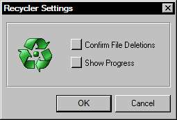
Confirm File Deletions: Makes the recycler prompt you for confirmation before deleting any files dragged into it and before emptying the recycler.
Show Progress: Makes the recycler show the progress of actions such as file deletion or purging of deleted files (Empty Recycler).
Shows current CPU activity as well as a list of the most active programs in the last minute. The Desktop CPU Meter can also display a list of processes that are currently using the most CPU time.
The CPU Meter features two styles, Bar Graphic or Histogram style.
The Bar style allows you to view at a glance the current CPU load, while the
Histogram style allows to view CPU usage over time.
The CPU Meter Context Menu
Right-clicking on the CPU Meter will bring up a standard module context menu with the following CPU meter module specific settings::
Run Task Manager: Launches Windows task manager. Equivalent to double clicking the in-shelf or desktop CPU Meter.
Most Active Programs: Lists the applications that used the most CPU time in the last two minutes.
Hide/Show Systray Icon: Hides or Shows the CPU Meter icon on the Systray.
This panel allows you to alter general preferences for both Desktop and In-Shelf/Dock CPU Meters.
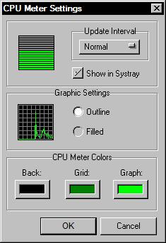
Update Interval: Allows you to set how fast the CPU Meter refreshes, from fast (2 times per second) to slow (once every 2 seconds).
Show in Systray: Shows a CPU Meter icon on the Systray which permits you to visualize the current CPU load. Double clicking the Systray icon launches Windows task manager, while a single click (XP and above only) displays a bubble tooltip with the current CPU load and the application that is currently using most CPU time.
Graphic Settings: Allows you to define if the Histogram graphic style is outlined or filled.
CPU Meter Colors: Allows you to define the colors used by the in-shelf CPU Meter (and the desktop version when advanced skinning is turned off) - note that these settings are saved with the CPU Meter theme.
The Email Checker module can monitor multiple POP3 or IMAP email accounts and report the number of pending messages and their total size, both visually and by sound. It also allows you to access mail servers using non-standard ports and a secure connection (Secure Sockets Layer or SSL), the later being a feature required to monitor Gmail accounts, for instance. It can also automatically launch your favorite email client whenever it detects that you have pending messages.
While connecting with the mail servers, the Email Checker in-shelf icon rotates. If you have no pending messages it stops, otherwise it will tell you the number of pending messages by voice and will keep on rotating to call your attention.
Note that the functionality of this module is disabled by default since you must first configure it properly (in this case you must first specify your email account settings and the data gathering interval specific to this module).
The Email Checker module features
two styles, a rotating world or a rotating @
sign when you get new mail - this affects the in-shelf Email Checker, but only affects the desktop
Email Checker if 'advanced skinning' is disabled or if the skinner chooses to
display the rotating icon in the desktop module.
The Email Checker Context Menu
Right-clicking on the Email Checker will bring up a standard module context menu with the following Email Checker module specific settings:
Check Email: Checks to see if you have any pending email on your POP3/IMAP account(s).
Say Pending Messages: The Email Checker voice module will tell you how many pending messages you have.
Run Email Client: Launches the email client you specified in the Email Checker Settings panel. Equivalent to double clicking the in-shelf or desktop Email Checker.
Hide/Show Systray Icon: Hides or Shows the Email Checker icon on the Systray.
Voices: Permits you to switch between any of your currently installed voice themes.
Sounds: As above - allows you select the sound theme you wish to use (Message arrival chimes, etc).
The Email Checker Settings Panel
This panel allows you to alter general preferences for both Desktop and In-Shelf/Dock Email Checkers.
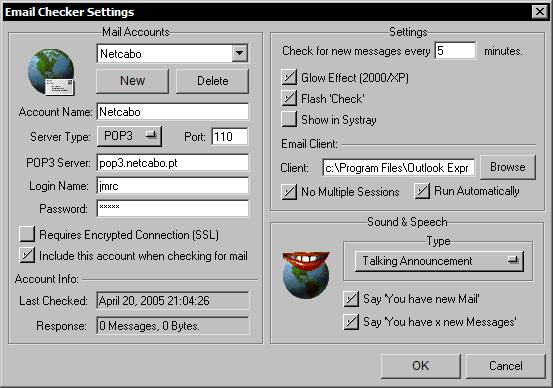
Mail Accounts: Here you can setup multiple POP3/IMAP email accounts for WorkShelf to monitor. Just click on the New button to add new accounts or on the Delete button to remove old accounts after selecting them in the combo box.
Settings: Here you can specify how often the Email Checker monitors your account(s). This interval when set to '0' (the default) disables the internet Email Checker function. Note that Internet communication settings for the modules that retrieve information from the Internet can be found on the Global Preferences tab. While WorkShelf is accessing the internet mail servers the in-shelf Email Checker icon rotates and the desktop Email Checker can be made to 'glow'. The glow effect is only available on Windows 2000 and above systems, however, which is why you can also use the flash 'check' method, where the word 'check' is displayed on and off when Workshelf is accessing the mail servers.
If Show in Systray is selected, WorkShelf puts an Email Checker icon on the Systray which permits you to quickly visualize if you have pending mail or not. Double clicking the Systray icon launches the Email Client specified below this setting.
When the Email Checker module detects that you have new pending messages, it can automatically launch the Email client you specify (if you select Run Automatically) or you can launch it manually by clicking on the module itself. If you select No Multiple Sessions, WorkShelf will make sure the Email client is not running already before launching another session. If it is and Run Automatically is enabled, WorkShelf will instead pull the Email client window to the foreground. When the Email client is activated through the Email Checker module, WorkShelf automatically resets the number of pending messages and messages size back to zero, since it assumes the Email client will be used to retrieve the unread messages from the mail server.
If your email client is an integrated application that requires an argument to open as an email program instead of, say, a web browser, you should enclose the filename in double quotes and add the argument at the end, e.g.; "C:\Program Files\mozilla.org\Mozilla\mozilla.exe" -mail
Sound and Speech: The Type drop menu allows you to choose if the Email Checker module announces new messages with a chime or by actually telling you that you have new messages and how many new messages you have. When you choose voice mode, you can also toggle on/off the following functions:
Say 'You have new Mail'
Say 'You have x new Messages'
In the Global Preferences tab you can also specify a 'Silent Period' in which WorkShelf will NOT speak or play chimes. This is useful to prevent the speech feature of the WorkShelf Email Checker from waking you up, and the members of your household, at 3 o'clock in the morning.
If you wish to put together your own Voice theme for the Email Checker and other voice using modules, the pre-defined filenames are as follows:
Wave files used for the voice pack:
0.wav
1.wav
10.wav
100hours.wav
11.wav
12.wav
13.wav
14.wav
15.wav
16.wav
17.wav
18.wav
19.wav
2.wav
20.wav
3.wav
30.wav
4.wav
40.wav
5.wav
50.wav
6.wav
7.wav
8.wav
9.wav
AM.wav
PM.wav
Oclock.wav
TheTimeIs.wav
YouHave.wav
NewMail.wav
NewMessages.wav
NoMessages.wav
The Weather Module allows you to know the current weather conditions on a given location, as well as a 5 day forecast for that same location. The Weather Module currently supports over 39,000 cities all over the world and can display such information as current weather and sky conditions, temperature, wind speed and direction, humidity, barometric pressure, etc... In addition, the Weather Module uses icons that convey current and future weather conditions at a glance. Based on the METAR (sometimes also referred as ICAO) system used by thousands of airports all over the world for reporting current weather conditions and on Weather.com data for weather forecasts, weather information is usually updated every hour. Weather forecasts, where available, can be seen on the weather information balloon tooltip by moving the mouse pointer over the weather module.
Note that this module is configured to display
the current weather conditions at New York, USA, by default - to change the
locale, right click on the module and select 'Weather Module Settings'.
The Weather Module Context Menu
Right-clicking on the Weather Module will bring up a standard module context menu with the following Weather module specific settings:
Check Weather: Retrieves Weather information from the Internet for the currently selected location.
Detailed Weather Conditions: Launches a web browser window containing the last 24 hour weather conditions for the selected location. Equivalent to double clicking the in-shelf or desktop Weather Module.
Hide/Show Systray Icon: Hides or Shows the Weather Module icon on the Systray.
The Weather Module Settings Panel
This panel allows you to alter general preferences for both desktop and In-Shelf/Dock Weather Modules.
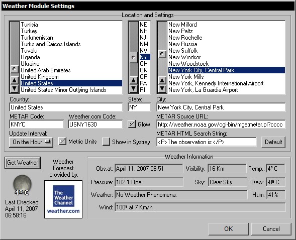
Location and Settings: The only information WorkShelf needs to report the current weather at a specific location is the location's 4 character METAR code. To obtain a 5 day weather forecast for the same location, you also need the appropriate 8 character Weather.com code. To make it easier for you, WorkShelf provides a list of over 39,000 cities around the world that can return weather information. Select the country you're in on the panel at the left, the US State on the middle panel if required, and then the city closest to your location on the panel at the right - Workshelf will retrieve the corresponding METAR and Weather.com codes for that location. Alternatively you can directly type in the METAR and/or Weather.com codes plus the country and city information.
The weather module's ability to work with both the METAR and Weather.com systems provides a certain degree of redundancy. While the Weather.com system is used to obtain the current weather conditions - besides the 5 day forecast - when the location has no associated METAR station, the METAR system is limited to reporting current weather conditions only.
WorkShelf retrieves METAR weather information from the National Weather Service. If you wish to retrieve information from another METAR compatible site you can change the METAR Source URL as well as the HTML Search String (WorkShelf adds the METAR code to the URL, loads the corresponding web page into memory and then starts scanning, just after the HTML Search String, for the METAR information strip). The ability to change the URL and Search String also provides a bit of future proof in case the National Weather Service decides to change the location and/or format of the weather pages. If you change these settings and the Weather Module stops working, you can always get back the defaults by clicking on the Default button.
Weather information gathering can be turned off (Never) or it can be set to occur on the hour, a quarter past, half past or every quarter to the hour. Note that Internet communication settings for the modules that retrieve information from the Internet can be found on the Global Preferences tab. While WorkShelf is retrieving weather information from the internet the desktop Weather Module can be made to 'glow'. This glow effect is only available on Windows 2000 or later systems, however.
The Weather Module can display temperature, distance and pressure units either in Imperial or Metric units. Select 'Use Metric Units' for the later.
If Show in Systray is enabled, WorkShelf shows a Weather icon on the Systray which permits you to visualize the current weather at the given location. A single click on the systray weather icon (XP and above only) displays a bubble tooltip with detailed weather information.
Weather Information: This panel displays detailed weather information for the selected location. It also makes it easy to quickly check the weather in different locations: just select the country and city on the panels above and click on the Get Weather button.
The Net Meter Module allows you to monitor the bandwidth usage (bytes in and bytes out) of a chosen network adapter and is usually used to monitor Internet usage. The Net Meter module also provides various TCP/IP statistics and allows you to see which applications are currently using your Internet Connection (very useful to spot any stealth Trojans that might have inadvertently found their way into your computer).
The Net Meter features two styles, Bar Graphic or Histogram style.
The Bar style allows you to view at a glance the current Network usage load, while the
Histogram style allows to view Net usage over time.
The Net Meter Module Context Menu
Right-clicking on the Net Meter Module will bring up a standard module context menu with the following Net Meter module specific settings:
Active Connections: Opens the Active Connections panel that displays (and allows you to close) all your currently active UDP/TCP connections plus various information about each connection. This is very useful to know which programs (or even Trojans) are using your Internet connection to communicate with the outside world.
Net Statistics: Opens a window displaying various statistics (TCP, IP, UDP, ICMP In, ICMP Out) about the Network Interface that is currently being monitored.
Interface to Monitor: Allows you to quickly chose which Network Interface Card (NIC) should be monitored by the Net Meter.
Hide/Show Systray Icon: Hides or Shows the Net Meter Module icon on the Systray.
The Net Meter Module Settings Panel
This panel allows you to alter general preferences for both Desktop and In-Shelf/Dock Net Meter Modules.
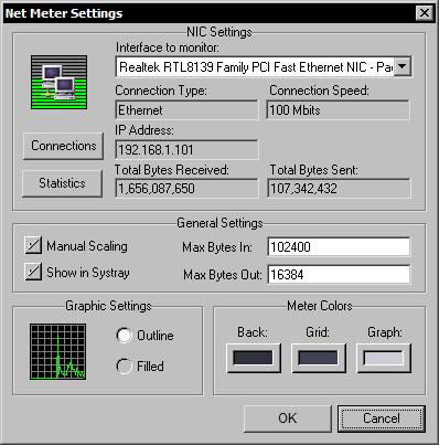
NIC Settings: Here you can choose which Network Interface Adapter (NIC) to monitor (assuming you have more than one) from the list of network cards available in your computer. This section also displays information about the Connection Type, Maximum Connection speed, current IP address and the total number of bytes received and sent through the chosen interface. The Connections button opens a window holding information about your currently active connections (and which applications are using them) and the Statistics buttons displays various statistical information regarding the interface.
General Settings: By selecting Manual Scaling you can force the Net Meter to always assume the given values as maximum throughoutput instead of calculating them on the fly.
If Show in Systray is enabled, WorkShelf shows a Net Meter icon on the Systray which permits you to visualize the current bandwidth usage. A single click on the systray Net Meter icon (XP and above only) displays a bubble tooltip with detailed bandwidth information.
Graphic Settings: Allows you to define if the Histogram graphic style is outlined or filled.
Meter Colors: Allows you to define the colors used by the in-shelf Net Meter (and the desktop version when advanced skinning is turned off) - note that these settings are saved with the Net Meter theme.
The Net Meter 'Active Connections' Panel
The Active Connections panel displays - and optionaly copies to the Clipboard - all your currently active UDP/TCP connections plus various information about each connection. It allows you to see which processes are connecting via TCP/IP and UDP and to forcefully terminate the connection or the process itself. It can also display information about the processes and perform WHOIS searches on target hostnames.
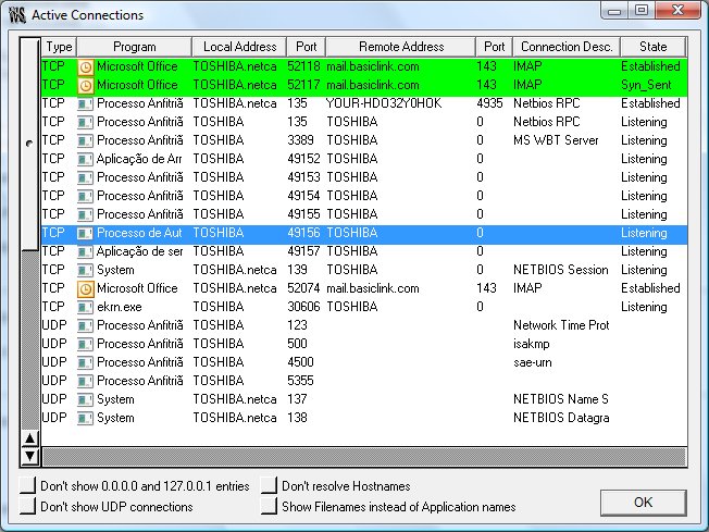
The Active Connections panel can be accessed by double clicking the Desktop Net Meter module or through the module's context menu.
The active connections list can be sorted in descending or ascending order by clicking on the column headers.
Columns can be resized horizontaly by clicking and dragging the vertical edges of the column headers.
New connections appear in green and terminated connections in red.
Right clicking on a connection displays a menu from where you can get information about the process using that connection, terminate the process, close the connection, perform a WhoIs search on a hostname, and/or copy the information to the clipboard.
You can select multiple connections by pressing the SHIFT or CTRL keys when left clicking.
The Active Connections panel is resizable and remembers the last size you set it to. It can also be minimized or left running on the desktop without it interfering with other Winstep Xtreme items.
The RAM Meter module shows current memory usage and displays various memory statistics.
The RAM Meter features two styles, Bar Graphic or Histogram style.
The Bar style allows you to view at a glance the current RAM load, while the
Histogram style allows to view RAM usage over time.
The RAM Meter Context Menu
Right-clicking on the RAM Meter will bring up a standard module context menu with the following RAM Meter specific settings:
Task Manager: Launches the Windows task manager. Equivalent to double clicking the in-shelf or desktop RAM Meter.
Hide/Show Systray Icon: Hides or Shows the RAM Meter icon on the Systray.
This panel allows you to alter general preferences for both Desktop and In-Shelf/Dock RAM Meters.
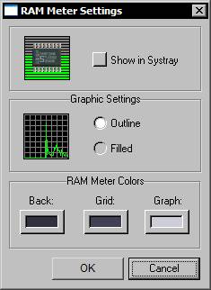
Show in Systray: Shows a RAM Meter icon on the Systray which permits you to visualize the current RAM load. Double clicking the Systray icon launches Windows task manager, while a single click (XP and above only) displays a bubble tooltip with the current RAM load and the application that is currently using most RAM time.
Graphic Settings: Allows you to define if the Histogram graphic style is outlined or filled.
RAM Meter Colors: Allows you to define the colors used by the in-shelf RAM Meter (and the desktop version when advanced skinning is turned off) - note that these settings are saved with the RAM Meter theme.
Wanda the fish is a special Module, based on the equivalent GNOME applet, which, due to popular request, has found its way into the Windows world through Winstep. Wanda the fish sits on your desktop and, when clicked on - or at the chosen interval - dispenses little gems of wisdom and wit. It's not a very useful module like the others, but it has a particularity: you will either love or hate it with deep passion. By default Wanda gets its gems of wisdom from local 'cookie files' but it has optional access to an online database of over 50,000 'fortune cookies'. You can also easily add your own cookie files. Note that access to the online cookie database is disabled by default since we cannot control the contents of the retrieved cookies and occasionally off-color quotes come through. Use at your own discretion.
Wanda displays fortune cookies inside a balloon
tooltip - unlike other balloon tooltips, however, this one allows you to click
on it and select/copy the text inside. Useful if you want to save the text of a
particular fortune cookie before the tooltip disappears.
The Wanda Module Context Menu
Right-clicking on the shelf Wanda Module will bring up a standard module context menu with the following Wanda specific settings:
Show Fortune Cookie: Displays a random fortune cookie.
Hide/Show Systray Icon: Hides or Shows the Wanda Module icon on the Systray.
Sounds: Allows you to choose a particular Sound scheme for when Wanda shows a fortune cookie.
The Wanda Module Settings Panel
This panel allows you to alter general preferences for both Desktop and In-Shelf/Dock Wanda Modules.
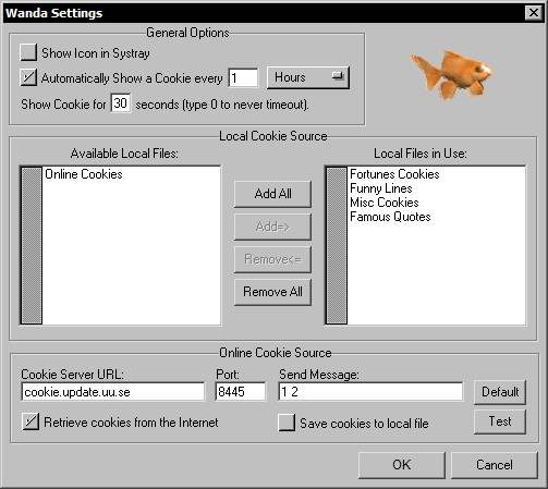
If Show in Systray is enabled, WorkShelf shows a Wanda icon on the Systray. A single click on the systray Wanda icon (XP and above only) displays a bubble tooltip with a random fortune cookie.
You can set Wanda to automatically display a fortune cookie at the time interval you specify. If you disable this option you can still get a cookie by clicking on the in-shelf Wanda or double-clicking on the desktop Wanda. You can also specify how long is the cookie displayed before automatically fading away.
Note that you can select and copy text from the Wanda bubble tooltip, which can be useful if you find a particular quote interesting and want to save it for later.
Local Cookie Source: Workshelf comes with a set of four 'fortune cookie' (or quotes) text files. In this section you can specify which cookie files to use, depending on your mood. Cookie files are text files stored in the '...\Winstep\Wanda' folder. If you want, you can modify the existing ones or even add your own.
Cookie files are ASCII text files that have a .SRC file type.
Each cookie can be any length and each line should be terminated by CR/LF (just press ENTER in Notepad).
Cookies are delimited by a single line containing %% or % followed by CR/LF -
this signals the end of one cookie and the start of the next.
As an example, the text below contains 3 cookies:
%%
Anything worth doing is worth overdoing
%%
It will be advantageous to cross the great stream...the Dragon is on
the wing in the Sky...the Great Man rouses himself to his Work.
%%
If you perceive that there are four possible ways in which a procedure
can go wrong, and circumvent these, then a fifth way will promptly
develop.
%%
Online Cookie Source: WorkShelf can also retrieve cookies from an online database of over 50,000 different cookies. If you wish to retrieve information from another Cookie compatible site you can change the Cookie Server URL and Port, as well as the message sent to the server to retrieve the cookie. The ability to change the URL, port and message to send also provides a bit of future proof in case the default cookie server goes permanently offline. If you change these settings and Wanda stops properly retrieving cookies from the Internet, you can always get back the defaults by clicking on the Default button. Clicking on the Test button will help determine if your new settings are correct, it will either retrieve a cookie from the site you specify or return a failure error.
As cookies are retrieved from an online source, they can also be automatically saved into a local cookie file named 'Online Cookies.src' for future use. If you choose to enable this option, note that the maximum size allowed for the file is 150 KB. Once the file reaches this limit, WorkShelf will stop adding new cookies to it - to keep getting more just rename the file to something else and WorkShelf will start with a fresh 'Online Cookies.src' file.
Note that Internet communication settings for the modules that retrieve information from the Internet can be found on the Global Preferences tab.
The following is a list of all the WorkShelf internal commands that can be added to shelves and docks. Some of those internal commands might not be available to you if the Operating System does not support them or if you don't have the necessary application installed.
Internal Command Name |
Windows 9x | Windows NT4 | 2000/XP/Vista/Win7 |
| WorkShelf Help | Yes | Yes | Yes |
| WorkShelf Preferences | Yes | Yes | Yes |
| Exit WorkShelf | Yes | Yes | Yes |
| Quick Exit WorkShelf | Yes | Yes | Yes |
| Exit Winstep Xtreme | Yes | Yes | Yes |
| Quick Exit Winstep Xtreme | Yes | Yes | Yes |
| Version Info | Yes | Yes | Yes |
| Backup WorkShelf Settings | Yes | Yes | Yes |
| Restore WorkShelf Settings | Yes | Yes | Yes |
| Check for Updates | Yes | Yes | Yes |
| Show Tip of the Day | Yes | Yes | Yes |
| Show/Hide Desktop Modules | Yes | Yes | Yes |
| Bring WorkShelf Forward | Yes | Yes | Yes |
| More Themes | Yes | Yes | Yes |
| Capture Desktop | Yes | Yes | Yes |
| Show Start Menu | Yes | Yes | Yes |
| Show Volume Control | Yes | Yes | Yes |
| Run | Yes | Yes | Yes |
| Search | Yes | Yes | Yes |
| Find Computer | Yes | Yes | Yes |
| Windows Help | Yes | Yes | Yes |
| Control Panel | Yes | Yes | Yes |
| My Computer | Yes | Yes | Yes |
| Network Neighborhood | Yes | Yes | Yes |
| Printers | Yes | Yes | Yes |
| Briefcase | Yes | Yes | --- |
| Start Screen-Saver | Yes | Yes | Yes |
| Power Off Monitor | Yes | ||
| Sleep | Yes | Yes | Yes |
| Hibernate | --- | --- | Yes (XP/Vista) |
| Log Off | Yes | Yes | Yes |
| Quick Log Off | Yes | Yes | Yes |
| Restart Windows | Yes | Yes | Yes |
| Quick Restart Windows | Yes | Yes | Yes |
| Shutdown Windows | Yes | Yes | Yes |
| Quick Shutdown Windows | Yes | Yes | Yes |
| Fast User Switching | --- | --- | Yes |
| Show Recycle Bin | Yes | Yes | Yes |
| Empty Recycle Bin | Yes | Yes | Yes |
| Clear Recent Documents | Yes | Yes | Yes |
| Show Desktop | Yes | Yes | Yes |
| Minimize All Windows | Yes | Yes | Yes |
| Restore All Windows | Yes | Yes | Yes |
| Show Desktop Icons | Yes | Yes | Yes |
| Hide Desktop Icons | Yes | Yes | Yes |
| Hide/Show Desktop Icons | Yes | Yes | Yes |
| Show Desktop Folder | Yes | Yes | Yes |
| Rebuild Icon Cache | Yes | Yes | Yes |
| Show Taskbar | Yes | Yes | Yes |
| Hide Taskbar | Yes | Yes | Yes |
| Hide/Show Taskbar | Yes | Yes | Yes |
| Task Manager | Yes | Yes | Yes |
| Copy Disk | Yes | Yes | Yes |
| Format Floppy Disk | Yes | Yes | Yes |
| Eject CD-ROM | Yes | Yes | Yes |
| Close CD-ROM Door | Yes | Yes | Yes |
| Eject Drive x: | --- | Yes | Yes |
| Close CDROM x: Door | Yes | Yes | Yes |
| Add New Modem | Yes | Yes | --- |
| Add New Connection | Yes | --- | --- |
| Connect to the Internet | Yes | Yes | Yes |
| Disconnect Modem | Yes | Yes | Yes |
| Accessibility Properties | Yes | Yes | Yes |
| Add New Hardware | Yes | --- | Yes |
| Add New Printer | Yes | Yes | Yes |
| Add-Remove Programs | Yes | Yes | Yes |
| Console Options | --- | Yes | --- |
| Date & Time Properties | Yes | Yes | Yes |
| Desktop Themes | Yes | Yes | Yes |
| Display Properties | Yes | Yes | Yes |
| Fax Properties | --- | Yes | Yes |
| Game Controllers | Yes | Yes | Yes |
| Internet Options | Yes | Yes | Yes |
| Keyboard | Yes | Yes | Yes |
| Mail and Fax Options | Yes | --- | --- |
| Mail Options | --- | Yes | --- |
| Mail Post Office Options | Yes | --- | --- |
| Mouse Properties | Yes | Yes | Yes |
| Modem Properties | Yes | --- | --- |
| Multimedia Properties | Yes | Yes | Yes |
| Network Properties | Yes | Yes | Yes |
| ODBC32 Data Admin. | Yes | Yes | Yes |
| Password Properties | Yes | --- | --- |
| PC Card Options | --- | Yes | --- |
| Port Options | --- | Yes | --- |
| Power Management | Yes | Yes | Yes |
| Regional Settings | Yes | Yes | Yes |
| Scanners and Cameras | Yes | --- | Yes |
| Server Options | --- | Yes | --- |
| Show Fonts | Yes | Yes | Yes |
| Sounds | Yes | Yes | Yes |
| Speech Properties | Yes | Yes | Yes |
| System Properties | Yes | Yes | Yes |
| Telephony Properties | Yes | Yes | Yes |
| UPS Options | --- | Yes | --- |
| User Properties | Yes | --- | --- |
| AtGuard Settings | Yes | Yes | Yes |
| Creative Labs AudioHQ | Yes | Yes | Yes |
| Norton's LiveUpdate | Yes | Yes | Yes |
| QuickTime Properties | Yes | Yes | Yes |
| TweakUI | Yes | Yes | Yes |
| WindowBlinds Properties | Yes | Yes | Yes |
| WinAmp 2.x Previous | Yes | Yes | Yes |
| WinAmp 2.x Play | Yes | Yes | Yes |
| WinAmp 2.x Pause | Yes | Yes | Yes |
| WinAmp 2.x Stop | Yes | Yes | Yes |
| WinAmp 2.x Next | Yes | Yes | Yes |
| WinAmp 2.x Volume Up | Yes | Yes | Yes |
| WinAmp 2.x Volume Down | Yes | Yes | Yes |
| WinAmp 2.x Preferences | Yes | Yes | Yes |
| WinAmp 2.x Equalizer | Yes | Yes | Yes |
| WinAmp 2.x Playlist | Yes | Yes | Yes |
When using bitmaps for the various items in WorkShelf, these must be placed in the folder specified in the bitmaps paths and have the following names:
Theme Wallpaper |
|
| wallpaper.bmp/.jpg | Displayed as the desktop wallpaper. |
Workshelf 'Standard' skinning bitmaps |
|
| wsbacka.bmp/.jpg | The bitmap used as the background of the Active tab and shelf body. |
| wsbacki.bmp/.jpg | The bitmap used as the background of the inactive tabs. |
Workshelf 'Advanced Skinning' bitmaps |
|
| wsFullTabA.bmp/.jpg/.png/.tif | Active tab. |
| wsFullTabI.bmp/.jpg/.png/.tif | Inactive tab. |
| wsFulltabmL.bmp/jpg/.png/.tif | Left mini-tab. |
| wsFulltabmR.bmp/jpg/.png/.tif | Right mini-tab. |
NOTE: WorkShelf will only use the above two independent mini-tab bitmaps if these files exist - if not present, the mini-tabs will be skinned with the main tab bitmaps. If wsFullTabMR does not exist but the left mini tab bitmap does, then WorkShelf will use the same bitmap for both tabs. |
|
| wsFullbody.bmp/.jpg/.png/.tif | Shelf body. |
WorkShelf Custom Icons These may be used to replace certain other default shelf components when using either type of skinning format. |
|
| wsprefs.ico/.png/.tif | Left mini-tab icon. |
| wsprefsm.ico/.png/.tif | Left mini-tab icon on mouse over. |
| wshide.ico/.png/.tif | Right mini-tab icon. |
| wshidem.ico/.png/.tif | Right mini-tab icon on mouse over. |
| wshidec.ico/.png/.tif | Right mini-tab icon when shelf collapsed. |
| wshidecm.ico/.png/.tif | Right mini-tab icon when shelf collapsed - mouse over. |
| wsuparrow.ico/.png/.tif | Shelf scroll up arrow. |
| wsuparrowm.ico/.png/.tif | Shelf scroll up arrow - mouse over. |
| wsuparrowP.ico/.png/.tif | Shelf scroll up arrow - Pressed. |
| wsdnarrow.ico/.png/.tif | Shelf scroll down arrow. |
| wsdnarrowm.ico/.png/.tif | Shelf scroll down arrow - mouse over. |
| wsdnarrowP.ico/.png/.tif | Shelf scroll down arrow - Pressed. |
|
|
| wsFullTabAF.bmp/.jpg/.png/.tif | Active tab. |
| wsFullTabIF.bmp/.jpg/.png/.tif | Inactive tab. |
| wsFulltabmlF.bmp/jpg/.png/.tif | Left mini-tab. |
| wsFulltabmrF.bmp/jpg/.png/.tif | Right mini-tab. |
| wsFullbodyF.bmp/.jpg/.png/.tif | Main shelf body. |
| wsprefsF.ico/.png/.tif | Left mini-tab icon. |
| wsprefsmF.ico/.png/.tif | Left mini-tab icon on mouse over. |
| wshideF.ico/.png/.tif | Right mini-tab icon. |
| wshidemF.ico/.png/.tif | Right mini-tab icon on mouse over. |
| wshidecF.ico/.png/.tif | Right mini-tab icon when shelf collapsed. |
| wshidecmF.ico/.png/.tif | Right mini-tab icon when shelf collapsed - mouse over. |
| wsuparrowF.ico/.png/.tif | Shelf scroll up arrow. |
| wsuparrowmF.ico/.png/.tif | Shelf scroll up arrow - mouse over. |
| wsuparrowPF.ico/.png/.tif | Shelf scroll up arrow - Pressed. |
| wsdnarrowF.ico/.png/.tif | Shelf scroll down arrow. |
| wsdnarrowmF.ico/.png/.tif | Shelf scroll down arrow - mouse over. |
| wsdnarrowPF.ico/.png/.tif | Shelf scroll down arrow - Pressed. |
NeXuS Control Icon |
|
| nxcontrol.ico/.png/.tif | Replaces the default NeXuS control icon. |
NeXuS Tile Skinning Mode bitmaps |
|
| nxtile.bmp/.jpg/.png/.tif | Dock Tile. |
NeXuS Background Skinning Mode bitmaps |
|
| nxback.bmp/.jpg/.png/.tif | Background for a dock attached to the bottom screen edge. |
| nxbacktop.bmp/.jpg/.png/.tif | Background for a dock attached to the top screen edge. |
| nxbackleft.bmp/jpg/.png/.tif | Background for a dock attached to the left screen edge. |
| nxbackright.bmp/jpg/.png/.tif | Background for a dock attached to the right screen edge. |
NeXuS Advanced Skinning Mode bitmaps |
|
| nxtile.bmp/.jpg/.png/.tif | Dock Tile for a dock attached to the bottom screen edge. |
| nxtiletop.bmp/.jpg/.png/.tif | Dock Tile for a dock attached to the top screen edge. |
| nxtileleft.bmp/.jpg/.png/.tif | Dock Tile for a dock attached to the left screen edge. |
| nxtileright.bmp/.jpg/.png/.tif | Dock Tile for a dock attached to the right screen edge. |
NeXuS Endcap bitmaps |
|
| nxtilestart.bmp/.jpg/.png/.tif | Start Endcap for a dock attached to the bottom screen edge. |
| nxtilestarttop.bmp/.jpg/.png/.tif | Start Endcap for a dock attached to the top screen edge. |
| nxtilestartleft.bmp/.jpg/.png/.tif | Start Endcap for a dock attached to the left screen edge. |
| nxtilestartright.bmp/.jpg/.png/.tif | Start Endcap for a dock attached to the right screen edge. |
| nxtileend.bmp/.jpg/.png/.tif | Endcap for a dock attached to the bottom screen edge. |
| nxtileendtop.bmp/.jpg/.png/.tif | Endcap for a dock attached to the top screen edge. |
| nxtileendleft.bmp/.jpg/.png/.tif | Endcap for a dock attached to the left screen edge. |
| nxtileendright.bmp/.jpg/.png/.tif | Endcap for a dock attached to the right screen edge. |
NeXuS Overlay bitmaps |
|
| nxoverlay.bmp/.jpg/.png/.tif | Overlay for a dock attached to the bottom screen edge. |
| nxoverlaytop.bmp/.jpg/.png/.tif | Overlay for a dock attached to the top screen edge. |
| nxoverlayleft.bmp/.jpg/.png/.tif | Overlay for a dock attached to the left screen edge. |
| nxoverlayright.bmp/.jpg/.png/.tif | Overlay for a dock attached to the right screen edge. |
NeXuS Overlay Endcap bitmaps |
|
| nxoverlaystart.bmp/.jpg/.png/.tif | Start Endcap for a dock attached to the bottom screen edge. |
| nxoverlaystarttop.bmp/.jpg/.png/.tif | Start Endcap for a dock attached to the top screen edge. |
| nxoverlaystartleft.bmp/.jpg/.png/.tif | Start Endcap for a dock attached to the left screen edge. |
| nxoverlaystartright.bmp/.jpg/.png/.tif | Start Endcap for a dock attached to the right screen edge. |
| nxoverlayend.bmp/.jpg/.png/.tif | Endcap for a dock attached to the bottom screen edge. |
| nxoverlayendtop.bmp/.jpg/.png/.tif | Endcap for a dock attached to the top screen edge. |
| nxoverlayendleft.bmp/.jpg/.png/.tif | Endcap for a dock attached to the left screen edge. |
| nxoverlayendright.bmp/.jpg/.png/.tif | Endcap for a dock attached to the right screen edge. |
NeXuS Sub-dock Indicators |
|
| nxSubC.ico/.png/.tif | Sub-dock closed indicator for a dock attached to the bottom screen edge. |
| nxSubCtop.ico/.png/.tif | Sub-dock closed indicator for a dock attached to the top screen edge. |
| nxSubCleft.ico/.png/.tif | Sub-dock closed indicator for a dock attached to the left screen edge. |
| nxSubCright.ico/.png/.tif | Sub-dock closed indicator for a dock attached to the right screen edge. |
| nxSubO.ico/.png/.tif | Sub-dock open indicator for a dock attached to the bottom screen edge. |
| nxSubOtop.ico/.png/.tif | Sub-dock open indicator for a dock attached to the top screen edge. |
| nxSubOleft.ico/.png/.tif | Sub-dock open indicator for a dock attached to the left screen edge. |
| nxSubOright.ico/.png/.tif | Sub-dock open indicator for a dock attached to the right screen edge. |
| nxSubM.ico/.png/.tif | Sub-dock mouseover indicator for a dock attached to the bottom screen edge. |
| nxSubMtop.ico/.png/.tif | Sub-dock mouseover indicator for a dock attached to the top screen edge. |
| nxSubMleft.ico/.png/.tif | Sub-dock mouseover indicator for a dock attached to the left screen edge. |
| nxSubMright.ico/.png/.tif | Sub-dock mouseover indicator for a dock attached to the right screen edge. |
NeXuS Dock Placeholder (separator) bitmaps |
|
| nxSep/.png/.tif | Separator bitmap for a dock attached to the bottom screen edge. |
| nxSepTop.ico/.png/.tif | Separator bitmap for a dock attached to the top screen edge. |
| nxSepLeft.ico/.png/.tif | Separator bitmap for a dock attached to the left screen edge. |
| nxSepRight.ico/.png/.tif | Separator bitmap for a dock attached to the right screen edge. |
Clock Module |
|
| wsclock.bmp/.jpg/.png/.tif | Desktop Clock module bitmap. |
| WsHour.bmp/.jpg/.png/.tif | Desktop Clock Hour hand bitmap. |
| WsHourShadow.bmp/.jpg/.png/.tif | Desktop Clock Hour hand shadow bitmap. |
| WsMin.bmp/.jpg/.png/.tif | Desktop Clock Minutes hand bitmap. |
| WsMinShadow.bmp/.jpg/.png/.tif | Desktop Clock Minutes hand shadow bitmap. |
| WsSec.bmp/.jpg/.png/.tif | Desktop Clock Seconds hand bitmap. |
| WsSecShadow.bmp/.jpg/.png/.tif | Desktop Clock Seconds hand shadow bitmap. |
| WsClockA.ico/.png/.tif | In-Shelf Analog Clock Icon. |
| WsClockD.ico/.png/.tif | In-Shelf Digital Clock Icon. |
Recycler Module |
|
| wsTrashE.bmp/.jpg/.png/.tif | Desktop module Empty Recycler bitmap. |
| wsTrashF.bmp/.jpg/.png/.tif | Desktop module Full Recycler bitmap. |
| wsTrashAni.png/.tif | Desktop module custom Recycler animation. |
| WsTrashES.ico/.png/.tif | Empty Recycler Icon. |
| WsTrashFS.ico/.png/.tif | Full Recycler Icon. |
| WsTrashD.ico/.png/.tif | Deposit Recycler Icon. |
| WsTrash1.ico/.png/.tif | Frame 1 Recycler Icon Animation. |
| WsTrash2.ico/.png/.tif | Frame 2 Recycler Icon Animation. |
| WsTrash3.ico/.png/.tif | Frame 3 Recycler Icon Animation. |
| WsTrash4.ico/.png/.tif | Frame 4 Recycler Icon Animation. |
In-Shelf/Dock Meters Background |
|
| wsMeter.ico/.png/.tif | Background bitmap for the in-shelf/in-dock meters (CPU, RAM, Net In and Net Out). |
CPU Meter Module |
|
| wsCPU.bmp/.jpg/.png/.tif | Desktop CPU Meter module bitmap. |
| wsCPUh.bmp/.jpg/.png/.tif | Desktop CPU Meter histogram bitmap. |
| wsCPUb.bmp/.jpg/.png/.tif | Desktop CPU Meter bar bitmap. |
| wsCPUMulti.bmp/.jpg/.png/.tif | Desktop CPU Meter multi-image bitmap. |
| wsCPUGauge.bmp/.jpg/.png/.tif | Desktop CPU Meter gauge needle bitmap. |
| wsCPUGaugeShadow.bmp/.jpg/.png/.tif | Desktop CPU Meter gauge needle shadow bitmap. |
| wsCPUOverlay.bmp/.jpg/.png/.tif | Desktop CPU Meter overlay ( foreground) bitmap. |
Email Checker Module |
|
| wsMailE.bmp/.jpg/.png/.tif | Desktop 'No Mail' Email Checker module bitmap. |
| wsMailF.bmp/.jpg/.png/.tif | Desktop 'Mail Available' Email Checker module bitmap. |
| wsMailAni.png/.tif | Desktop Email module custom animation. |
| wsMailES.ico/.png/.tif | No Mail Icon. |
| wsMailFS.ico/.png/.tif | Mail Available Icon. |
Weather Module |
|
| wsWeather.bmp/.jpg/.png/.tif | Desktop Weather module bitmap. |
Net Meter Module |
|
| wsNet.bmp/.jpg/.png/.tif | Desktop Net Meter module bitmap. |
| wsNeth.bmp/.jpg/.png/.tif | Desktop Net Meter histogram bitmap (both IN and OUT). |
| wsNetb.bmp/.jpg/.png/.tif | Desktop Net Meter bar bitmap (both IN and OUT). |
| wsNetMulti.bmp/.jpg/.png/.tif | Desktop Net Meter multi-image bitmap (both IN and OUT). |
| wsNetGauge.bmp/.jpg/.png/.tif | Desktop Net Meter gauge needle bitmap (both IN and OUT). |
| wsNetGaugeShadow.bmp/.jpg/.png/.tif | Desktop Net Meter gauge needle shadow bitmap (both IN and OUT). |
| or | |
| wsNethIn.bmp/.jpg/.png/.tif | Desktop Net Meter IN histogram bitmap. |
| wsNetbIn.bmp/.jpg/.png/.tif | Desktop Net Meter IN bar bitmap. |
| wsNetMultiIn.bmp/.jpg/.png/.tif | Desktop Net Meter IN multi-image bitmap. |
| wsNetGaugeIn.bmp/.jpg/.png/.tif | Desktop Net Meter IN gauge needle bitmap. |
| wsNetGaugeShadowIn.bmp/.jpg/.png/.tif | Desktop Net Meter IN gauge needle shadow bitmap. |
| wsNethOut.bmp/.jpg/.png/.tif | Desktop Net Meter OUT histogram bitmap. |
| wsNetbOut.bmp/.jpg/.png/.tif | Desktop Net Meter OUT bar bitmap. |
| wsNetMultiOut.bmp/.jpg/.png/.tif | Desktop Net Meter OUT multi-image bitmap. |
| wsNetGaugeOut.bmp/.jpg/.png/.tif | Desktop Net Meter OUT gauge needle bitmap. |
| wsNetGaugeShadowOut.bmp/.jpg/.png/.tif | Desktop Net Meter OUT gauge needle shadow bitmap. |
| wsNetOverlay.bmp/.jpg/.png/.tif | Desktop Net Meter overlay (foreground) bitmap. |
RAM Meter Module |
|
| wsRAM.bmp/.jpg/.png/.tif | Desktop RAM Meter module bitmap. |
| wsRAMh.bmp/.jpg/.png/.tif | Desktop RAM Meter histogram bitmap. |
| wsRAMb.bmp/.jpg/.png/.tif | Desktop RAM Meter bar bitmap. |
| wsRAMMulti.bmp/.jpg/.png/.tif | Desktop RAM Meter multi-image bitmap. |
| wsRAMGauge.bmp/.jpg/.png/.tif | Desktop RAM Meter gauge needle bitmap. |
| wsRAMGaugeShadow.bmp/.jpg/.png/.tif | Desktop RAM Meter gauge needle shadow bitmap. |
| wsRAMOverlay.bmp/.jpg/.png/.tif | Desktop RAM Meter overlay ( foreground) bitmap. |
Wanda Module |
|
| wsWanda.bmp/.jpg/.png/.tif | Desktop Wanda module background bitmap. |
| wsWandaOverlay.bmp/.jpg/.png/.tif | Desktop Wanda module overlay (foreground) bitmap. |
| wsWandaAni.png/.tif | Animation strip for custom Wanda fish animations. |
Voice files |
|
| 0.wav | Spoken for voice feature. |
| 1.wav | Spoken for voice feature. |
| 10.wav | Spoken for voice feature. |
| 11.wav | Spoken for voice feature. |
| 12.wav | Spoken for voice feature. |
| 13.wav | Spoken for voice feature. |
| 14.wav | Spoken for voice feature. |
| 15.wav | Spoken for voice feature. |
| 16.wav | Spoken for voice feature. |
| 17.wav | Spoken for voice feature. |
| 18.wav | Spoken for voice feature. |
| 19.wav | Spoken for voice feature. |
| 2.wav | Spoken for voice feature. |
| 20.wav | Spoken for voice feature. |
| 3.wav | Spoken for voice feature. |
| 30.wav | Spoken for voice feature. |
| 4.wav | Spoken for voice feature. |
| 40.wav | Spoken for voice feature. |
| 5.wav | Spoken for voice feature. |
| 50.wav | Spoken for voice feature. |
| 6.wav | Spoken for voice feature. |
| 7.wav | Spoken for voice feature. |
| 8.wav | Spoken for voice feature. |
| 9.wav | Spoken for voice feature. |
| am.wav | Spoken for voice feature. |
| pm.wav | Spoken for voice feature. |
| oclock.wav | Spoken for voice feature. |
| thetimeis.wav | Spoken for voice feature. |
| youhave.wav | Spoken for voice feature. |
| newmail.wav | Spoken for voice feature. |
| newmessages.wav | Spoken for voice feature. |
Legacy Bitmaps These bitmaps are ONLY supported to maintain backwards compatibility with older themes. They should NOT be used on new themes. |
|
| wstaba.bmp/.jpg | Active tab: middle portion |
| wstabla.bmp/.jpg | Active tab: left edge |
| wstabra.bmp/.jpg | Active tab: right edge |
| wstabi.bmp/.jpg | Inactive tab: middle portion |
| wstabli.bmp/.jpg | Inactive tab: left edge |
| wstabri.bmp/.jpg | Inactive tab: right edge |
| wstabml.bmp/jpg | Left mini-tab |
| wstabmr.bmp/jpg | Right mini-tab |
| wsbleft.bmp/.jpg | Left edge of main shelf body. |
| wsbleftt.bmp/.jpg | Top left corner of main shelf body. |
| wsbleftb.bmp/.jpg | Bottom left corner of main shelf body. |
| wsbody.bmp/.jpg | Main shelf body. |
| wsbodyt.bmp/.jpg | Top edge of main shelf body. |
| wsbodyb.bmp/.jpg | Bottom edge of main shelf body. |
| wsbrght.bmp/.jpg | Right edge of main shelf body. |
| wsbrghtt.bmp/.jpg | Top right corner of main shelf body. |
| wsbrghtb.bmp/.jpg | Bottom right corner of main shelf body. |
| wstabaF.bmp/.jpg | Inverted Shelf Active tab: middle portion |
| wstablaF.bmp/.jpg | Inverted Shelf Active tab: left edge |
| wstabraF.bmp/.jpg | Inverted Shelf Active tab: right edge |
| wstabiF.bmp/.jpg | Inverted Shelf Inactive tab: middle portion |
| wstabliF.bmp/.jpg | Inverted Shelf Inactive tab: left edge |
| wstabriF.bmp/.jpg | Inverted Shelf Inactive tab: right edge |
| wstabmlF.bmp/jpg | Inverted Shelf Left mini-tab |
| wstabmrF.bmp/jpg | Inverted Shelf Right mini-tab |
| wsbleftF.bmp/.jpg | Inverted Shelf Left edge of main shelf body. |
| wsblefttF.bmp/.jpg | Inverted Shelf Top left corner of main shelf body. |
| wsbleftbF.bmp/.jpg | Inverted Shelf Bottom left corner of main shelf body. |
| wsbodyF.bmp/.jpg | Inverted Shelf Main shelf body. |
| wsbodytF.bmp/.jpg | Inverted Shelf Top edge of main shelf body. |
| wsbodybF.bmp/.jpg | Inverted Shelf Bottom edge of main shelf body. |
| wsbrghtF.bmp/.jpg | Inverted Shelf Right edge of main shelf body. |
| wsbrghttF.bmp/.jpg | Inverted Shelf Top right corner of main shelf body. |
| wsbrghtbF.bmp/.jpg | Inverted Shelf Bottom right corner of main shelf body. |
| WsTrashE.ico | Empty Trash Icon. |
| WsTrashF.ico | Full Trash Icon. |
| wsMailE.ico | No Mail Icon. |
| wsMailF.ico | Mail Available Icon. |
When the theme is saved, these files PLUS any sound files that are part of the theme are automatically copied to a subdirectory in the themes folder, and the bitmaps paths are updated to reflect this.
When a theme is loaded or imported from a ZIP file, WorkShelf automatically updates the bitmap and sound paths so they point to the right place in that user's WinSTEP directory structure.
The scroll arrows and mini-tab icons must be 16x16 icons and the symbols should be centered in the icons. If WorkShelf cannot find a specified icon file, it will use the default symbols instead.
When adding bitmaps for inverted shelves, there are two things you must take into account: All bitmap files MUST be flipped before being saved - this is because WorkShelf will flip these bitmaps again as it does with normal bitmaps. The normal way to do an inverted WorkShelf version is:
1) Take the full
image for WorkShelf and move the tabs to below the body section.
2) Work on the shadows and gradients so they look right for an inverted shelf.
3) Flip the image.
To make sure the 3D frame around the icons feature does not interfere with your shelf body bitmap, note that the top of the 3D frame starts at the Top Tile position of your shelf body bitmap minus two pixels.
There are many theme designers constantly making new themes for WorkShelf. Users who do not wish to do so, can either use one of the many themes that come by default with WorkShelf or they can download hundreds of new themes from http://www.winstep.net/themes
The Advanced Skinning panel is split into 2 sections: Tabs and Shelf Body.
Tabs
The tab images are made up of two bitmaps; one for the active tab and one for the inactive tabs. The left and right mini-tabs are also made of one bitmap each.
The pre-defined filenames for the bitmaps are:
Active tabs
wsfulltaba.bmp/.jpg/.png - Active tab
Inactive tabs
wsfulltabi.bmp/.jpg/png - Inactive tab
'Mini' Tabs
wsfullTabML.bmp/.jpg/.png - Left mini-tab bitmap.
wsfullTabMR.bmp/.jpg/.png - Right mini-tab bitmap.
WorkShelf will only use independent mini-tab bitmaps if these files exist. If wsTabMR does not exist but the left mini tab bitmap does, then WorkShelf will use the same bitmap for both tabs.
Important: The mini-tab bitmaps should be the same height as the Active and Inactive tab bitmaps, and must be 28 pixels wide each.
WorkShelf itself is usually split in two main sections: the tabs section at the top, and the shelf body at the bottom. The height of the tab area is defined by the height of the tab bitmaps, unless the 'Tabs Overlap Body' option is selected, in which case the shelf body bitmap is applied to the whole shelf.
If the tabs are made to overlap the shelf body bitmap, then you may or may not use tab bitmaps. If you don't, all that is displayed on the tab area of the shelf body bitmap is the title of each shelf plus the left and right mini-tab symbols. You may also supply only the active tab bitmap.
The left and right tab offsets specify where the tabs section starts and ends in relation to the shelf body.
Tabs can also be made to overlap each other by the specified amount of pixels, creating the overlapping tabs effect you see on the picture in the Shelf Body section.
In addition there are also settings for tab text positioning (both horizontal
and vertical - the vertical option allowing for active and inactive tabs to be
of different heights) and for setting the maximum width of the text on the tab
(as a percentage of the tab width).
Shelf Body
The shelf body is constructed from a single bitmap. The pre-defined filename is:
wsfullbody.bmp/.jpg/.png - Shelf body bitmap.
As above, there are options for tiling or stretching each individual section and for using bitmap transparency.
The shelf body bitmap tile sections also define the shelf content offset from the body edges, but you can set this independently by using the offset settings below. If you want the shelf content to overlap the non-stretchable edge areas in part or in full, use negative values for the the content offsets.
Pressing the OK button confirms your new settings and takes you back to the 'Appearance Preferences' tab.
The NeXuS Appearance Preferences tab allows you to configure NeXuS themes.
NeXuS supports three different skinning modes: Tiles, Background and Advanced. With a Tiles skinning mode, the same bitmap is applied as the background of each dock item. The Background skinning mode applies a single bitmap as the background of all dock items, stretching or tiling it as necessary. The Advanced skinning mode is like the Tiles skinning mode, but the skinner can specify different bitmaps for each of the four dock orientations.
When creating a 'Tiles' or 'Advanced' theme, the skinner can also supply dock 'endcap' bitmaps (because of their nature, Background based themes do not need endcaps).
In these two skinning modes, three options become available at the bottom of the screen. 'Maintain Tile Aspect Ratio' changes the units of 'Content Offset from Edge' from pixels to percentage. This is important for certain themes where the icons must always be placed at the same relative position in relation to the background tile when the icons magnify ('Zoom Tiles on Magnify Effect' is similar, but, because the size of tiles and icons are not the same, their relative position changes as thy are magnified).
If 'Maintain Aspect Ratio' is enabled, the 'Adjust Icon Reflections to Tile' option becomes available as well. This crops icon reflections to the visible part of the tile, so reflections do not appear to extend from the tile into 'thin air'. Note that this option should not be enable unless absolutely necessary for the theme, as reflection cropping has to be performed in real time when the icons are magnifying and can be a bit processor intensive.
The cropping area can be calculated automatically based on the actual tile bitmap, or you can supply optional mask bitmaps for adjusting the icon reflection to the tiles. NeXuS will look for the following bitmaps in the theme folder and automatically use them as cropping masks if found:
nxTile-Mask.png/tif/bmp - Reflection mask for bottom docks.
nxTileTop-Mask.png/tif/bmp - Reflection mask for top docks (optional).
nxTileLeft-Mask.png/tif/bmp - Reflection mask for Left docks (optional).
nxTileRight-Mask.png/tif/bmp - Reflection mask for Right docks (optional) .
If the 'Zoom Tiles on Magnify Effect' option is selected, then NeXuS will magnify tiles both vertically and horizontally on mouse over, instead of just horizontally - this can be an important option for themes where the dock icons should appear to be 'sitting on' the tiles.
Regardless of the skinning mode, dock themes also support the use of 'overlays'. Overlays are bitmaps that exist behind the dock or over it. When set to be over the dock, overlays are applied on top of the icons, which gives the skinner the ability to create some very nice looking effects: for instance, you can use overlays to give the whole dock - including the icons - a 'glass reflection' effect, or you can use them to make a dock where vines are tangled over and around the icons.
In the Bitmaps Folder text box you can specify the folder in which the NeXuS bitmaps are stored.
If 'No Overlay on Sub-docks' is enabled, an overlay is only applied to the main dock, keeping any sub-docks simple.
If 'Extended Endcaps' is selected, any endcap bitmaps extend before and after the dock itself. Regardless of this setting, docks with endcaps require at least 3 tiles to display properly (the start cap, the dock tile itself, and the end cap), otherwise the dock would look cropped - because of this, any dock with endcaps and less than 3 items automatically behaves as if the 'Extended Endcaps' option was selected.
The Skinning Mode pull up menu allows you to select which of the three skinning modes will be used for the theme. Different modes use different bitmaps, as such:
Tile Skinning Mode:
nxtile.bmp/jpg/png/tif
Background Skinning Mode:
nxback.bmp/jpg/png/tif
nxbacktop.bmp/jpg/png/tif (optional)
nxbackleft.bmp/jpg/png/tif (optional)
nxbackright.bmp/jpg/png/tif (optional)
Advanced Skinning Mode:
nxtile.bmp/jpg/png/tif
nxtiletop.bmp/jpg/png/tif (optional)
nxtileleft.bmp/jpg/png/tif (optional)
nxtileright.bmp/jpg/png/tif (optional)
If a theme uses endcaps, the following bitmaps should be supplied:
nxtilestart.bmp/jpg/png/tif
nxtilestarttop.bmp/jpg/png/tif (optional)
nxtilestartleft.bmp/jpg/png/tif (optional)
nxtilestartright.bmp/jpg/png/tif (optional)
nxtileend.bmp/jpg/png/tif
nxtileendtop.bmp/jpg/png/tif (optional)
nxtileendleft.bmp/jpg/png/tif (optional)
nxtileendright.bmp/jpg/png/tif (optional)
NeXuS will automatically recognize that a theme uses endcaps if it finds bitmap files with the above names in the theme folder. The non-stretchable sections of endcap bitmaps can be specified by changing the 'object' pull up menu from 'Background' or 'Main Tile' to 'Endcap' and 'Startcap'. Same for dock placeholder (separator) bitmaps.
Docks have four orientations: bottom screen edge oriented, top screen edge oriented, left screen edge oriented and right screen edge oriented. It is not necessary for the skinner to provide different bitmaps for each of the different orientations, since NeXuS is perfectly capable of rotating the default bitmap (and any tile and offset settings) as required.
Note that the default bitmaps for each of the different skinning modes (nxtile, nxback, nxtilestart and nxtileend) are the bitmaps that are used for a bottom oriented dock (i.e.; a dock attached to the bottom screen edge).
If you want NeXuS to automatically rotate the bitmaps and settings, then you should select 'Rotate Automatically' in the Position pull up menu - in this case provide the settings you would for a dock attached to the bottom screen edge. Otherwise you can specify individual tile and offset settings for each of the four dock orientations.
Tile Sections define the areas of the bitmap that are drawn 'as is' before NeXuS starts to tile or stretch the bitmap in order to fit the items that will go on top of it. Tile Horizontally and Tile Vertically specify if the bitmap is tiled or stretched in that direction, as needed.
For Tile and Advanced skinning modes, the Content Offset From Edge section specifies the distance between the edges of the bitmap and where dock items are placed, and is independent of the values specified in the tiles section.
To keep compatibility with external themes (i.e.; themes originally intended for other docks), however, this section has a different meaning when using the Background skinning mode. In this case, the Tile and Offset values are added together, and it is this result that defines how far dock content is from the dock edges.
Docks can have four types of overlays: None, Over the dock, Under the Dock or Per Tile. With 'Per Tile' overlays, the overlay bitmap is applied over each dock tile instead of stretched/tiled over or under the whole dock.
Overlay bitmaps use the following file names:
nxoverlay.bmp/jpg/png/tif
nxoverlaytop.bmp/jpg/png/tif (optional)
nxoverlayleft.bmp/jpg/png/tif (optional)
nxoverlayright.bmp/jpg/png/tif (optional)
When using 'Per Tile' overlays, the skinner can also provide overlay endcaps. Overlay endcaps have the following file names:
nxOverlaystart.bmp/jpg/png/tif
nxOverlaystarttop.bmp/jpg/png/tif (optional)
nxOverlaystartleft.bmp/jpg/png/tif (optional)
nxOverlaystartright.bmp/jpg/png/tif (optional)
nxOverlayend.bmp/jpg/png/tif
nxOverlayendtop.bmp/jpg/png/tif (optional)
nxOverlayendleft.bmp/jpg/png/tif (optional)
nxOverlayendright.bmp/jpg/png/tif (optional)
As it happens with dock tiles, NeXuS will automatically recognize that a theme uses overlay endcaps if it finds bitmap files with the above names in the theme folder.
The Overlay Position pull up menu and Bitmap Tile Sections work exactly the same for overlays as for dock bitmaps.
The Overlay Offset from Dock section controls the positioning of the overlay, measured in pixels, in relation to the dock background. If Retain Vertical Size or Retain Horizontal Size are selected, then NeXuS will not stretch the overlay bitmap in that direction, i.e.; it will use the overlay bitmap 'as is' in the retained direction.
Clock Module Advanced Skinning
This panel holds the settings for the free-form skinning of the desktop clock.
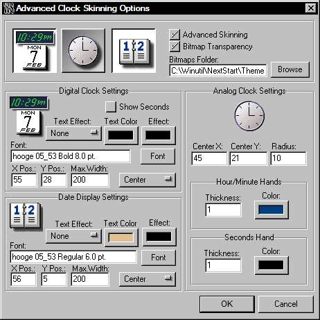
The first 3 buttons of the 'Advanced' tab allow you to select digital and/or analog display for the time and toggle date display on and off. Next to this are checkboxes to enable 'advanced skinning' and image transparency (the transparent area of the bitmap may be defined using the 'big pink', RGB color 255,0,255).
Digital Clock Settings: This area enables you to chose the font, effect and text colors used and also to position the text within your bitmap using X,Y co-ordinates. You can also specify if the text is left justified, right justified or centered. If the text is centered but the X Position is not 0, then the text will be centered at the specified X coordinate.
Date Display Settings: Exactly as above, but for the date.
Analog Clock Settings: This allows you to position the 'hands' correctly and also enables you to alter the width and color of the hands themselves.
Note that you can also specify bitmaps for the clock hands and clock hand shadows: these bitmaps will be used automatically if found in the theme folder. Clock hand bitmaps are automatically rotated around the specified center coordinates, using the center of the images as the rotational point. If shadow bitmaps are supplied, these are automatically shifted down and to the right by 1 pixel, thus creating the effect of a drop shadow. The seconds hand is the last bitmap to be drawn, overlapping all the others, so you should use this bitmap for any 'clock central dot'.
Clicking 'OK' at the bottom of the panel will take you back to the 'Module Preferences' tab and allow you to preview any changes made.
Recycler Module Advanced Skinning
This panel holds the settings for the free-form skinning of the desktop recycler. The 'skin' for the recycler uses two bitmap images: wstrashe.bmp for the empty recycler and wstrashf.bmp for the full recycler.
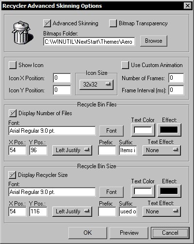
This panel holds check boxes to enable 'advanced skinning' and image transparency (the transparent area of the bitmap may be defined using the 'big pink', RGB color 255,0,255). You can also specify here the folder in which the recycler bitmaps are stored.
If you want, you can have WorkShelf displaying the animated recycler icon - at the size and position of your choice - in the desktop module. The icon will animate whenever you drag a file to be deleted over the recycler module. You can also customize the animation through the use of a WsTrashAni.png strip, where each animation frame is stored one after the other. If you specify a custom animation, it will also be used by the in-shelf recycler module.
The Recycler desktop module can also display the current number of files in the Recycle bin and the total disk space used by them. Disk space will always be reported in the most appropriate units, i.e.; Bytes, Kb (Kilobytes), Mb (Megabytes) or Gb (Gigabytes). The Prefix and Suffix fields allow you to precede or succeed the reported units with the text of your choice (e.g.; 'Space Used: xx Mb in Disk').
Clicking 'OK' at the bottom of the panel will take you back to the 'Module Preferences' tab and allow you to preview any changes made.
CPU Meter Module Advanced Skinning
This panel holds the settings for the free-form skinning of the
desktop CPU Meter. The 'skin' for the CPU Meter uses
one bitmap image: wscpu.bmp.
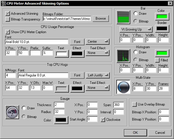
The first section on the Advanced dialog holds check boxes to enable 'advanced skinning' and image transparency (the transparent area of the bitmap may be defined using the 'big pink', RGB color 255,0,255). You can also specify here the folder in which the CPU Meter bitmaps are stored.
In the CPU Usage Percentage section you can specify the font, colors, etc, used to display the percentage of CPU usage at one given moment. You can also specify any text that you want to precede or be printed after this value. Because of a backwards compatibility issue, the CPU meter load always added the "%" symbol to the value. To prevent this, put the @ (at) character in the suffix field.
The Desktop CPU meter can also display which processes are currently using most of the CPU time. You can display as many processes as you want (as long as there is space to display them in the bitmap) but since most of the processes running in your computer will be using nearly zero percent of your CPU processing power at any given time, it is a good idea to keep this list fairly short (between one and three processes). If you don't specify a Vertical Offset (the space in pixels between one process line and another) by leaving it at zero, WorkShelf will automatically set each process line apart by the height of the associated font.
The CPU Bar Graph can be either drawn or a bitmap. If you choose to use a bitmap simply provide an image displaying what the bar graph would look like when full and WorkShelf will do the rest. You can also specify if the bar graph is vertical or horizontal and in which direction it should grow.
The Histogram can also be drawn or use a bitmap. If drawn you can also specify if the histogram is filled or not. Since each pixel in the width of the histogram represents one sample (usually 1 sample is taken every second, unless you specify otherwise in the CPU Settings panel) the maximum number of samples that can be displayed (and therefore the maximum width of the histogram) is 128.
CPU usage can also be displayed using multi-state images (for representations like round gauges, pie charts, etc...). Multi-state frames are stored inside a single bitmap: create a bitmap named wsCPUMulti.bmp/png with as many single state images as you want, side by side, and tell WorkShelf the x and y position of the multi-state object within wsCPU.bmp/png as well as how many different frames (states) exist within wsCPUMulti.bmp/png.
Another way to represent CPU usage is through an analog gauge format. Gauges typically rotate a needle around a pivot point so that the needle points to a value in the defined range. The 'needle' can be either drawn or a bitmap. Bitmap needles can also have a bitmap representing the shadow of the needle. Analog gauges are used in this format in automobiles as speedometers, RPM meters, gas gauges, etc, as it's easy for the driver to see what the value is at a glance.
The CPU module can also have an overlay bitmap (wsCPUOverlay.png), which is applied on top of the background bitmap AFTER all the other items have been drawn. Overlay bitmaps are useful for, say, painting the central dot of the gauge needle or applying glass reflection effects to the whole module.
Clicking 'OK' at the bottom of the panel will take you back to the 'Module Preferences' tab and allow you to preview any changes made.
Email Checker Module Advanced Skinning
This panel holds the settings for the free-form skinning of the desktop Email Checker. The 'skin' for the Email Checker uses two bitmap images: WsEmailE.bmp (used when there are no pending messages) and WsEmailF.bmp (used when you have pending messages).
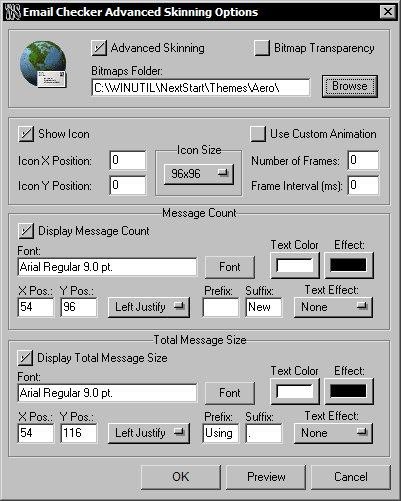
The first section holds check boxes to enable 'advanced skinning' and image transparency (the transparent area of the bitmap may be defined using the 'big pink', RGB color 255,0,255). You can also specify here the folder in which the Email Checker bitmaps are stored.
If you want, you can have WorkShelf displaying the animated email icon - at the size and position of your choice - in the desktop module. Besides the different WsEmailE and WsEmailF bitmaps, this will also help calling the user's attention to the arrival of new mail. You can also customize the animation through the use of a WsEmailAni.png strip, where each animation frame is stored one after the other. If you specify a custom animation, it will also be used by the in-shelf email module.
In the following two sections you can specify whether to show the number of unread messages and total message size or not, as well as the position, font, color, etc, of this information. If you are displaying the animated icon as well, note that the text information is painted after the icon, so you can have the text overlapping the icon (just make sure to use a text effect to increase the readability of the information in this case). You can also specify any text that you want to precede (Prefix) or be printed after (Suffix) these values (e.g.; 'You Have x New Messages').
Clicking 'OK' at the bottom of the panel will take you back to the 'Module Preferences' tab and allow you to preview any changes made.
Weather Module Advanced Skinning
This panel holds the settings for the free-form skinning of the desktop Weather Module. The 'skin' for the Weather Module uses one bitmap image: wsweather.bmp.
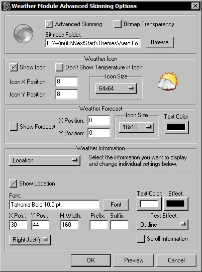
The first section holds check boxes to enable 'advanced skinning' and image transparency (the transparent area of the bitmap may be defined using the 'big pink', RGB color 255,0,255). You can also specify here the folder in which the Weather Module bitmaps are stored.
If you want, you can have WorkShelf displaying the weather icon plus current temperature (unless you specify otherwise) - at the size and position of your choice - in the desktop module. Note that the weather text information is painted after the icon, so you can have the text overlapping it (just make sure to use a text effect to increase the readability of the information in this case).
You can also optionally display the 5 day weather forecast on the weather module itself (this is usually displayed on the weather module tooltip, though).
The Weather Module can also display a variety of weather information for that particular location. Here is the complete list:
Location
Observation Time
Weather Information
Sky Conditions
Detailed Sky Conditions
Temperature
Dew Point
Relative Humidity
Visibility
Wind Information
Wind Speed
Wind Direction
Pressure
Just select which information you
want to display from the pull down menu and change the individual settings below
(font, colors, text effects, etc...). You can also choose to Scroll the
Information, which is very useful for detailed information that would not fit on
the desktop Weather Module otherwise. In this case the information is
automatically scrolled right to left within the allotted space.
Clicking 'OK' at the bottom of the panel will take you back to the 'Module Preferences' tab and allow you to preview any changes made.
Net Meter Module Advanced Skinning
This panel holds the settings for the free-form skinning of the desktop Net Meter Module. The 'skin' for the Net Meter Module uses one bitmap image: wsnet.bmp.
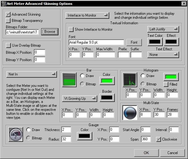
The first section holds check boxes to enable 'advanced skinning' and image transparency (the transparent area of the bitmap may be defined using the 'big pink', RGB color 255,0,255). You can also specify here the folder in which the Net Meter Module bitmaps are stored.
The Net Meter Module can also display a variety of textual information regarding the network interface adapter being monitored. Here is the complete list:
Interface to Monitor
Connection Type
Connection Speed
Bytes In
Bytes Out
Total Bytes In
Total Bytes Out
Max Bytes In
Max Bytes Out
IP Address
Just select which information you want to display from the pull down menu and change the individual settings below (font, colors, text effects, etc...).
Although the Net Meter is a single module, it monitors two different things: output and input bandwidth usage. In a way, it is two modules in one, and, because of this, you can choose which section you are working with from the pull up menu in the lower section (either Net In or Net Out).
The Net Meter Bar Graph can be either drawn or a bitmap. If you choose to use a bitmap simply provide an image displaying what the bar graph would look like when full and WorkShelf will do the rest. You can also specify if the bar graph is vertical or horizontal and in which direction it should grow.
The Histogram can also be drawn or use a bitmap. If drawn you can also specify if the histogram is filled or not. Since each pixel in the width of the histogram represents one sample (usually 1 sample is taken every second, unless you specify otherwise in the Net Meter Settings panel) the maximum number of samples that can be displayed (and therefore the maximum width of the histogram) is 128.
Throughoutput can also be displayed using multi-state images (for representations like gauges, pie charts, etc...). Multi-state frames are stored inside a single bitmap: create a bitmap named wsNetMulti.bmp/png with as many single state images as you want, side by side, and tell WorkShelf the x and y position of the multi-state object within wsNet.bmp/png as well as how many different frames (states) exist within wsNetMulti.bmp/png.
Another way to represent throughoutput is through an analog gauge format. Gauges typically rotate a needle around a pivot point so that the needle points to a value in the defined range. The 'needle' can be either drawn or a bitmap. Bitmap needles can also have a bitmap representing the shadow of the needle. Analog gauges are used in this format in automobiles as speedometers, RPM meters, gas gauges, etc, as it's easy for the driver to see what the value is at a glance.
The Net Meter module can also have an overlay bitmap, which is applied on top of the background bitmap AFTER all the other items have been drawn. Overlay bitmaps are useful for, say, painting the central dot of the gauge needles or applying glass reflection effects to the whole module.
Clicking 'OK' at the bottom of the panel will take you back to the 'Module Preferences' tab and allow you to preview any changes made.
RAM Meter Module Advanced Skinning
This panel holds the settings for the free-form skinning of the desktop RAM Meter. The 'skin' for the RAM Meter uses one bitmap image: wsRAM.bmp.
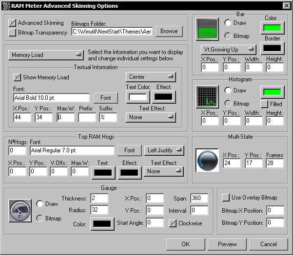
The first section on the Advanced dialog holds check boxes to enable 'advanced skinning' and image transparency (the transparent area of the bitmap may be defined using the 'big pink', RGB color 255,0,255). You can also specify here the folder in which the RAM Meter bitmaps are stored.
The RAM Bar Graph can be either drawn or a bitmap. If you choose to use a bitmap simply provide an image displaying what the bar graph would look like when full and WorkShelf will do the rest. You can also specify if the bar graph is vertical or horizontal and in which direction it should grow.
The Histogram can also be drawn or use a bitmap. If drawn you can also specify if the histogram is filled or not. Since each pixel in the width of the histogram represents one sample (usually 1 sample is taken every second, unless you specify otherwise in the RAM Settings panel) the maximum number of samples that can be displayed (and therefore the maximum width of the histogram) is 128.
RAM usage can also be displayed using multi-state images (for representations like gauges, pie charts, etc...). Multi-state frames are stored inside a single bitmap: create a bitmap named wsRAMMulti.bmp/png with as many single state images as you want, side by side, and tell WorkShelf the x and y position of the multi-state object within wsRAM.bmp/png as well as how many different frames (states) exist within wsRAMMulti.bmp/png.
Another way to represent RAM usage is through an analog gauge format. Gauges typically rotate a needle around a pivot point so that the needle points to a value in the defined range. The 'needle' can be either drawn or a bitmap. Bitmap needles can also have a bitmap representing the shadow of the needle. Analog gauges are used in this format in automobiles as speedometers, RPM meters, gas gauges, etc, as it's easy for the driver to see what the value is at a glance.
The RAM Meter module can also have an overlay bitmap (wsRAMOverlay.png), which is applied on top of the background bitmap AFTER all the other items have been drawn. Overlay bitmaps are useful for, say, painting the central dot of the gauge needle or applying glass reflection effects to the whole module.
The RAM Meter Module can also display a variety of textual information regarding RAM usage. Here is the complete list:
Memory Load
Total Memory
Available Memory
Used Memory
Total Physical Memory
Available Physical Memory
Used Physical Memory
Just select which information you want to display from the pull down menu and change the individual settings below (font, colors, text effects, etc...).
The Desktop RAM meter can also display which processes are currently using most of your system's memory. You can display as many processes as you want (as long as there is space to display them in the bitmap) but it is a good idea to keep this list fairly short (between one and three processes). If you don't specify a Vertical Offset (the space in pixels between one process line and another) by leaving it at zero, WorkShelf will automatically set each process line apart by the height of the associated font.
Clicking 'OK' at the bottom of the panel will take you back to the 'Module Preferences' tab and allow you to preview any changes made.
Wanda Module Advanced Skinning
This panel holds the settings for the free-form skinning of the desktop Wanda Module. The 'skin' for the Wanda Module uses one background bitmap image, wsWanda.bmp/png, and an overlay bitmap, wsWandaOverlay.bmp/png.
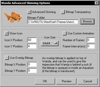
The first section holds check boxes to enable 'advanced skinning' and image transparency (the transparent area of the bitmap may be defined using the 'big pink', RGB color 255,0,255). You can also specify here the folder in which the Wanda Module bitmaps are stored.
If you want, you can have WorkShelf displaying the animated Wanda icon - at the size and position of your choice - in the desktop module. You can also use your own custom animation for Wanda: just specify how many frames it will use and the time interval (in milliseconds) between each frame. Custom Wanda animations are made of a single PNG bitmap (WsWandaAnim.png) storing all the individual frames one after the other.
To make the animated Wanda icon appear partially covered by an object (for instance, a rock) or to apply a glass reflection effect to it, you can also specify a bitmap that is overlaid on top of each Wanda frame (wsWandaOverlay.png).
Clicking 'OK' at the bottom of the panel will take you back to the 'Module Preferences' tab and allow you to preview any changes made.
To uninstall Winstep Xtreme use the Add/Remove Programs applet in the Control Panel. Don't forget to exit all Winstep applications first first!
Some systems seem to have trouble with the 'Shutdown Windows' internal command. If your system is one of those, try tweaking the 'Force Power Off' and 'Force Shutdown' options in the Global Preferences tab. If that still doesn't help, the Microsoft Knowledge Base has several articles about this that might help you troubleshoot your system. For instance, try Q238096 - How to Troubleshoot Windows 98 Second Edition Shutdown Problems
Q) Is WorkShelf compatible with
Windows 95/98/ME and NT4 or does it work only on Windows 2000 and above?
A) WorkShelf will run in all Windows versions, but some of the more
advanced features, like per pixel alpha transparency, will not be available
unless you are using Windows 2000 and above. Note that WorkShelf gives theme
authors a fall back mechanism that will make themes using per pixel alpha
transparency display properly on Win9x/NT4 systems (without the per pixel alpha
effects), but theme authors must explicitly
take advantage of it.
Q) Is WorkShelf compatible with Windows XP 64
bit and Windows Vista/Win7 32 and 64 bit?
A) Yes.
Q) When running
WorkShelf some applications don't display properly or create screen artifacts
(XP only).
A) WorkShelf uses a new function in XP to display tasks as snapshots of the
actual windows. This function is still somewhat buggy and some applications may
not behave properly with it, resulting in the artifacts you see or in the
application not displaying properly at all. With the problem application
running, open the Tasks shelf in WorkShelf and CTRL-Right Click on the
application's task icon. In the context menu that pops up, select 'Add to
Snapshot Exclusion List'.
Q) WinDVD 7 and
Roxyo Player 2.0 do not display video when WorkShelf is running. Is there
any way to fix this?
A) Yes, but be aware that this is a problem with the players themselves, not
with WorkShelf. You will have the same problem if you run any application
that uses layered windows to obtain per pixel alpha transparency. Windows Media
Player, PowerDVD and Ulead Player (and certainly most others) do not have this problem, for instance. To fix the
problem in WinDVD and Roxyo, you must disable the video overlay mode in
Advanced Options and restart the application.
Q) How
do I make WorkShelf run automatically every time I reboot my computer?
A) Open the Global Preferences tab and enable 'Run WorkShelf on Startup'.
Q) Can
I run WorkShelf as the shell?
A) WorkShelf is a regular application that enhances the shell, not a shell replacement. You can run
it as the shell, but this is not supported and you will lose your Systray,
among other Explorer provided functions. Nothing stops you, however, from running
WorkShelf along with other shells - such as LiteStep
or GeoShell.
Q) How do I make WorkShelf automatically hide my desktop icons when it runs?
A) Open the Global Preferences tab and enable 'Hide Desktop Icons on
Startup'. WorkShelf will automatically hide your desktop icons next time it starts. If you want to hide your desktop icons now, then right click
on the shelf's left mini-tab and select 'Hide Desktop Icons' from the context
menu.
Q) How do I install
and preview downloaded themes?
A) If the file is a .xtreme file, simply double click on it, if an older .zip
file, open the Themes Management tab in WorkShelf Preferences. If you have downloaded the theme
zip files to the \Winstep\AutoInstall folder, all you have to do is click on
the Import button (the one with a picture of a box with arrows pointing out) and WorkShelf will automatically
install all of them. If not, you will first have to provide the path to the
folder where
the theme zip files were downloaded. Once the themes have been installed, they
will be shown on the list of available themes. Select the theme you want to
preview and click on the Diskette button or click on the Preview button below. Once you are happy with the theme
you selected, press the OK button in Preferences to make it effective.
Q) How do I prevent WorkShelf from changing my wallpaper every time I change a
theme?
A) Open the Themes Management tab in WorkShelf Preferences and click on
the Theme Options button . On the Load Theme Options dialog that pops up, make
sure your wallpaper is set to 'Locked'. You can also lock the theme of
individual WorkShelf modules here.
Q) I'm
installing a NextSTART theme I downloaded from the net but when I apply the
theme WorkShelf does not change! What's going on?
A) NextSTART was already available long before WorkShelf first saw the
light of the day. For this reason, some of the older NextSTART themes do not
have a WorkShelf companion.
Q) I want to make my
own theme. What is the best way to start?
A) Open the Themes Manager tab of WorkShelf Preferences and select an
existing theme as similar as possible to the theme you want to make. Now change
the name of the theme to whatever you want, put your name in the Author box and save by clicking on the button with a picture of a diskette and pencil. WorkShelf
will automatically create a new theme folder, copy all the original bitmaps,
fonts and configuration files into it, rename the configuration files so they
match the name of your theme and add the new theme to the list of available
themes. You can view the contents of this newly created folder in Explorer by
clicking on the button with a picture of a folder, and you can now play with the
theme settings and bitmaps safe in the knowledge that you are not changing a
previously existing theme.
Q) How
do I dock the Shelf at the top?
A) Open the shelf's left mini-tab context menu and select 'Dock to Top'.
Q) I
have a multi-monitor system and want to dock the Shelf on my second monitor.
How do I do this?
A) First undock the Shelf by right clicking on the left-mini tab and
selecting 'Undock'. Now drag the Shelf so that the left edge is within your
secondary monitor, right-click on the left mini-tab again and select either
'Dock to Bottom' or 'Dock to Top'.
Q) I can't resize the shelf
horizontally! What's the problem?
A) If the shelf is docked, then open the Shelf Preferences tab and make sure that Full Screen Width in Docked Options is NOT selected.
Q) I want the Shelf to
display more than one row of icons at once, instead of always having to scroll
up and down. Is there any way to do this?
A) Yes, several ways, if fact. To make a shelf display all the
icons it contains (provided they fit on the screen), double click it's tab.
Double click the tab again to make the shelf return to normal size. You can also
manually drag a tab up or down to show more or less icon rows. Additionally, if
you want WorkShelf to always display more than one row of icons, open Shelf
Preferences and, in the Shelf Settings section, specify the number of icon rows you would like displayed by
default.
Q) I like that the
Shelf automatically collapses when not in use, but sometimes I want it to stay
open while I do other things. Is this possible?
A) Yes. If you manually un-collapse the shelf by clicking on the right
mini-tab, then the shelf will remain open until you click the right mini tab
again.
Q) Can I use the
keyboard to access shelves and launch items?
A) Yes. You can associate a hot key to each shelf by right clicking on a
tab and opening the Shelf Properties dialog. Even if you are in another
application, using this hot key combination will un-collapse WorkShelf, bring it
to the foreground and open the associated shelf. You can also assign hot keys to
items in Regular Shelves by right clicking on the item and
selecting Properties (NOT File Properties) to open the Properties Editor
dialog. Note that using an item-associated hot key will launch the application
silently, i.e.; without un-collapsing, opening or otherwise bringing WorkShelf
to the front.
Q) How do I add more
shelves?
A) Right click on a tab and select either Insert Shelf or Add Shelf. A new
blank shelf will be created at the insertion point or after all the existing
tabs.
Q) How do I re-arrange
shelves?
A) Right click on a tab and select Shelf Editor. You can move shelves
around using the Shelf Editor dialog.
Q) Can
I drag items from NextSTART to WorkShelf and vice-versa?
A) Yes, just remember that to drag items from NextSTART menus you must
press either the SHIFT (move) or CTRL (copy) keys while doing so.
Q) My computer does
not Power Off or hangs when I select Shutdown Windows from WorkShelf?
A) Open the Global Preferences tab and enable 'Force Power Off'. If that
still doesn't work, you might also try enabling 'Force Shutdown'.
You can download the latest version of WorkShelf and Winstep Xtreme from
For questions and support just e-mail us at
or visit the Winstep Message Board at
http://forums.winstep.net/phpBB2/index.php
Special thanks to:
John T.Folden for being the inspiration engine for Winstep and its main graphics designer.
Jody Holmes for his friendship, help and bandwidth provided, plus setting up and hosting the old Winstep IRC server and mirror.
Paul Cobbs for all the help testing stuff and helping me with the graphics.
Gary Waugh for writing most of the initial draft of this User Guide, and for always being there.
Ric Sharma for his great NeXT related suggestions and insight, and for all that bug testing.
Daniel Seiden, Stephane and Basiclink for their incredible work setting up the Winstep web site and Forums. If you need a host for your web site, you can't do better than Basiclink.
Thomas Bradford, Jen, Barb, Kim Valentine and all the other people at BMT Micro for always going above and beyond the call of duty.
Tim Dagger for the old default Recidivist Theme and for all those other nice themes. You can visit his web site at http://essorant.tripod.com/index.htm
Renato C. Veras Jr. aka Treetog for all his help and incredible graphical work. Do yourself a favor and visit his web site at http://www.treetog.com
And finally but not the least, many thanks to all the wonderful people who dwell on the Winstep mailing lists and forums. Thank you for all the great suggestions and help testing Winstep applications - we owe it all to you.