1. Introduction
This guide explains WorkShelf, the desktop organization component of Winstep Xtreme. It covers the main Preferences window, per-object Properties panels, Docks, Shelves, Drawers, Grid Stacks, Launch Pads, modules, internal commands, themes, task management, and practical day-to-day workflows.
1.1 What is Winstep Xtreme?
Winstep Xtreme is a suite of shell enhancements for the Windows environment. Its purpose is to improve and extend the standard Explorer desktop while giving the user a very high degree of control over how the desktop works and looks.
WorkShelf, NextSTART, Start Menu Organizer Pro, and FontBrowser are components of Winstep Xtreme. This guide focuses on WorkShelf, but some features are shared with or enhanced by NextSTART when the full Winstep Xtreme suite is running.
1.2 What is WorkShelf?
WorkShelf is a powerful, multi-page desktop organizer and task management environment. It can be used as an alternative to, or as a supplement for, the normal Windows desktop.
WorkShelf provides Docks, Shelves, Drawers, Grid Stacks, Launch Pads, desktop modules/widgets, task handling, system tray access, themes, and extensive drag-and-drop organization. A modern WorkShelf setup can have multiple Docks, Shelves, Drawers, modules, and nested objects arranged around different monitors and workflows.
1.3 What is NextSTART?
NextSTART is the menu, hotspot, and taskbar component of Winstep Xtreme. It can replace or complement the standard Windows Start Menu and taskbar with skinnable menus, custom taskbars, hotspots, and keyboard or mouse activation methods.
1.4 How WorkShelf and NextSTART work together
Some settings are shared between WorkShelf and NextSTART. For example, the current theme can be synchronized between both components unless that behavior is disabled, so changing the theme in WorkShelf can also change it in NextSTART, and vice versa.
WorkShelf can create shortcuts to NextSTART hotspots. When NextSTART is running, activating that shortcut runs the action assigned to the hotspot in NextSTART.
NextSTART can also activate WorkShelf objects such as Docks, Grid Stacks, and Launch Pads from the NextSTART taskbar or from user-customized NextSTART menus.
Desktop modules can be captured into the NextSTART taskbar, where they appear in iconic form. Under Winstep Xtreme, WorkShelf right-click context menus also use the current NextSTART menu theme by default.
1.5 The Winstep product family
Winstep Xtreme is the full Winstep desktop suite. It includes WorkShelf, NextSTART, desktop modules, and the Start Menu Organizer Pro, giving users a complete environment for docks, shelves, drawers, Grid Stacks, Launch Pads, desktop modules, skinnable menus, hotspots, and taskbar replacement.
Nexus Free and Nexus Ultimate are smaller products focused on the Dock side of the Winstep environment. Nexus Free provides a single Dock, while Nexus Ultimate adds the advanced Dock and workspace organization features also available through WorkShelf in Winstep Xtreme.
This guide documents WorkShelf as part of Winstep Xtreme. It also explains how WorkShelf integrates with NextSTART where the two applications share themes, menus, hotspots, modules, and desktop organization features.
2. Core WorkShelf concepts
2.1 Docks
Docks are central to the WorkShelf/Nexus object model. A Dock is a launcher, task manager, and desktop organizer that can sit on any screen edge, float on the desktop, auto-hide, dodge windows, show running applications, host modules, and open nested containers such as Sub-Docks, Grid Stacks, and Launch Pads.
Docks are usually the fastest way to reach daily applications. They also act as workflow entry points: a single Dock can hold the tools, folders, documents, modules, and commands related to a particular kind of work.
2.2 Sub-Docks
Sub-Docks are Docks nested inside other Docks. They let you keep a main Dock clean while still placing complete groups of related items one click away. Sub-Docks can themselves contain more Sub-Docks, Grid Stacks, Launch Pads, modules, shortcuts, documents, folders, and internal commands.
2.3 Shelves
Shelves are tabbed containers. Each tab can hold normal shortcuts or display live contents such as folders, Desktop, Documents, Control Panel, Recent Documents, running tasks, the Recycle Bin, the System Tray, themes, and other supported system locations. Shelves are ideal when you want categorized pages of content instead of one linear row of icons.
2.4 Drawers
A Drawer is a single-tab Shelf-style container that opens from an edge or floating tab. It is useful when you want Shelf-like content and labels, but without a full multi-tab Shelf. In practice, a Drawer works like a cross between a Dock and a Shelf: compact and quick to access like a Dock, but able to display richer, labeled Shelf-style content.
2.5 Grid Stacks
A Grid Stack displays items as a pop-up grid. Grid Stacks are especially useful for browsing folders, system locations, and nested content from Docks, Shelves, Drawers, menus, or hotspots. Folder items inside a Grid Stack can open as additional Grid Stacks.
2.6 Launch Pads
A Launch Pad is a workflow launcher. Instead of opening one item, it launches all the items it contains: applications, folders, documents, URLs, and internal commands. Use it for tasks that always require the same set of tools.
2.7 Modules
Modules provide live information and controls such as clocks, weather, battery status, CPU and memory usage, network activity, disk activity, moon phases, email notification, and the Recycler. They can appear as compact iconic modules inside containers, or as larger skinnable desktop widgets.
2.8 Internal Commands
Internal Commands are built-in actions that can be added to Docks, Shelves, Drawers, Grid Stacks, Launch Pads, menus, hotspots, and other Winstep objects. They can show the Start Menu, empty the Recycler, open the Alarm Manager, capture a screenshot of the desktop, control media playback, toggle Power Saving Mode, and perform many other system or Winstep actions.
3. Global Preferences vs. per-object Properties
| Configuration level | What it affects | Examples |
|---|---|---|
| Global Preferences | Application-wide behavior and shared features. | General program options, global task/tray behavior, modules, themes, sound events, performance, power saving, troubleshooting, advanced settings, about/registration information. |
| Per-object Properties | Only the selected object. | The contents, position, behavior, appearance, effects, and theme of one particular Shelf or Dock. |
When the guide says "open Preferences," it should mean the main WorkShelf Preferences window. When it says "open Shelf Properties" or "open Dock Properties," it should mean the settings panel for a specific Shelf or Dock.
3.1 Modern Windows integration
Several WorkShelf features apply across Docks, Shelves, Drawers, Grid Stacks, Launch Pads, modules, and task management. They are documented here as shared behavior instead of being tied to one object type.
3.2 Modern applications, UWP apps, and PWAs
WorkShelf can work with traditional desktop applications, UWP apps, and supported browser-installed Progressive Web Apps. Current PWA support lets Chrome, Brave, and Microsoft Edge PWAs behave as separate app-like items instead of being grouped only as ordinary browser windows.
This applies to Winstep objects in general: Docks, Shelves, Drawers, Grid Stacks, Launch Pads, and task management can all benefit from modern app and PWA handling.
3.3 Multi-monitor profiles and high-DPI support
Multi-monitor profiles are intentionally user-transparent. In normal use there is no profile editor to manage: WorkShelf detects the active monitor configuration, saves the layout for that configuration, and restores it when the same configuration appears again.
A profile stores more than just object positions. It also remembers which Docks, Shelves, Drawers, Launch Pads, Grid Stacks, and desktop modules are enabled or disabled for that particular monitor setup. For example, you might use a single Dock when working on a laptop screen only, but enable an additional Dock, Shelf, or group of desktop modules when a second monitor is connected. When you return to the single-monitor setup, the objects meant for the missing monitor are disabled again; when the second monitor is reconnected, they are restored automatically.
This helps prevent objects from being stranded on missing monitors, squeezed onto the wrong display, or constantly rearranged when switching between laptop-only, office-dock, external-monitor, and presentation setups. Each monitor configuration can therefore have its own practical workspace layout, with the right objects visible in the right places.
The feature also works together with per-monitor high-DPI support. Objects can be restored to the correct monitor while being rendered at the correct scale for that monitor. Desktop modules also take the current theme into account, so their positions can remain properly aligned even when a theme changes the size or layout of the module graphics.
Automatic monitor profiles can be disabled in the General tab of Preferences.
3.4 Full-screen applications and games
When a full-screen application such as a game is running, Dock activation methods are disabled and modules on that monitor stop updating to save CPU cycles. This prevents an accidental screen-edge bump from disrupting a game or other full-screen application.
Applications that should not trigger this behavior can be added to the Full-Screen Exclusion List. This is useful for applications that use borderless full-screen windows, unusual display modes, or custom rendering surfaces but should still allow normal activation behavior.
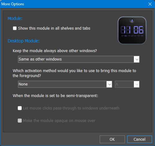
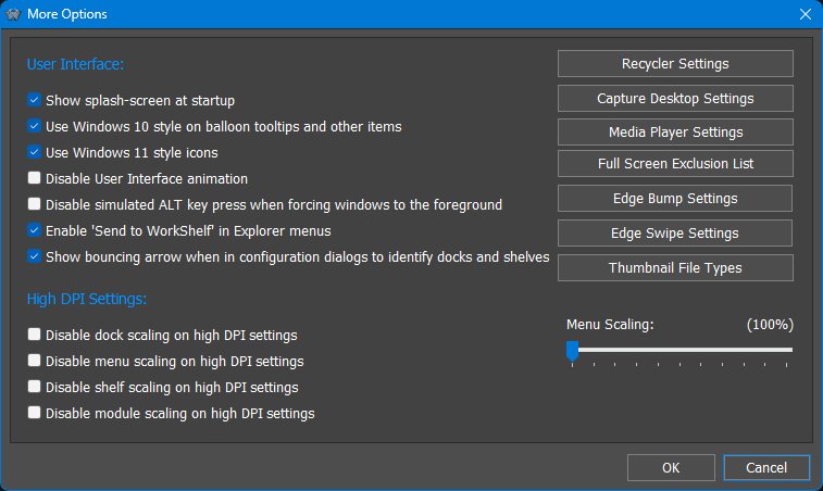
The Full-Screen Exclusion List is a global setting and can be accessed from the More Options dialog in the General tab of Preferences. It is also available from the Activation Settings panel in object Properties dialogs.
4. Working with Items and Containers
4.1 Context menus as a command surface
Right-click context menus are one of the main ways to work with Winstep objects. They are not limited to simple commands: they can expose object properties, insertion commands, shell commands for the underlying file, theme and style controls, Dock/Shelf management, module-specific settings and parent-object menus. When you are looking for a command related to a Dock item, Shelf tab, Drawer, Grid Stack, Launch Pad, module, running task or tray item, right-click it first.
4.2 Container types at a glance
| Object | Main purpose | Best used for |
|---|---|---|
| Docks | Primary launcher and task manager. | Daily applications, running tasks, modules, and nested containers. |
| Sub-Docks | Nested Docks inside another Dock. | Keeping related groups one click away without crowding the parent Dock. |
| Shelves | Tabbed content containers. | Large categorized collections, live folder views, system locations, and project pages. |
| Drawers | Single-tab Shelf-style containers. | Edge or floating containers with labels and Shelf-like content. |
| Grid Stacks | Pop-up grid browsers. | Quick folder browsing, system locations, and compact visual navigation. |
| Launch Pads | One-click workflow launchers. | Opening several apps, folders, documents, URLs, and commands together. |
WorkShelf objects are easier to understand if you think of them as different ways to display, launch, browse, and organize the same kinds of items.
4.3 Regular items versus live folder views
A regular Shelf tab or regular container stores Winstep items such as shortcuts, modules, internal commands, Sub-Docks, and Launch Pads. Removing a shortcut from a regular tab normally removes that object from the Winstep container only.
This live behavior is powerful because it lets WorkShelf act as a real file-management view when needed, but it also means folder-backed tabs should be handled with the same care as Explorer windows, Desktop folders, Documents folders, Control Panel views, Recycler views, and other Windows shell locations.
4.4 Manual ordering, live views, and sort options
Where appropriate, live and folder-backed tabs provide Sort options instead. Folder-type contents can be sorted by name, creation date, modification date, file extension or type, and file size. Ascending and descending order choices are available where the view supports them.
Other tab types are usually live views of folders, system locations, or dynamic system data. They behave more like Explorer, This PC, Control Panel, or other Windows shell folders: the contents come from the underlying source, so arbitrary manual ordering is generally not available.
Regular Shelf tabs and Regular Grid Stack tabs are user-managed containers. In these tabs, items can be manually rearranged by dragging them into the desired order.
4.5 System and virtual folder views
Winstep containers can display more than ordinary user-created tabs or normal folders. Depending on the object type and selected tab type, they can show live views of Windows system locations and virtual folders such as Control Panel, Desktop, Documents, Downloads, Network Connections, Printers, Recent Documents, Recycler, Settings, System Tray, Templates, Themes, and All Programs.
These views let the user bring Windows system locations into Shelves, Drawers, Grid Stacks, menus, and taskbar workflows. A Control Panel tab, for example, becomes a visual launcher for system settings; a System Tray tab can relocate tray icons away from the Windows taskbar; a Recent Documents tab becomes a quick way to return to recent work.
Because many of these views are live views of real Windows folders or shell locations, their contents should not be confused with ordinary Winstep shortcut items. Depending on the view, adding, renaming, moving, or deleting items may affect the underlying files, shortcuts, or system objects. In other views, some or all items may be system-managed and cannot be moved, renamed, deleted, or reorganized.
4.6 Browsing folder shortcuts through menus
A folder shortcut in a Dock, Shelf, Drawer, Grid Stack, Launch Pad, or compatible object can be browsed through a pop-up menu instead of being opened in Explorer. This is useful when you want to see many items at once without opening a separate Explorer window.
This behavior can be made the default left-click action for that folder by enabling Show Folder in a Menu in the folder item's Properties dialog. When browsing folders through menus, documents can show a thumbnail next to the menu when the mouse pointer pauses over them.
Folder browse menus can be sorted by right-clicking an item in the browse menu. Available sort choices include name, type, date created, date modified, and file size.
4.7 Search-as-you-type filtering
Quick Search: just start typing
Shelves, Drawers, and Grid Stacks include a built-in search filter. When the object has focus, simply start typing: items that do not match the typed text are hidden in real time, leaving only matching applications, documents, folders, modules, or other objects visible.
This is especially useful for large All Programs tabs, folder-backed tabs, Documents tabs, project folders, and Grid Stacks that contain many items. It keeps the search local to the current container instead of sending the user to an unrelated global Windows or web search experience.
4.8 Multi-selection and batch manipulation
You can drag a selection rectangle around multiple items, use Shift to select ranges, use Ctrl to toggle individual items, and use Ctrl+A to select everything in the current container. Selected items can then be moved, copied, deleted, dragged into another compatible container, or reorganized together.
Modern Winstep objects support multi-selection where appropriate, allowing more than one item to be selected and manipulated at the same time. This is useful when reorganizing a large Shelf tab, cleaning a Grid Stack, moving related shortcuts to a sub-dock, or converting a group of items into a better structure.
4.9 Modern applications, PWAs, shortcuts, and item images
Items can use normal static icons, high-resolution image files, and supported animated icon strips. Current versions can also use WebP images directly as item icons. This matters when building polished workspaces: you can match shortcuts to a theme, replace low-resolution icons, or use animation only where it adds useful feedback.
Supported Progressive Web Apps installed through Chrome, Brave, or Microsoft Edge can also be pinned, launched, and managed like native desktop applications instead of being lumped together as generic browser windows. This is useful for users who rely on installed web apps for mail, chat, music, dashboards, and productivity tools.
WorkShelf does not treat modern Windows applications as second-class shortcuts. UWP apps can be added to Docks, Shelves, Drawers, Grid Stacks, and Launch Pads, including through the Apps tab type on supported Windows versions.
4.10 Keyboard navigation and remote-control use
Keyboard navigation is also an accessibility and convenience feature. It allows users to open a Dock or Shelf, move through its items, and launch what they need even when precise mouse control is inconvenient.
Docks, Shelves, desktop modules, and menus can be brought forward and used from the keyboard through hotkeys and keyboard navigation. Docks are especially useful here because they can be navigated and launched without using the mouse at all, making them suitable for home-theater setups, couch use, or remote-control devices such as Logitech Harmony remotes.
4.11 Document thumbnails and thumbnail file types
Documents displayed in Docks, Shelves, Drawers, Grid Stacks, and menus can show a thumbnail when Windows or WorkShelf can generate one. This makes image files, documents, and other visual content easier to identify at a glance than a generic file-type icon.
The list of file extensions that receive thumbnail treatment can be edited in the Thumbnail File Types dialog, available from the More Options dialog in the General tab of Preferences. This is useful when you want thumbnails for additional document or image formats, or when you want to avoid thumbnail generation for formats where a normal icon is faster or clearer.
4.12 Object-based drag & drop
Drag and drop works both into and out of Winstep objects. You can drag files, folders, shortcuts, URLs, images, printers, and other objects from Explorer or the Desktop into docks, shelves, drawers, and Grid Stacks; you can also drag items back out to Explorer folders or to the Desktop.
If a dropped shortcut needs to remain a shortcut file instead of being resolved to its target, hold Alt while dropping it. This is useful in unusual cases such as 64-bit redirection issues or shortcuts whose own Start in folder must be preserved exactly.
4.13 Fast icon customization by drag & drop
Icons can be customized very quickly by dragging an image file directly onto an item's icon. Supported image formats include PNG, ICO, TIF, and WEBP. This allows you to open an Explorer folder containing favorite icons and customize many Dock or Shelf items simply by dropping each image onto the item it should replace.
This is often much faster than opening the Properties dialog for each item individually, especially when building a themed Dock, replacing imported shortcut icons, or customizing a group of project shortcuts.
4.14 Dropping documents onto application items
Application items in Docks, Shelves, Drawers, Grid Stacks, and related objects support document drag & drop. Dropping a document onto an application item opens that document with the application. For example, dropping a text file onto a Notepad shortcut launches Notepad with that document; dropping an image onto an image editor opens the image in that editor; dropping a folder onto a utility that accepts folders launches the utility with that folder.
This makes Winstep objects useful not just for launching applications, but also for routing documents to the correct application without first opening the application manually. This behavior also applies to supported UWP application items, so modern Windows app shortcuts can behave like normal desktop application shortcuts where drag & drop is supported.
Documents can also be routed to applications that are already running. Drag a document over a running task icon and pause briefly to bring the associated window to the foreground, then drop the document into that window. If the icon represents a grouped task, hovering over the grouped icon first opens the live thumbnails; hovering over the desired thumbnail can then bring that specific window forward.
4.15 Converting and reorganizing objects
This is important when a workspace grows. Users do not have to get the structure perfect on the first try: they can start with a simple Dock, split related items into Sub-Docks, turn frequently browsed folders into Grid Stacks, and later create Shelf tabs or Drawers as the setup becomes more complex.
Docks, Sub-Docks, Shelf tabs, Drawers, Grid Stacks, and Launch Pads are designed to evolve. Items and whole objects can be duplicated, moved, converted, or restructured through context menus and drag & drop. A Dock can become a Sub-Dock, a Shelf tab can become a Dock-like object, and a folder shortcut can be converted into a Grid Stack.
4.16 Nested structures and moving complete object trees
Nested structures can also be reorganized by drag & drop. Dragging an object moves the whole nested structure with it; holding CTRL while dragging copies it instead. This makes it practical to duplicate a complex project launcher, move a complete Sub-Dock hierarchy to another Dock, or reorganize a large workspace without rebuilding it item by item.
Sub-Docks, Grid Stacks, Launch Pads, and related nested objects can be nested to unlimited levels. A Dock item can open a Sub-Dock, that Sub-Dock can contain another Sub-Dock or Grid Stack, and so on, allowing very large collections to remain organized without cluttering the top-level Dock or Shelf.
5. Main Preferences window
The main WorkShelf Preferences window contains global settings: options that affect WorkShelf as a whole, or that manage collections of objects such as shelves, docks, modules, themes, tasks, and tray icons. This is different from a Shelf Properties or Dock Properties panel, which affects only one specific object.
The tabs across the top of the Preferences window group related application-wide settings: Docks & Shelves, Modules, Themes, Sounds, Tasks, Tray, General, Advanced, and About.
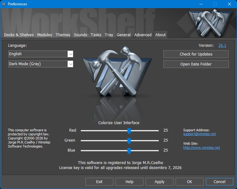
5.1 About tab
The About tab is the first page shown when the main Preferences window opens. It provides version, build, registration, support, update-related information, language selection, and general user-interface style options.
5.2 Docks & Shelves tab
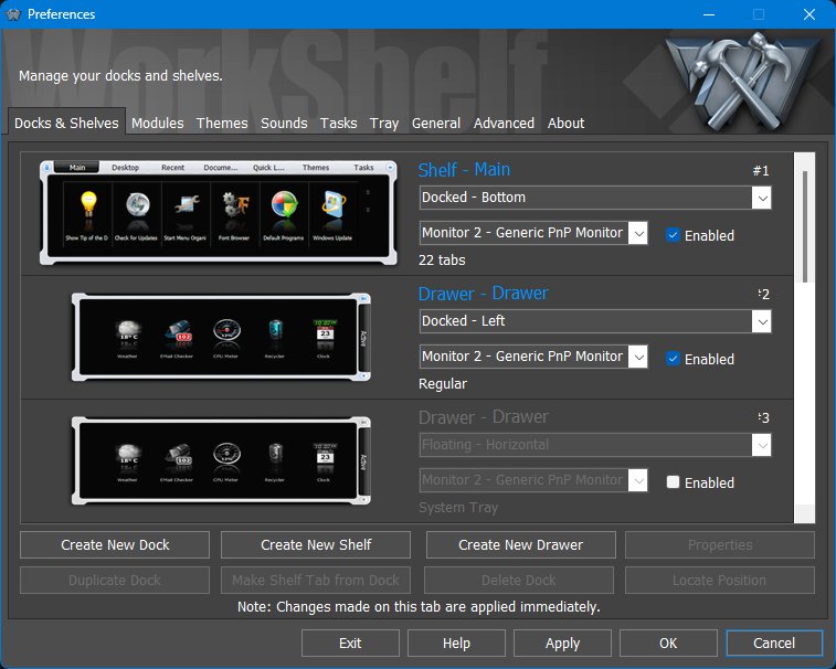
The Docks & Shelves tab is the object manager for Shelves, Docks, Drawers, and related desktop containers. It lets you see which objects exist, where they are docked, which monitor they belong to, and whether they are currently enabled.
Finding an object with Locate Position
The Locate Position command is useful when a Dock, Shelf, Drawer, or other object exists but the user is not sure where it is on the desktop. When clicked, WorkShelf expands or shows the selected object if necessary and displays a large bouncing arrow pointing directly at it.
This is especially useful on multi-monitor systems, after changing monitor arrangements, or when an object has been hidden, collapsed, moved to another screen edge, or placed on a monitor that is not currently the one the user is looking at.
5.3 Modules tab
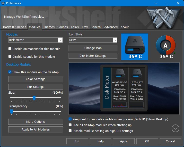
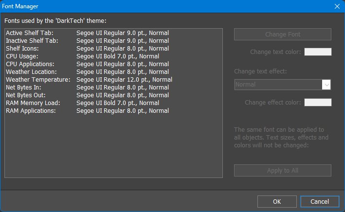
The Modules tab manages global settings for WorkShelf modules. Modules, also known as widgets or gadgets, are built-in mini-applications that run inside WorkShelf. They include the Clock, Recycler, Email Checker, Weather Monitor, CPU Meter, Net Meter, RAM Meter, Wanda, Battery Monitor, Calendar, Moon Phase, and Disk Meter modules.
Modules can appear as compact icons inside Docks and Shelves, and also as larger skinnable desktop widgets. All modules provide two icon styles for iconic presentation, and some styles can be further customized through user-provided background images or icons.
The desktop module theme can also be set to None. In that case the desktop module falls back to the iconic version of the module instead of using a larger free-form desktop skin. This gives you a compact desktop presentation while still keeping the module outside a Dock or Shelf.
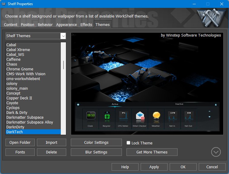
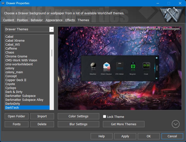
5.4 Themes tab
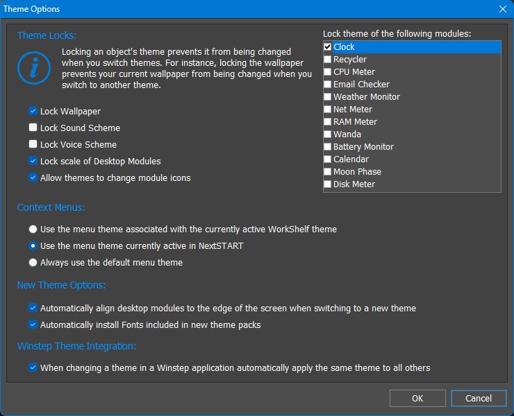
The Themes tab is the practical place to choose, preview, apply, import, save, delete, and export themes. Detailed theme behavior, colorization, locks, menu themes, and per-object theme interaction are also discussed later in Themes, appearance, and effects.
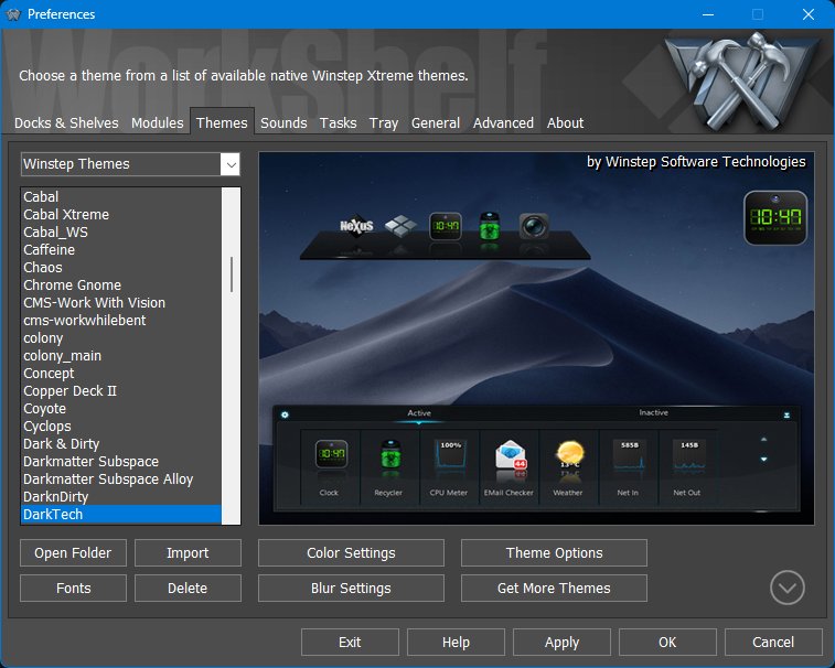
The Themes tab manages global Winstep themes and object-specific theme collections. Native Winstep themes can skin the full Winstep environment, including shelves, docks, modules, menus, sounds, wallpaper, fonts, and other visual elements. Third-party dock skins are more limited and usually skin only dock backgrounds.
Installing themes and 3rd party dock skins
Winstep themes and Nexus dock skins can be installed in several ways, depending on the file format and how the theme author packaged the download.
Applying 3rd party dock skins in WorkShelf
3rd party dock skins normally skin Dock backgrounds only. They do not contain the additional bitmaps and settings needed to skin Shelves, Drawers, Grid Stacks, Launch Pads, desktop modules, menus, taskbars, or the rest of the Winstep environment. For that reason, the main Themes tab normally lists native Winstep themes first.
To apply a 3rd party dock skin, use the object/category selector at the top-left of the Themes tab and select Nexus. The list then shows available Nexus Dock themes, including imported 3rd party dock skins. Applying one of these themes changes the Dock appearance without replacing the themes used by other object types.
This makes it possible to combine a native Winstep theme with a different Dock skin. Apply the native Winstep theme first, then switch the selector to Nexus and apply the Dock skin you want to use for Docks.
Applying a Dock theme from the main Themes tab affects all Docks of that type. To change only one specific Dock, open that Dock's own Properties dialog and use its Themes tab. The same per-object approach applies to Shelves, Drawers, and Grid Stacks where available.
5.5 Sounds tab
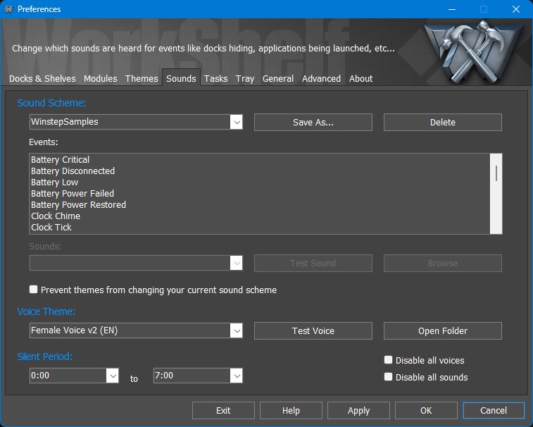
The Sounds tab controls global sound effects and voice files. Sound schemes provide event sounds, while voice themes provide spoken announcements used by modules.
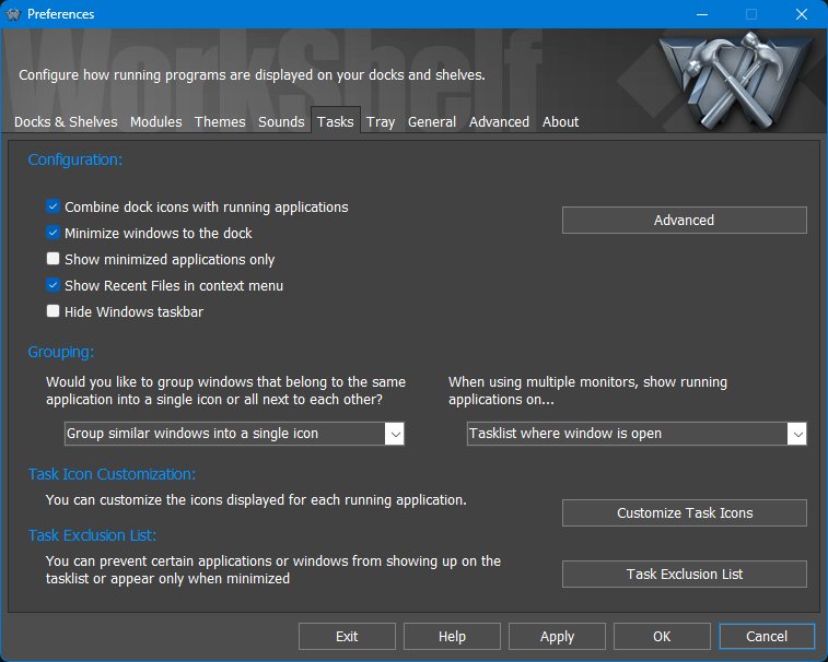
5.6 Tasks tab
The Tasks tab controls how running applications appear in WorkShelf docks and task-oriented Shelf tabs. These settings affect global task management behavior, not the contents of a single Shelf tab.
Running task context menus offer commands beyond the standard Windows task menu. Depending on configuration, they can include options to set a window's opacity, minimize all similar windows, or restore all similar windows from the same application at once. These commands are useful when an application has many related windows open and you want to manage them as a group.
Advanced Task Settings
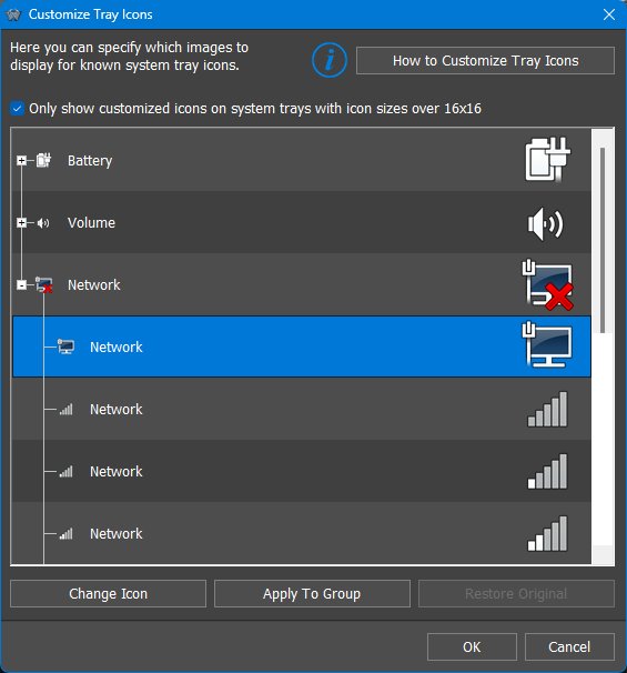
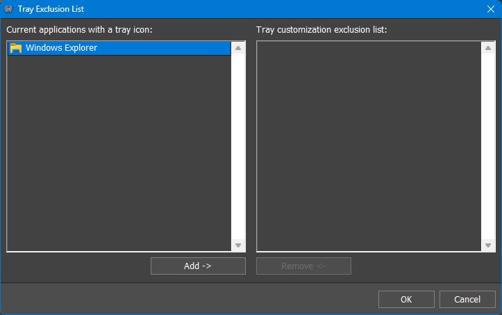
5.7 Tray tab
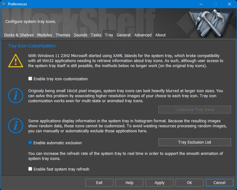
The Tray tab controls WorkShelf's system tray support and tray icon customization. This is especially relevant when the system tray is shown in a Shelf, Dock, or other WorkShelf object.
5.8 General tab
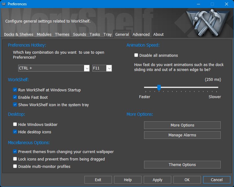
The General tab contains common application-wide behavior: the Preferences hotkey, startup behavior, animation speed, desktop/taskbar integration, miscellaneous protection options, alarms, and theme-related shortcuts.
More Options
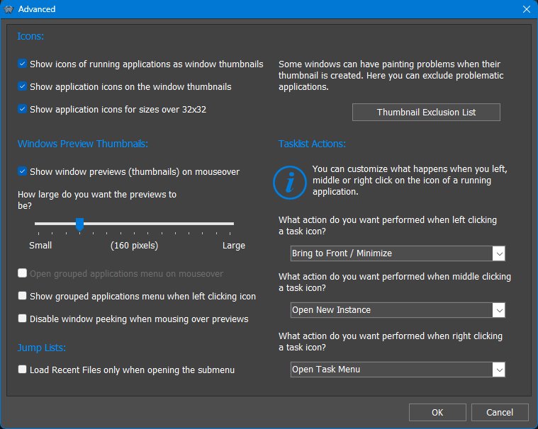
5.9 Advanced tab
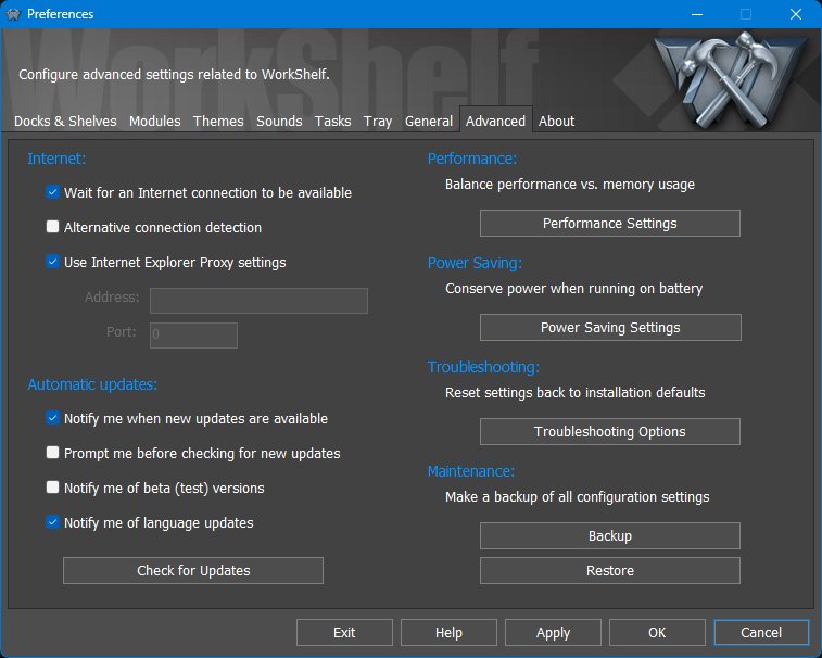
The Advanced tab contains application-wide technical settings for internet access, updates, performance, power saving, troubleshooting, backups, and maintenance.
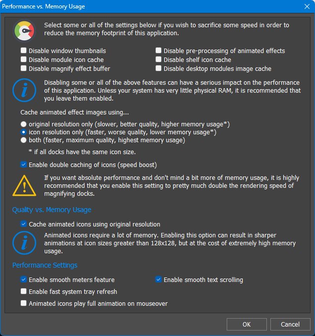
Performance Settings
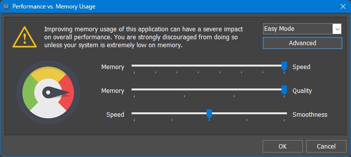
The Performance Settings dialog balances memory usage, speed, visual quality, and animation smoothness. The warning at the top is intentional: reducing memory usage can have a severe impact on overall performance and should normally be done only on systems with very little available memory.
Advanced Performance Settings
Power Saving Settings

The Power Saving Settings dialog is especially important on laptops and tablets. WorkShelf can reduce CPU usage and power consumption by lowering polling/update rates and disabling non-essential animations or cosmetic effects.
Troubleshooting Options
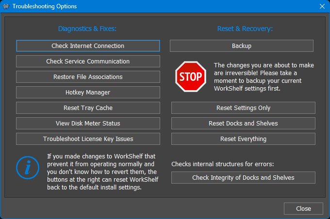
The Troubleshooting Options dialog contains diagnostic, repair, reset, backup, and recovery tools. The buttons on the left are intended to diagnose or fix specific problems. The buttons on the right can reset parts of the WorkShelf configuration and should be used with more care.
6. Working with Docks
A Dock is an icon strip for launching applications, opening documents and folders, displaying running tasks, hosting modules, and organizing frequently used items. Unlike Shelves, Drawers, and Grid Stacks, a Dock is not a tabbed container. WorkShelf/Winstep Xtreme supports multiple docks. Each dock has its own contents, position, behavior, appearance, effects, and theme.
Docks can be attached to a screen edge or left floating. When docked, a Dock can be aligned along the selected edge, optionally span the full screen width or height, reserve or respect screen space, auto-hide into the edge, and be activated by bumping or swiping the screen edge. Floating docks can be placed freely on the desktop and can collapse when not in use.
Each Dock includes an optional Dock control icon/tile. The control icon gives access to the Dock context menu and is used for operations such as opening Dock Properties, moving or converting the Dock, and accessing Dock management commands. Depending on the Dock settings, the control icon may be visible or hidden.
The Dock control icon can also be used directly in drag-and-drop operations. Depending on context and settings, dragging the control icon can help move, convert, or remove a Dock. This is another reason the control icon is important even when most day-to-day launching happens through the ordinary Dock items.
6.1 Dock context menus and shell integration
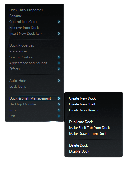
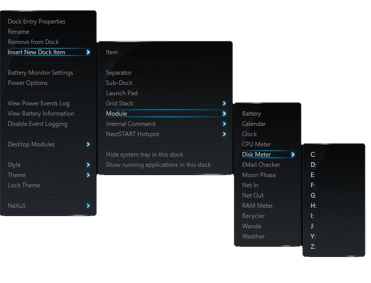
Dock right-click menus combine Winstep object management with the normal Windows shell context menu where appropriate. This is why an application shortcut can show WorkShelf commands such as Dock Entry Properties, Rename, Remove from Dock and Insert New Dock Item, followed by the same file/application commands and third-party shell extensions you would see in Explorer.
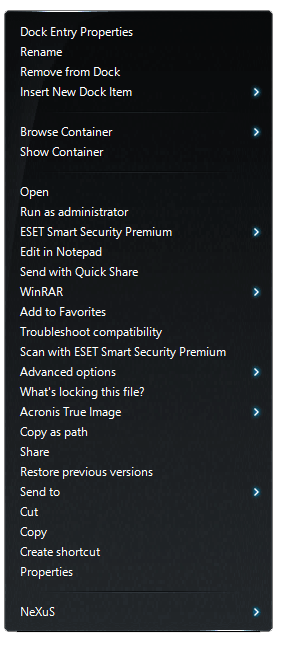
The Dock control icon is the main command surface for the Dock itself. The same Dock-level menu is also available from the NeXuS submenu in the right-click menu of individual Dock items.
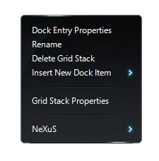
Special objects placed in a Dock expose their own commands. For example, a Grid Stack item offers Grid Stack Properties and Delete Grid Stack directly in its context menu.
6.2 Moving and docking Docks manually
When movement is allowed, click an empty space between Dock icons and drag to align or move the Dock. Holding Alt while left-clicking anywhere in the Dock also allows the Dock to be dragged horizontally.
Drag a docked Dock away from the screen edge to undock it, you should feel a certain resistence, that is normal. When the mouse pointer approaches a screen edge, the Dock automatically docks to that edge.
6.3 Sub-Docks and in-Shelf Docks
A Dock item can open a Sub-Dock, allowing related applications or shortcuts to be grouped under a single Dock item. Sub-Docks are useful for keeping the main Dock compact while still providing access to larger groups of items.
Existing Docks can also be converted into Sub-Docks or detached back into standalone Docks. This makes it possible to reorganize a Dock hierarchy without rebuilding it item by item.
A Dock can also be placed inside a Regular Shelf, Drawer, or Grid Stack tab as an in-Shelf Dock. In that form it appears as a control tile inside the container and expands when activated.
6.4 Dock styles
Docks can use native Nexus/Winstep themes, dock backgrounds, tile-based styles, and themes made for compatible third-party docks such as RocketDock, ObjectDock, and Y'z Dock. This gives Nexus and WorkShelf access to thousands of third-party dock themes available online, in addition to native Winstep themes.
Native Winstep themes provide the richest skinning support because they can define more than just the dock background. Third-party dock skins are useful for quickly applying simpler dock visual styles, but they usually affect only the dock background, tiles, or related dock artwork.
The Dock Themes tab and related style, colorization, and blur settings control the visual style for a specific Dock.

6.5 Docks as workflow entry points
A dock is often the fastest way to begin a task. Keep the main dock focused on the applications, documents, folders, modules, and internal commands used every day, then move less frequent items into sub-docks or Grid Stacks. This keeps the dock compact without hiding functionality.
6.6 Opening documents through dock applications
Dock items are not limited to being clicked. Dropping a document onto an application icon opens that document with that application, just as in Windows. This is useful for tools such as editors, image programs, archive managers, media players, and development utilities.
6.7 Changing item images by drag & drop
To personalize a dock or make a workflow more visually obvious, drag a supported icon or image file onto an existing item to change that item's image. This works especially well when a project uses custom icons or when imported shortcuts have poor default artwork.
6.8 Docks as task managers
Docks can be used as launchers, task managers, or both. A Dock can show pinned items and running applications together, only running tasks, only minimized windows, or a filtered subset of tasks. This lets one Dock act as a normal launcher while another acts as a dedicated task switcher for the current monitor or workflow.
When task grouping is enabled, multiple windows from the same application can be represented by a single grouped icon. Hovering or clicking can then reveal live previews or a task list, depending on the selected task behavior.
6.9 Document routing through Dock items
Dock items can accept files dropped onto them. This is a practical everyday shortcut: drop a document onto Word, a text file onto Notepad, an image onto an image editor, or a folder onto a utility that accepts folders. Supported UWP application items also participate in this behavior, which helps modern Windows apps behave consistently with classic desktop applications.
7. Dock Properties
The Dock Properties panel controls the settings for one specific Dock. Changes made here affect only the selected Dock, not every Dock in WorkShelf. Global Dock management remains in the main Preferences window, especially the Docks & Shelves tab and the global Themes tab.
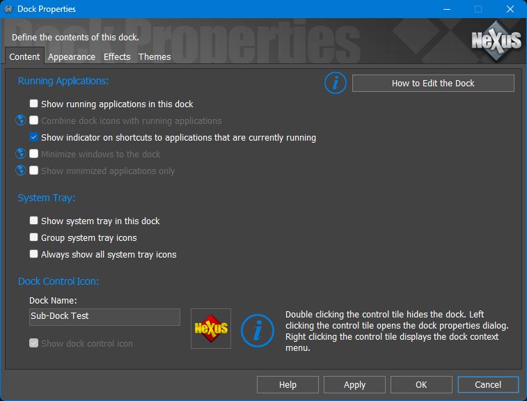
7.1 Content tab
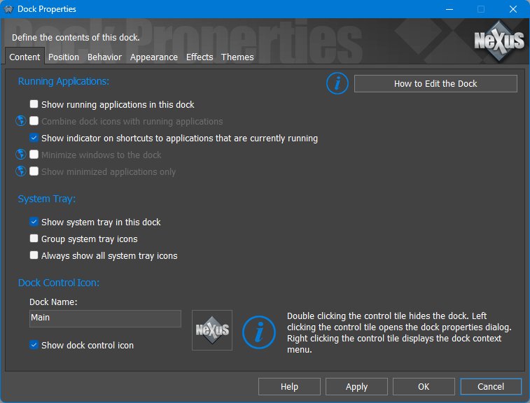
The Content tab defines what the selected Dock displays in addition to the user-created items already placed in the Dock.
7.2 Position tab
Docks can also reserve or respect screen space, auto-hide, or use Dodge Windows behavior so they stay visible until the active window would cover them. These options are different ways of balancing access and screen real estate: reserve space when the dock should always remain unobstructed, normal auto-hide when you want maximum screen space, and Dodge Windows when you want the dock visible except when it actually gets in the way.
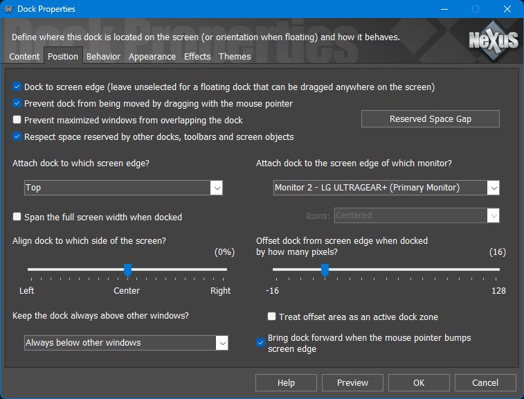
The Position tab controls where the Dock appears, whether it is docked or floating, how it aligns to the screen edge, and how it interacts with other windows and reserved screen areas.
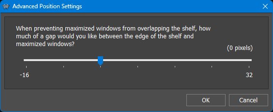
Reserved-space gap
The Reserved-space gap dialog controls the gap between the dock and maximized windows when Prevent maximized windows from overlapping the dock is enabled. The value is measured in pixels. Positive values leave extra space between the dock and maximized windows, while negative values allow maximized windows to move closer to, or slightly under, the dock's edge.
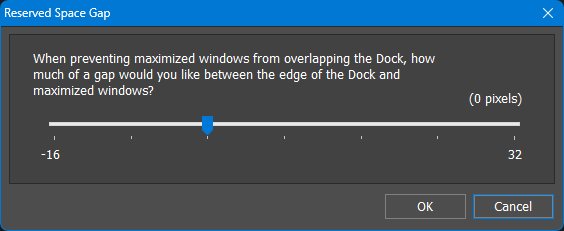
Shelf and Dock themes often include drop shadows, glow effects, or semi-transparent borders around the main body. Although these pixels are technically part of the object, they can create the impression that maximized windows stop too far away from the visible edge. This setting lets you compensate for that by using a small negative value, or deliberately leave extra breathing room with a positive value. The value is measured in pixels and has a small range because it is intended only for fine-tuning the reserved space.
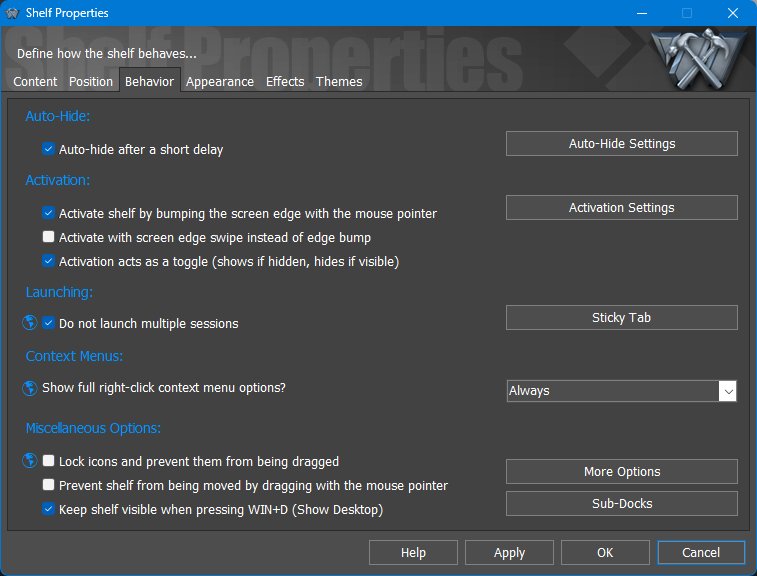
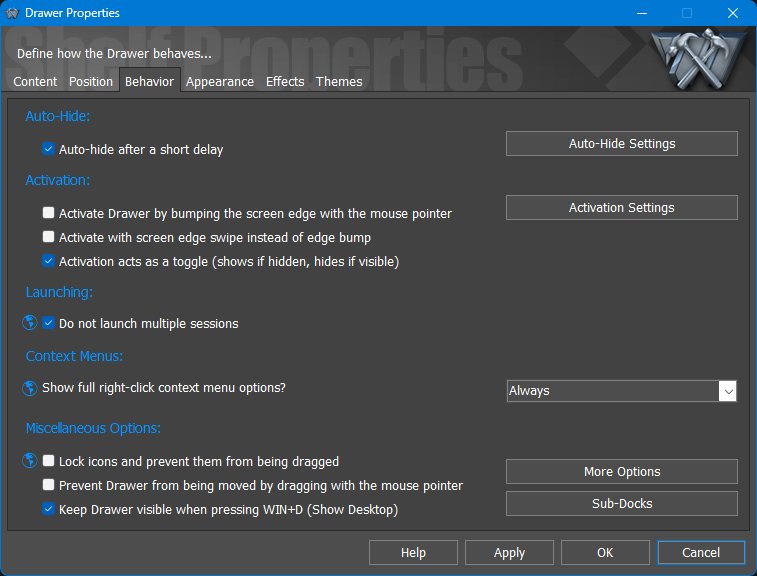
7.3 Behavior tab
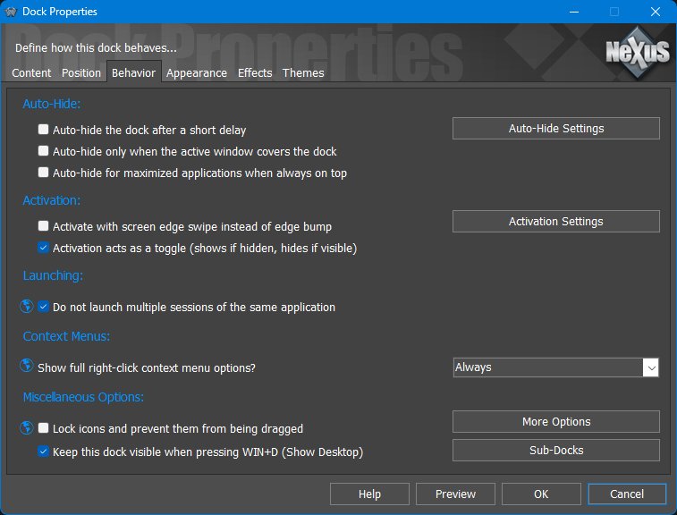
The Behavior tab controls how the Dock hides, activates, launches items, displays context menus, and handles dragging or desktop interactions.
The buttons on this page open related dialogs for Auto-Hide Settings, Activation Settings, More Options, and Sub-Docks.
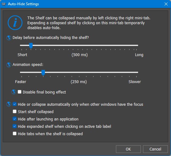
Auto Hide Settings
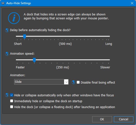
Auto Hide Settings control the delay, animation speed, animation style, and startup behavior used when the Dock hides into a screen edge or a floating Dock collapses.
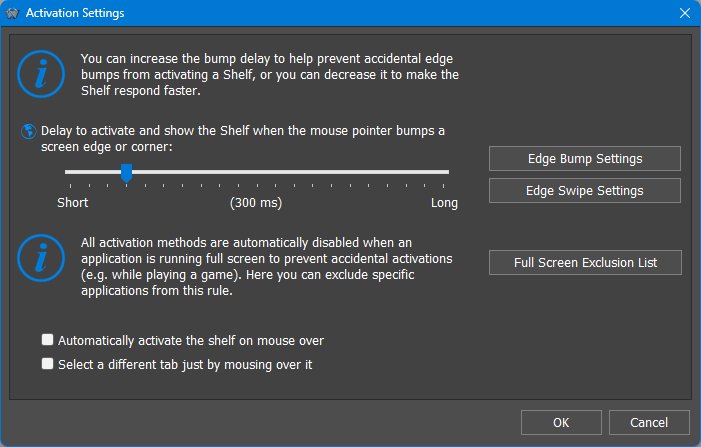
Activation Settings
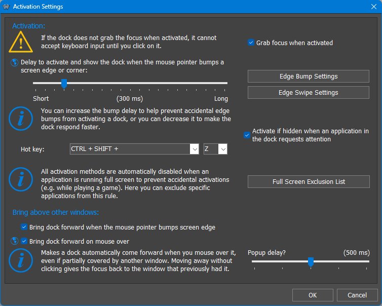
Activation Settings define how a hidden or covered Dock is brought forward or shown.
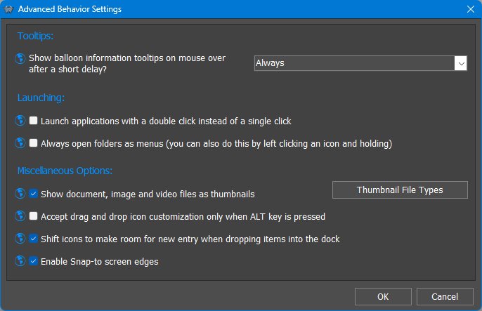
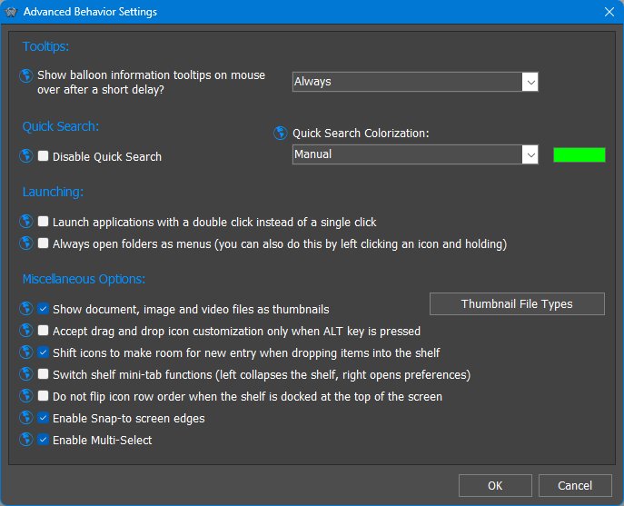
Advanced Behavior Settings
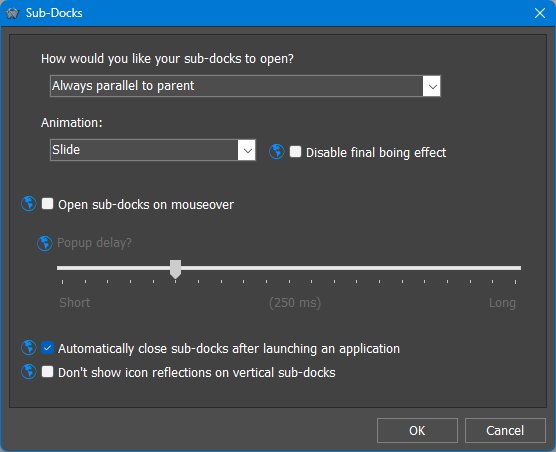
Sub-Dock Settings
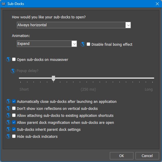
Sub-Dock Settings control how sub-docks open and behave when attached to Dock items.
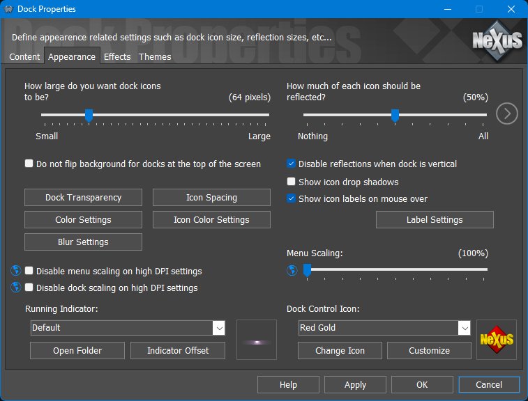
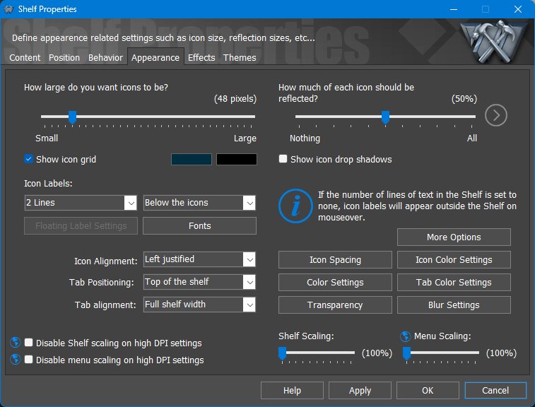
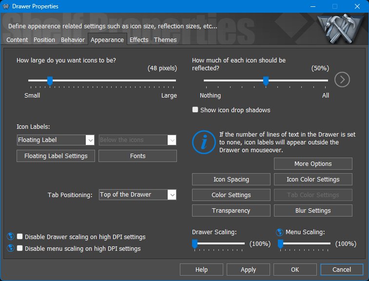
7.4 Appearance tab
Dock appearance is not limited to static icons. Docks can use live icon reflections that update as icons change, animated icons for supported image-strip formats, and visual effects that respond to mouseover, launch, attention, deletion, or dragging.
General item-image replacement by dropping PNG, ICO, TIF, or WebP files onto items is described in Working with Items and Containers , because it applies to more than Docks.
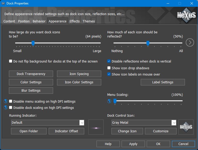
The Appearance tab controls Dock icon size, reflections, transparency, labels, indicators, control icon, scaling, and related visual options.
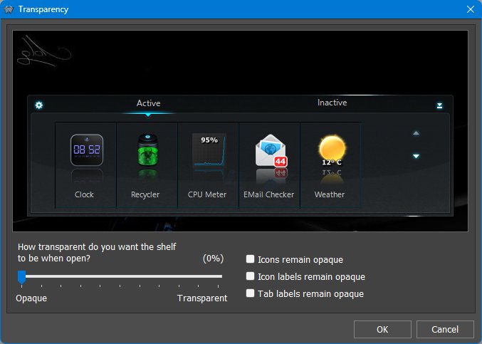
Transparency
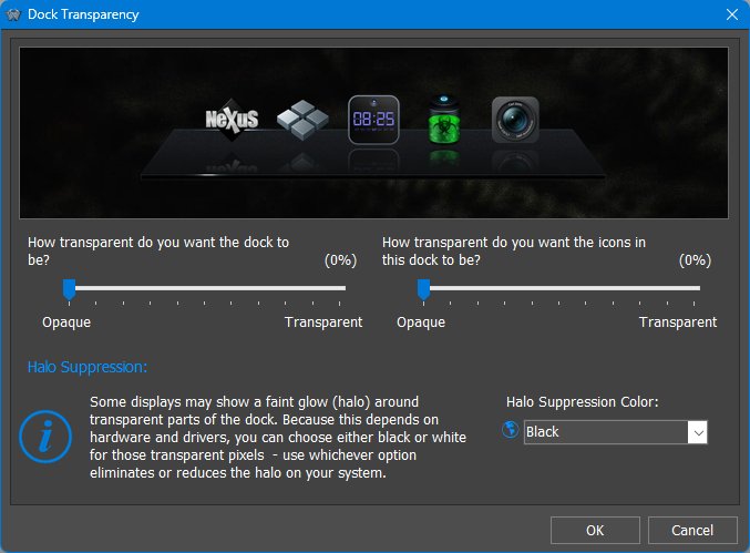
The Transparency dialog controls separate transparency levels for the Dock background and Dock icons. It also includes halo suppression settings for systems where transparent pixels show a faint glow around the Dock.
Icon Spacing
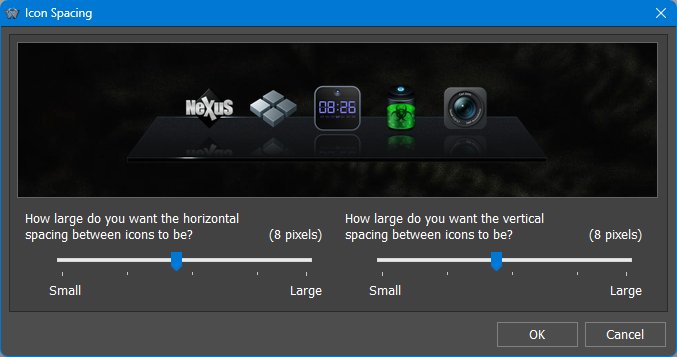
The Icon Spacing dialog provides two sliders: horizontal spacing between icons and vertical spacing between icons. Both values are measured in pixels.
Label Settings
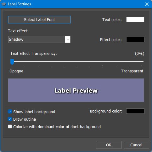
Label Settings control the appearance of mouseover labels, including the label font, text color, text effect, effect color, text effect transparency, optional label background, outline, background color, and whether the label is colorized with the dominant color of the Dock background.
Indicator Offset
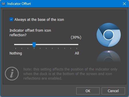
The Indicator Offset dialog adjusts where running/open indicators appear relative to the Dock icon and icon reflection. The dialog notes that this setting affects indicators at the top or bottom of the screen and is not relevant for side-attached Docks.
Icon Factory
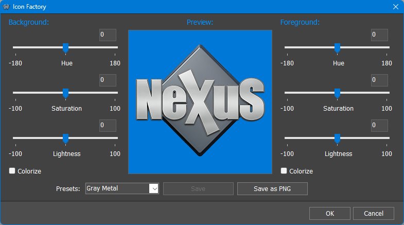
The Icon Factory dialog provides hue, saturation, and lightness adjustments for colorizing the Dock control icon, with presets and a live preview.
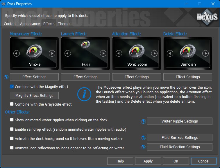
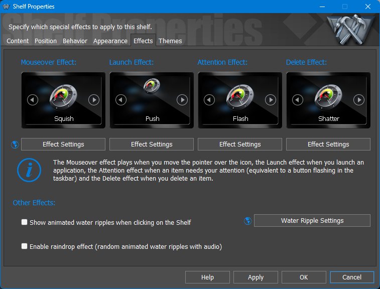
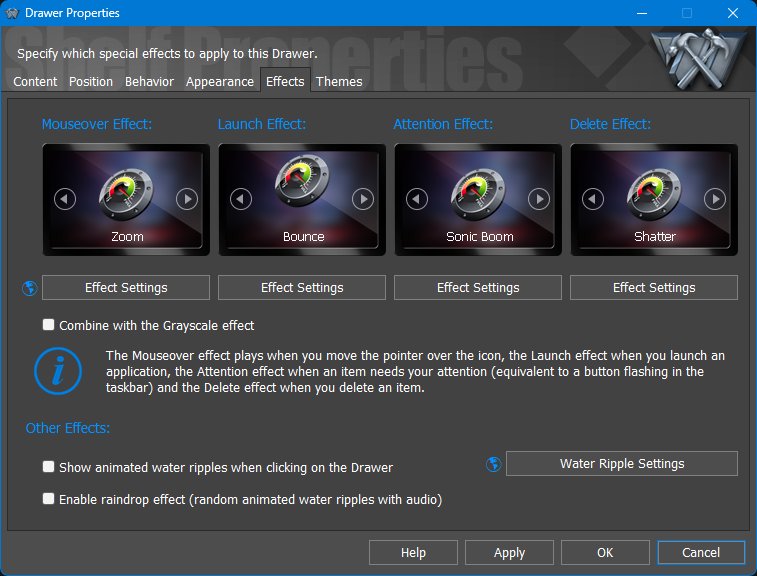
7.5 Effects tab
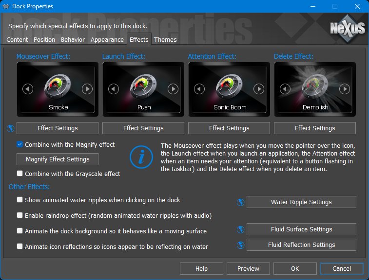
The Effects tab controls animated feedback for mouseover, launch, attention, deletion, and background/reflection effects.
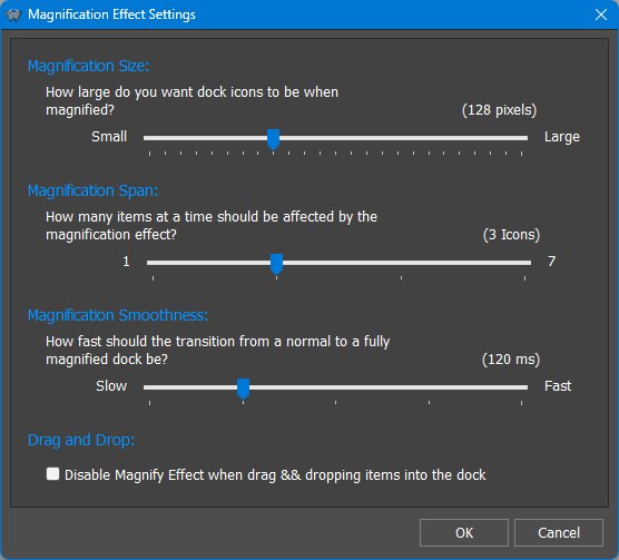
Magnify Effect Settings control the magnified icon size, the magnification span, transition smoothness, and whether magnification is disabled while drag-and-dropping items into the Dock.
Effects Panel preview
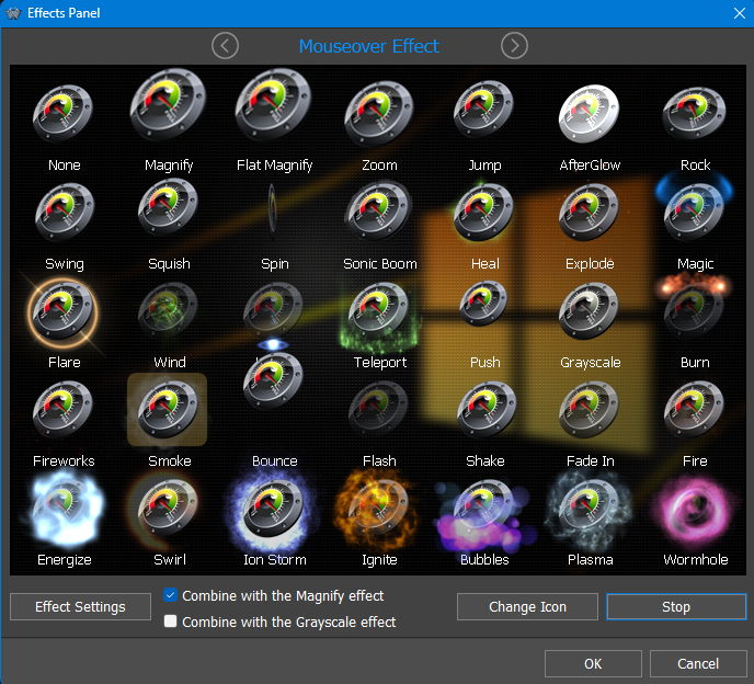
The Effects tab uses icons to represent each available effect. Clicking the effect icon opens the Effects Panel, which shows the available effects and lets the user preview them. This is much more useful than choosing from a plain list because effects such as Magnify, Jump, AfterGlow, Rock, Swing, Spin, Teleport, Fireworks, Smoke, Bubbles, Plasma, and others are best understood visually.
Some effects can be combined with Magnify or Grayscale, allowing the Dock to keep its normal magnification behavior while adding an additional visual response. Effects are not only decorative: they provide immediate feedback for mouseover, launch, attention, delete, and other actions.
Effects as feedback, not just decoration
Effects help communicate what is happening: mouseover effects show which item is active, launch effects confirm that a command was triggered, attention effects replace or supplement taskbar flashing, and delete effects provide visual confirmation when an item is removed. Fluid, ripple, and reflection effects are optional polish and can be disabled or reduced through Effects, Performance, or Power Saving settings.
On laptops or low-power systems, effects should be balanced against battery life and responsiveness. Normal and Ultra Power Saving modes automatically reduce or disable many animations, including dock hide/show animations, water effects, animated icons, and repeated effect timing.
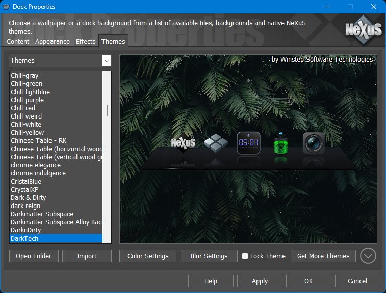
7.6 Themes tab
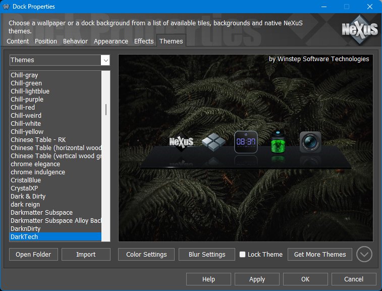
The Themes tab controls the visual resources used by the selected Dock. The selector can show Themes, Tiles, or Wallpapers. Themes shows both native Nexus/Winstep Dock themes and compatible third-party dock themes. Tiles lists tile images used by tile-based Dock styles. Wallpapers lists wallpapers included with installed themes.
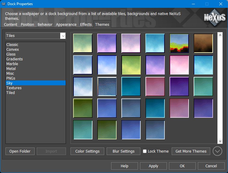
When tile-based styles are selected, the Themes tab shows tile categories such as classic, convex, glass, gradients, marble, metal, textures, and other installed tile collections.
Per-Dock themes versus global themes
Each Dock can use a theme different from the global theme. This is useful when one Dock is intended to be visually distinct - for example a compact utility Dock, a task-only Dock, or a large media-launcher Dock. If the Dock theme is locked, applying a new global theme will not replace the Dock's selected theme.
This per-object theme behavior is shared with Shelves and desktop modules, allowing different parts of the workspace to have different appearances while still using the global theme as the default.
8. Working with Sub-Docks
A Sub-Dock is a Dock that opens from another Dock item. Sub-Docks let you keep the main Dock short and readable while still storing complete groups of related items below a single parent icon. They can be nested to unlimited levels and the whole nested structure can be moved or duplicated by drag and drop. Hold CTRL while dragging to copy instead of moving.
Modern Sub-Docks normally occupy their own icon slot. The Sub-Dock indicator is still shown, but clicking the icon opens the Sub-Dock. This makes the target easy to hit even when dock magnification is enabled.
8.1 Attached Sub-Docks and backwards compatibility
Nexus docks existed before the magnifying Mac OS X Dock and were originally based on the older NeXT-style Dock. In those early static-tile docks, a Sub-Dock could be attached to an existing shortcut. The main icon launched the shortcut, while a small marker opened the Sub-Dock.
After magnification was added, the old method became less practical. The marker moved together with the icon, so users had to chase a small moving target with the mouse pointer. For this reason, the modern default is to give a Sub-Dock its own full icon slot.
The old split behavior is still available for backwards compatibility through Allow attaching sub-docks to existing application shortcuts. When enabled, clicking the icon launches the item and clicking the Sub-Dock indicator opens the Sub-Dock. With this option enabled, deleting the icon deletes the shortcut item, not the Sub-Dock. With the modern default behavior, deleting the Sub-Dock icon deletes the whole Sub-Dock after a strong warning.
If Sub-Docks inherit parent dock settings is enabled in the parent Dock settings, Sub-Docks use the parent Dock appearance and behavior. Disable that option when you want to configure a Sub-Dock individually.
9. Sub-Dock Properties
When Sub-Docks are configured individually, the Sub-Dock Properties dialog provides the settings that apply to that specific Sub-Dock. The available tabs are a focused subset of Dock Properties: Content, Appearance, Effects, and Themes.
9.1 Content tab
The Content tab defines whether the Sub-Dock shows running applications, the System Tray, shortcut indicators, minimized windows, and the Sub-Dock control icon. The control tile follows the same general logic as Dock control icons: it identifies and manages the Sub-Dock itself rather than launching a normal shortcut.
9.2 Appearance tab
The Appearance tab controls icon size, icon reflections, icon labels, shadows, transparency, spacing, scaling, color settings, blur, and the running indicator used by this Sub-Dock when it is not inheriting the parent Dock settings.
9.3 Effects tab
The Effects tab controls the mouseover, launch, attention, and delete effects for the Sub-Dock. These effects provide feedback when the user moves over icons, launches items, when an item needs attention, or when an item is removed.
9.4 Themes tab
The Themes tab lets an individually configured Sub-Dock use its own theme, independently of its parent Dock and of other docks or sub-docks. If the Sub-Dock theme is locked, applying a new global theme will not change it. If the Sub-Dock inherits parent settings, theme selection is controlled by the parent Dock instead.
10. Working with Shelves
A Shelf is best understood as a tabbed workspace. Instead of forcing every shortcut, module, folder, task list, and system item into a single flat launcher, a Shelf lets the user divide content into tabs and switch between them as needed.
10.1 Shelf tab context menus
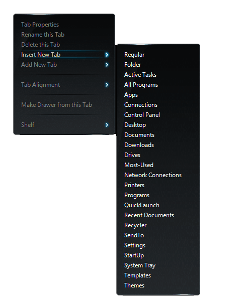
Right-clicking a Shelf tab opens the tab context menu. From here you can open Tab Properties, rename or delete the tab, insert a new tab before the current tab, add a new tab at the end, choose the new tab type, change tab alignment, or convert the current tab into a Drawer. The commands shown can vary depending on the tab type; for example, Regular tabs can also be converted into Docks.
10.2 Left mini-tab context menu
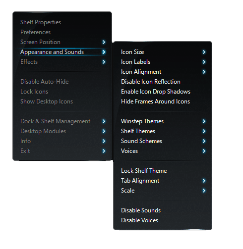
The left mini-tab context menu acts as a compact command center for the Shelf. It provides quick access to Shelf Properties, the main Preferences window, screen position, appearance and sounds, effects, auto-hide, icon locking, Desktop icon visibility, Dock & Shelf Management, Desktop Modules, Info and Exit commands.
10.3 Using Shelf tabs and mini-tabs
The right mini-tab is used to collapse and expand a Shelf. If the Shelf is collapsed and you manually click the right mini-tab, the Shelf expands and stays expanded even when auto-collapse or auto-hide is enabled. This is useful when you want the Shelf to remain open while you work with its contents.
Double-clicking a Shelf tab expands or collapses the Shelf so all items in that tab are visible, as long as available screen space permits. Double-clicking the tab again collapses the Shelf back to its default number of visible icon rows.
You can temporarily expand a Shelf by dragging the small tab header away from the Shelf body, revealing more rows of icons while leaving the Shelf’s normal size unchanged. Tabs can also be reordered by dragging their tab headers along the tab strip.
While dragging an item, hovering the item over a different Shelf tab selects that tab after about one second. If the target tab contains more rows than are currently visible, drag the item over the scroll arrows at the right side of the Shelf body to scroll the tab while still dragging.
Shelves can also be scrolled with the mouse wheel. Keyboard navigation and scrolling are available with the arrow keys, Page Up, Page Down, Home, and End.
10.4 Shelf tab types
Each Shelf is made of tabs, and each tab has a Type that determines where its contents come from and how those contents are maintained. Some tabs are ordinary user-managed tabs, while others are backed by folders, Windows system locations, running tasks, the system tray, or other live sources.
| Tab type | What it displays |
|---|---|
| Regular | A normal Shelf tab managed by the user. Items can be added, removed, arranged, and customized manually. |
| Folder | The contents of a selected folder. This lets any folder be displayed as a Shelf tab. |
| Active Tasks | Currently running applications and windows, providing task-switching behavior inside the Shelf. |
| All Programs | An alphabetized, searchable programs view that combines Start Menu folders into a single list. |
| Apps | Windows Apps/UWP applications. This type is available on Windows 10 and later. |
| Connections | Dial-up/VPN/RAS connection entries where supported. This type is available on Windows Vista and later. |
| Control Panel | The contents of the legacy Windows Control Panel. |
| Desktop | The contents of the user's Desktop, very useful when desktop icons are hidden. |
| Documents | The user's Documents folder. |
| Downloads | The user's Downloads folder. This type is available on Windows Vista and later. |
| Drives | The Windows This PC/My Computer view of available drives. |
| Most-Used | An automatically populated list based on Windows tracking of the most used applications. |
| Network Connections | Network connection entries. |
| Printers | Installed printers. |
| Programs | The Start Menu Programs folder/menu entries. |
| QuickLaunch | The Windows Quick Launch folder. |
| Recent Documents | Recently used documents, with options to limit how many items are shown or clear the list. |
| Recycler | The Recycle Bin/Recycler contents. |
| SendTo | The Windows SendTo folder. Dropping items here adds them as Send To shortcuts. |
| Settings | Windows Settings entries. This type is available on Windows 10 and later. |
| StartUp | The Windows Startup folder. |
| System Tray | System tray/notification area icons inside the Shelf. |
| Templates | The Windows Templates folder. |
| Themes | Installed Winstep themes, shown as preview thumbnails so they are easy to identify and quick to apply. |
The names shown in the interface are translated through WorkShelf's language system, so the wording may appear localized on non-English installations. Conditional types are shown only on supported Windows versions.
Regular Shelf tabs can be manually reordered by dragging items. Folder-backed tabs and system tabs, such as Desktop, Documents, Downloads, Control Panel, Drives, and similar live views, generally cannot be manually reordered because they reflect the underlying folder or shell namespace. Use the available Sort options for those tab types instead.
10.5 Typical Shelf uses
- Organizing applications by category, project, or workflow.
- Creating folder-based tabs such as Desktop, Documents, Downloads, or custom project folders.
- Displaying system content such as Control Panel, Settings, My Computer, Recent Documents, Frequent Programs, Tasks, and the System Tray.
- Hosting modules and in-shelf docks.
10.6 Searching Shelf contents
A Shelf is searchable without opening a separate search dialog. Open the Shelf or select the tab you want to work with and start typing. WorkShelf filters the visible contents of that tab as you type, making large All Programs tabs, folder tabs, and project tabs much faster to navigate. Because the first matching item is selected automatically, you can usually type a few letters and press Enter to launch the item you want.
10.7 Working directly with files in folder-based tabs
Folder-based Shelf tabs, such as Desktop, Documents, Downloads, and custom Folder tabs, are live views into real Windows folders. Copying, moving, renaming, or deleting items in those tabs affects the actual files. This makes the Shelf useful as a compact file-management surface, but it also means destructive actions should be treated with the same care as in Explorer.
10.8 Using Shelves as project workspaces
A practical Shelf can be organized by project rather than by application type. For example, one tab might contain the project folder, documents, development tools, URLs, and a Launch Pad that starts the complete working environment. Another tab can show Recent Documents or All Programs, while a System Tray or Tasks tab can keep status information close to the same workspace.
10.9 Tab Properties for Shelf, Drawer, and Grid Stack tabs
The Tab Properties dialog also includes an Open folders as Grid Stacks option. When enabled, folders opened from that tab appear as Grid Stacks instead of opening normally, making nested folder browsing faster and more visual.
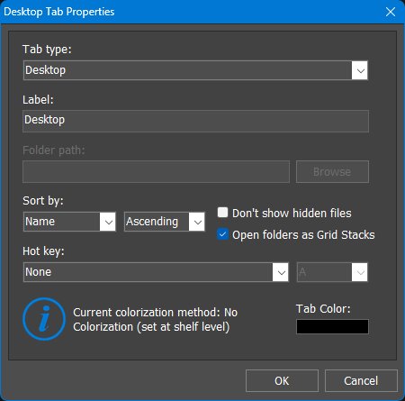
Right-click a Shelf, Drawer, or Grid Stack tab and choose Tab Properties to edit the selected tab. This dialog is the quickest way to change the tab type, label, folder path, sort order, hidden-file behavior, tab hot key, and tab color.
For Folder tabs, the Browse button selects the folder shown by the tab. The Sort by control determines how folder contents are ordered. The Open folders as Grid Stacks option makes folders open as Grid Stack pop-ups instead of opening directly in File Explorer, which is useful for browsing nested folders without leaving the Winstep environment.
The lower part of the dialog shows the current Shelf, Drawer, or Grid Stack tab colorization method, as set in the Appearance tab of the object's Properties dialog, and lets you choose an individual Tab Color. The color is applied only when tab colorization is enabled, using the currently selected colorization method.
10.10 Opening Shelf Properties
You can open the Shelf Properties dialog for a specific Shelf from any of that Shelf's context menus. The same dialog can also be opened from the Docks & Shelves tab in the main Preferences window.
Clicking the Shelf's left mini-tab opens the main Preferences window, not the Shelf Properties dialog. This is an important distinction: the main Preferences window controls global WorkShelf settings, while Shelf Properties controls the selected Shelf.
11. Shelf Properties
The Shelf Properties panel configures one specific Shelf. Its main tabs are Content, Position, Behavior, Appearance, Effects, and Themes.
11.1 Content tab
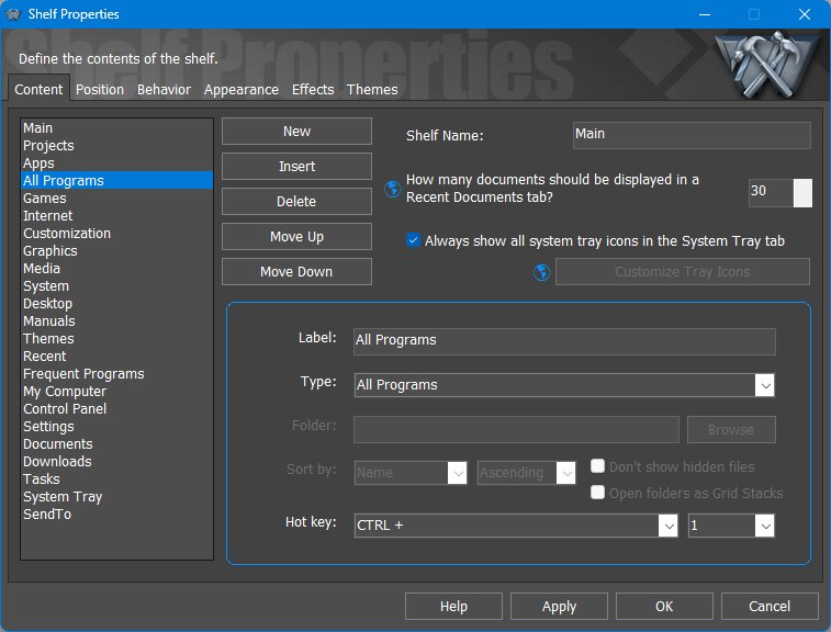
The Content tab defines the tabs that belong to the selected Shelf and what each tab displays.
The available Shelf tab types are described in the Working with Shelves introduction. The Content tab focuses on changing the selected tab's name, type, icon, and content source.
11.2 Position tab
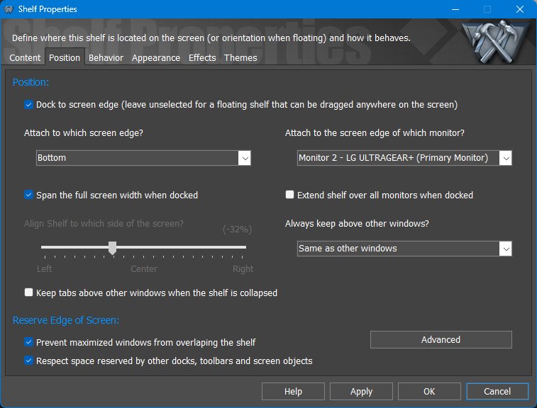
The Position tab determines whether the Shelf is docked to a screen edge or floats freely, which monitor it belongs to, how it interacts with other windows, and whether it reserves screen space.
A docked Shelf can be undocked by dragging it away from the screen edge. Move the mouse pointer near another edge, or back to the same edge, and the Shelf docks automatically to that edge.
Reserved-space gap
The Reserved-space gap dialog controls the gap between the collapsed Shelf and maximized windows when Prevent maximized windows from overlapping the shelf is enabled. The value is measured in pixels. Positive values leave extra space between the Shelf and maximized windows, while negative values allow maximized windows to move closer to, or slightly under, the Shelf edge.
Shelf and Dock themes often include drop shadows, glow effects, or semi-transparent borders around the main body. Although these pixels are technically part of the object, they can create the impression that maximized windows stop too far away from the visible edge. This setting lets you compensate for that by using a small negative value, or deliberately leave extra breathing room with a positive value. The value is measured in pixels and has a small range because it is intended only for fine-tuning the reserved space.
11.3 Behavior tab
The Behavior tab controls how the Shelf hides, activates, reacts to clicks and drag/drop operations, and handles sub-docks.
Auto-Hide Settings
Activation Settings
Sticky Tab
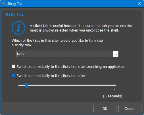
A sticky tab is a preferred tab that WorkShelf can automatically return to after certain actions or after a period of inactivity. This is useful when one tab should usually be the default view, such as Tasks, Main, or a frequently used application tab.
Advanced Behavior Settings
Sub-Docks
11.4 Appearance tab
The Appearance tab controls icon size, labels, tab placement, alignment, scaling, reflection, shadows, grid display, transparency, blur, colorization, and related visual options.
Because WorkShelf uses Per-Monitor High DPI Awareness v2, Shelf elements can scale appropriately on high-DPI and mixed-DPI monitor setups.
Advanced appearance / Shelf base
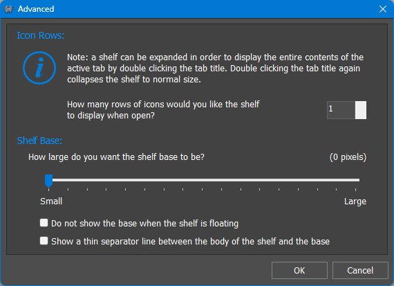
Icon Spacing
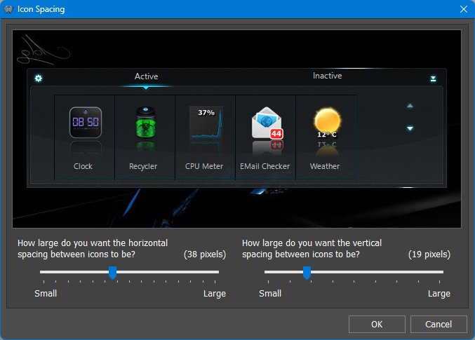
The Icon Spacing dialog adjusts the amount of space between icons. It provides two sliders: Vertical Icon Spacing and Horizontal Icon Spacing. Both values are measured in pixels. Increase the values to spread items farther apart, or decrease them for a more compact Shelf layout.
Tab Color Settings
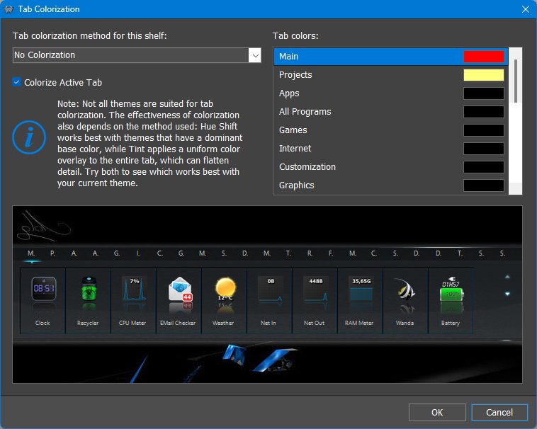
The Tab Color Settings dialog lets the user apply individual colors to the tab headers of the selected Shelf.
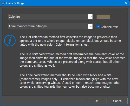
Different colorization methods work better with different themes. Hue shifting is useful when the theme has a clear base color, while tinting applies a more uniform color overlay. The best result depends on the selected Shelf theme and the tab artwork used by that theme.
Transparency
11.5 Effects tab
The Effects tab controls the visual effects and animations used by the selected Shelf. Effects can be assigned to common item actions, such as moving the pointer over an icon, launching an item, drawing attention to an item, or deleting an item.
11.6 Themes tab
The Themes tab lets the user select or preview the visual theme used by the selected Shelf. A per-Shelf theme fully overrides the global theme for that Shelf, and each Shelf can use a different theme.
When a new global theme is applied, all Shelves are normally reset to use the global theme. If the theme for a specific Shelf is locked, that Shelf keeps its current per-Shelf theme instead. The same per-object theme and lock behavior also applies to Docks.
12. Working with Drawers
A Drawer is a single-tab Shelf-style container. It combines some of the fast access of a Dock with the flexible content types of a Shelf, but without the full multi-tab Shelf interface. A Drawer can be docked to a screen edge or left floating, can auto-hide, can be activated by edge bump or edge swipe, and can display labels next to icons.
Unlike a Shelf, which shows one active tab at a time, a Drawer opens as a single container and can automatically expand to show all its contents, provided there is enough available screen space. Multiple Drawers can also be open at the same time and left open. If a Drawer contains more items than fit on screen, it can be scrolled to reach the remaining items.
Because Drawers share the same content model as Shelves, they can show normal shortcuts, folders, Desktop, Documents, Recent Documents, Control Panel, active tasks, the System Tray, and other supported tab types. Drawers can also be searched by typing, can use drag and drop, and can participate in nested Dock/Sub-Dock/Grid Stack structures.
When hidden, a Drawer collapses into a small tab instead of disappearing completely into the screen edge. This makes it easy to access manually, and Drawers can also reserve screen space so their collapsed tabs are not overlapped by maximized windows.
13. Drawer Properties
The Drawer Properties dialog uses the same main tabs as Shelf Properties: Content, Position, Behavior, Appearance, Effects, and Themes. The sections below focus on the Drawer-specific meaning of those pages.
13.1 Content tab
The Content tab defines the Drawer name and the single tab/content source used by the Drawer. It uses the same tab type system as Shelves, but a Drawer is presented as a single container rather than a row of multiple tabs.
13.2 Position tab
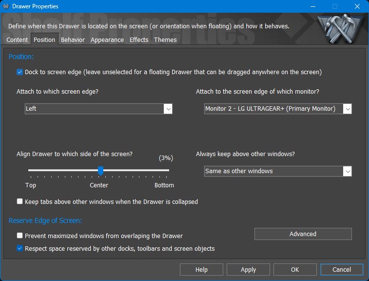
The Position tab controls whether the Drawer is docked to a screen edge or floating, which monitor and edge it uses, how it aligns along that edge, and whether collapsed tabs reserve screen space. Reserving screen space applies to the collapsed Drawer/tab area, not necessarily to the fully expanded Drawer.
13.3 Behavior tab
The Behavior tab controls auto-hide, edge activation, multiple-session handling, context menu detail, drag locking, and whether the Drawer remains visible when using Windows Show Desktop. Sub-Dock behavior for items inside the Drawer is configured through the Sub-Docks button.
13.4 Appearance tab
Drawer height can be fine tuned from the Icon Spacing dialog in the Drawer Appearance tab. Increasing or decreasing Vertical Icon Spacing changes how much vertical room each row uses, which effectively adjusts the Drawer height and visual density.
The Appearance tab controls icon size, reflections, drop shadows, label placement, tab position, spacing, colors, transparency, blur, scaling, and menu scaling. Drawers also support floating labels, which are useful when you want labels to appear outside the Drawer on mouseover.
13.5 Effects tab
The Effects tab controls visual feedback for mouseover, launch, attention, and delete actions, plus optional water ripple and raindrop effects when clicking the Drawer.
13.6 Themes tab
If the object theme is locked, applying a new global theme will not change this object. This makes it possible to keep a Dock, Shelf, Drawer, Grid Stack, Launch Pad, or module using a different theme from the rest of the desktop.
The Themes tab lets each Drawer use its own theme and lock that theme so it is not replaced when a global theme is applied.
14. Working with Grid Stacks
A Grid Stack opens content as a compact pop-up grid. Grid Stacks are useful for browsing folders, system locations, programs, documents, and other content from Docks, Shelves, Drawers, menus, hotspots, or the NextSTART taskbar.
Grid Stacks are not limited to normal folders. Using the same content model as Shelves, they can also display virtual and system locations such as the Windows Desktop, Control Panel, Recent Documents, Applications, and other supported content types.
Folder-based Grid Stacks act as live views into the underlying folders. Files can be opened, added, removed, renamed, moved, or dragged in and out of the Grid Stack, with changes reflected immediately in the actual folder.
Folders inside a Grid Stack can open as additional Grid Stacks instead of Explorer windows, making it possible to browse a folder tree without opening File Explorer.
Grid Stacks normally open temporarily and close when dismissed. You can detach a Grid Stack and make it stay open by dragging it by its tab; a detachment sound plays to confirm the change. A detached Grid Stack can be closed by clicking its right mini-tab. Multiple Grid Stacks can be left open at the same time, which is useful when moving or copying files between locations.
14.1 Grid Stack tab ordering and sorting
Regular Grid Stack tabs can be manually arranged by dragging items. Folder-backed or system-based Grid Stack tabs are live views, so their contents are ordered through Sort options instead of arbitrary manual item placement.
Use Tab Properties from a Grid Stack tab context menu to change the tab type, label, folder path, sort method, hidden-file behavior, hot key, and tab color.
15. Grid Stack Properties
Grid Stack Properties contains Content, Appearance, Effects, and Themes. It is similar to a focused Shelf/Drawer configuration panel, but optimized for pop-up grid behavior.
15.1 Content tab
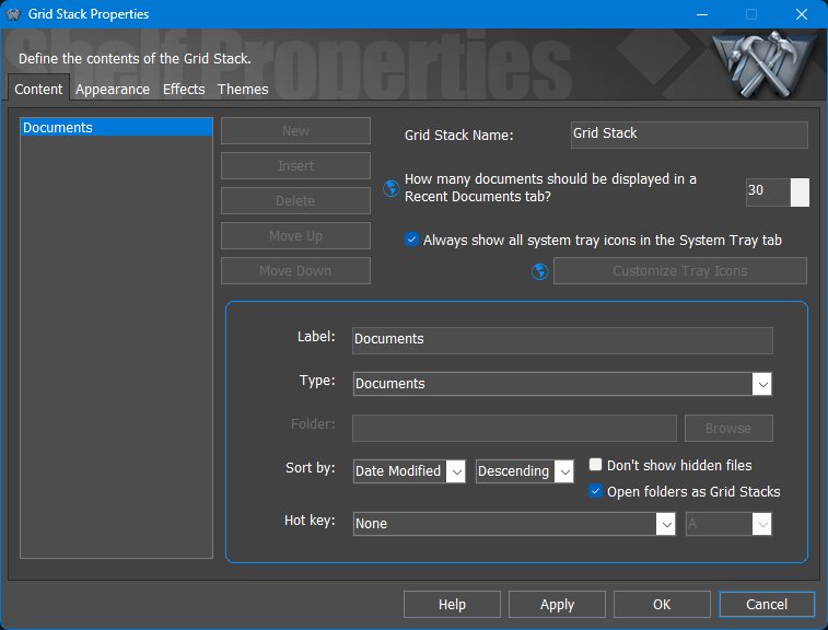
The Content tab selects what the Grid Stack displays. The Open folders as Grid Stacks option is central to the Grid Stack experience because it lets folders open as additional Grid Stack pop-ups instead of simply launching File Explorer.
Grid Stack tabs use the same Tab Properties dialog as Shelf tabs. Right-click a tab and choose Tab Properties to adjust sorting, folder path, hidden-file display, hot key, and tab color.
15.2 Appearance tab
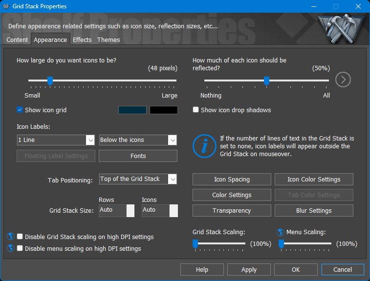
The Appearance tab controls icon size, reflections, icon grid display, labels, tab positioning, rows, columns, spacing, colors, transparency, blur, scaling, and menu scaling. Fixed row and icon counts can be used when you want a predictable grid size.
15.3 Effects tab
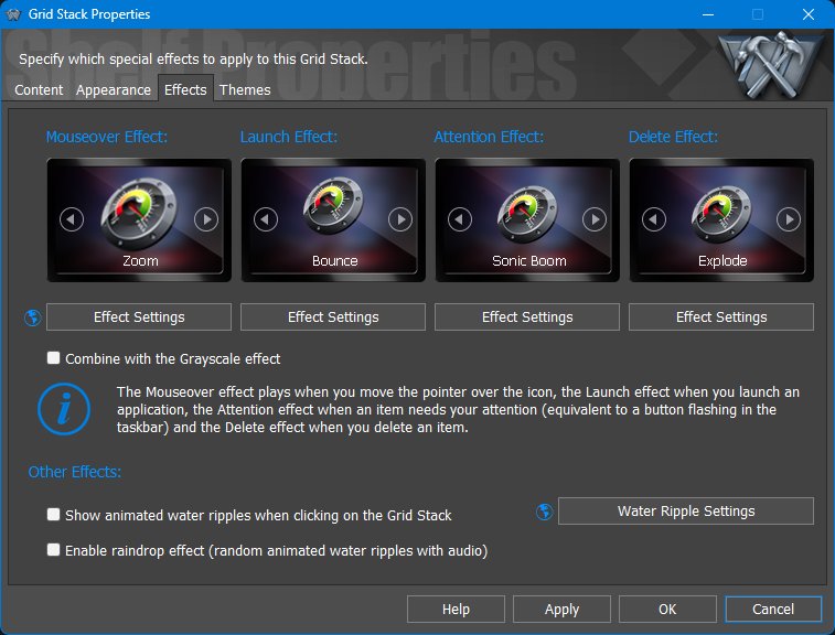
The Effects tab controls mouseover, launch, attention, and delete effects, plus water ripple and raindrop effects for Grid Stack clicks.
15.4 Themes tab
If the object theme is locked, applying a new global theme will not change this object. This makes it possible to keep a Dock, Shelf, Drawer, Grid Stack, Launch Pad, or module using a different theme from the rest of the desktop.
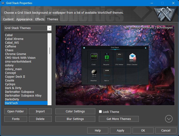
The Themes tab lets a Grid Stack use its own theme, including color settings, blur settings, fonts, and a lock option to protect that object theme from global theme changes.
16. Working with Launch Pads
A Launch Pad is a workflow launcher. It lets you launch multiple applications, folders, documents, URLs, and internal commands with a single click, making it possible to start an entire working environment at once.
A Launch Pad is similar in form to a Grid Stack, but it works differently. Instead of displaying the contents of a folder or system location, a Launch Pad contains a fixed set of shortcuts that are all executed together. Launch Pads are therefore limited to shortcut-based content and do not display dynamic or folder-based tab types.
Launch Pads can be added to Docks, Shelves, Drawers, and Grid Stacks. They expand automatically as items are dragged into them, making them quick to set up for repeated tasks.
Use Launch Pads for repeated work setups. Examples include opening a development workspace, launching customer support tools, opening design applications and project folders, starting a streaming setup, or preparing a group of documents and web pages for a recurring task.
Items launched from a Launch Pad follow the same multiple-instance rules as normal items. If the global Do not launch multiple sessions behavior is enabled, WorkShelf tries to use an already-running instance of the same application where appropriate. To allow a specific Launch Pad item to start a new instance instead, enable Allow Multiple Instances in that item's Properties dialog.
If one of the items in a Launch Pad must run elevated, enable Run as Administrator for that item in its Properties dialog. WorkShelf will then request the required elevation when launching the group.
17. Launch Pad Properties
Launch Pad Properties contains Appearance, Effects, and Themes. A Launch Pad is configured visually like a compact container, but its purpose is to launch a group of items together.
17.1 Appearance tab
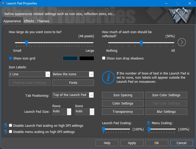
The Appearance tab controls icon size, reflections, the icon grid, icon labels, tab position, rows, icon count, spacing, colors, transparency, blur, Launch Pad scaling, and menu scaling.
17.2 Effects tab
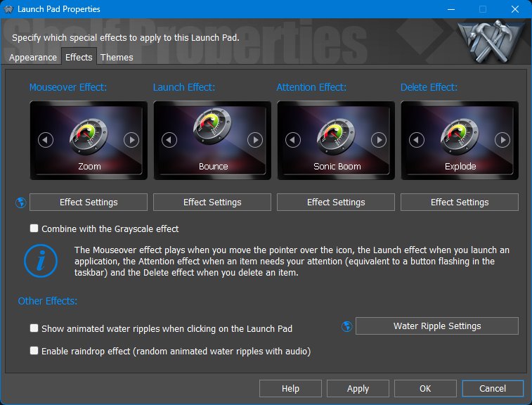
The Effects tab controls mouseover, launch, attention, and delete effects, plus optional click effects such as water ripple and raindrop.
17.3 Themes tab
If the object theme is locked, applying a new global theme will not change this object. This makes it possible to keep a Dock, Shelf, Drawer, Grid Stack, Launch Pad, or module using a different theme from the rest of the desktop.
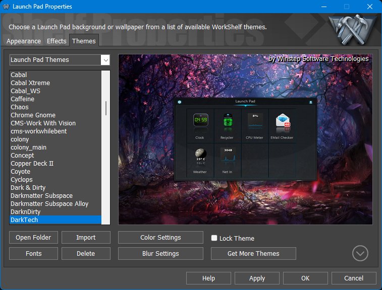
The Themes tab lets each Launch Pad use its own theme, fonts, colors, blur settings, and lock state.
18. Modules and Widgets
Modules are built-in WorkShelf mini-applications. They can appear as compact items inside Docks and Shelves and, in Winstep Xtreme, as larger skinnable desktop widgets. Modules are meant to be practical instruments, not just decorations. Depending on the module, they can monitor or show system activity, battery and UPS information, network activity, mail status, weather, time, disk information, recycle bin status or other useful desktop information.
The built-in modules are: Battery Monitor, Calendar, Clock, CPU Meter, Disk Meter, Email Checker, Moon Phase, Net Meter, RAM Meter, Recycler, Wanda and Weather Monitor. Each module has its own purpose, settings and context menu commands.
18.1 Module context menus
Module context menus are object-specific. A Battery Monitor item, for example, can open Battery Monitor Settings, Power Options, the power events log, battery information and event logging controls.
18.2 Iconic modules versus desktop widgets
Modules can appear in two different forms: as compact iconic modules inside Docks, Shelves and other containers, or as larger desktop widgets in Winstep Xtreme.
Iconic modules are designed to remain readable at icon sizes and usually provide two main styles, optional icon backgrounds, and focused per-module customization. They are best for compact, always-available status information or commands inside another object.
In desktop widget form, the same module can appear as a larger free-form skinnable desktop object. Desktop modules can show more detail, use richer skins, be scaled, made transparent, assigned their own theme, and positioned independently on the desktop or across monitors.
Desktop modules can be positioned precisely on the screen. Click a desktop module to select it, then use the arrow keys to move it one pixel at a time.
Choosing between the two forms depends on purpose: iconic modules are best for compact always-available status information, while desktop widgets are best when the user wants a larger at-a-glance display or a visual part of the desktop theme.
| Module form | Typical use | Examples |
|---|---|---|
| Iconic | Small, always-available status or command item inside another container. | Clock icon in a Dock, Battery in a Shelf, Disk Meter for one drive, Net Meter in a taskbar/module area. |
| Desktop widget | Larger skinnable display left on the desktop. | CPU, RAM and Net histograms, multi-drive Disk Meter, Weather display, animated Moon Calendar, Wanda swimming on the desktop. |
This difference explains why some settings appear in the global Modules tab while others are in the module's own settings panel. The global tab controls how the module is presented, whether the desktop version is shown, its size, transparency, desktop placement, colorization, sounds, animations, icon style and theme-related presentation. The module settings panel controls what the module actually monitors, announces, logs, displays, or does when it is clicked.
The sections below describe the settings and options available for each module, including related information panels, statistics, event logs and secondary dialogs where applicable.
18.3 Clock module
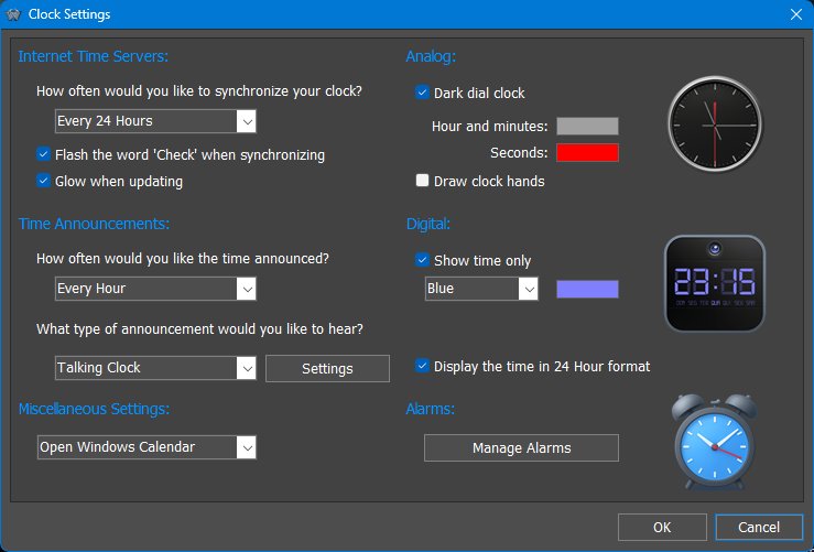
The Clock module shows the current time as either an analog or digital clock. It can synchronize the system clock with Internet time servers, announce the time using installed voice files, and provide access to alarms.
The iconic Clock module has two digital-style variants: one displays both a calendar and the time, while the other displays only the time. This lets the user choose between a more informative compact clock or a simpler time-only presentation.
What the Clock is useful for
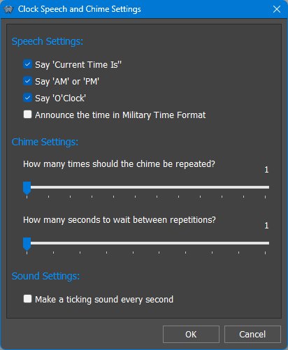
The Clock module is more than a visible clock. It can synchronize the system time with Internet time servers, announce the time using installed voice packs, obey a silent period so spoken announcements do not occur at night, and act as the entry point to the Alarm Manager.
Multiple Clock items can be configured with different time zones, making them useful for remote teams, family abroad, servers in another region, or customers in different countries. Daylight saving time is handled by the selected time zone rather than by manual offsets.
To show multiple time zones, add more than one Clock module item and configure each one separately. Right-click a Clock item, open its properties or settings, and use the time zone option to select the city or time zone that clock should display.
18.4 Calendar module
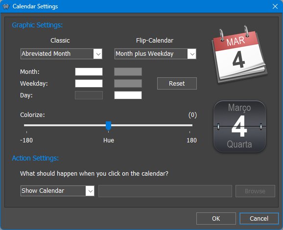
The Calendar module displays the current date as an iconic module and, in desktop widget form, can show a full calendar. The iconic Calendar can be customized to show different date information, use different colors, and perform a selected action when clicked.
Desktop Calendar behavior
In desktop widget form, the Calendar module can show a full calendar matching the current Calendar style, even when no separate desktop skin is available for it. Double-clicking the date returns the desktop calendar to the current month. Clicking the calendar arrows moves by month; holding SHIFT while clicking the arrows jumps by year.
Calendar and alarms
The Calendar module is also integrated with alarms. Days with alarm events are highlighted in the calendar, and hovering the mouse pointer over a day can show a tooltip describing the events for that day. Alarms can be added, edited, or deleted directly from the calendar by clicking the corresponding day.
What the Calendar is useful for
The Calendar module is useful both as a compact date display and as a quick front-end for the built-in calendar and alarms. It can show the current date in an iconic form, open a pop-up calendar, launch an external calendar application, and help manage alarm events directly from the calendar view.
18.5 Recycler module
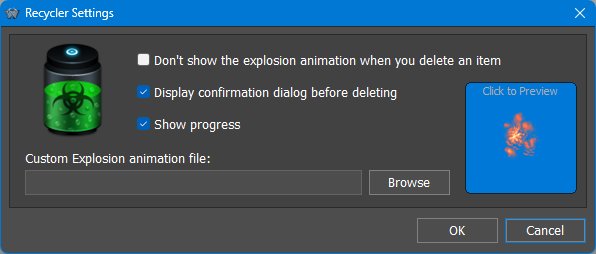
The Recycler module reflects the status of the Windows Recycle Bin and allows files, shortcuts, and compatible WorkShelf items to be deleted by dropping them onto the module.
18.6 CPU Meter module
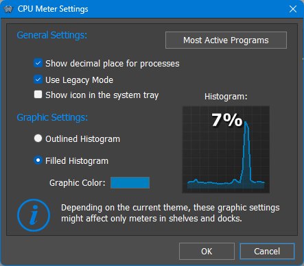
The CPU Meter module monitors processor activity. Depending on the selected module style, it can appear as a gauge, histogram, or other theme-provided CPU display. Clicking the module opens the Windows Task Manager, and hovering the mouse pointer over the module can show which application is currently using the most CPU.
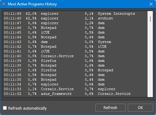
The Most Active Programs panel lists the two applications that have been using the most processor time over the last few minutes. This makes it easier to identify programs or background services that are consuming CPU resources.
CPU usage, cores and hyper-threading
CPU usage is calculated against the total processing capacity of the system, not against a single processor core. On a multi-core system, 100% CPU usage means that all available cores are fully busy. If hyper-threading is enabled, Windows treats the additional logical processors as part of that total capacity.
This means that a single-threaded program can be maxing out one core while still showing only a fraction of total CPU usage. For example, on a system with four physical cores and hyper-threading enabled, Windows sees eight logical processors. A process using one logical processor completely would therefore appear as roughly 12.5% of total CPU usage.
Multi-threaded programs can use more than one core at the same time, so they can show higher CPU percentages. This is why the same percentage can mean different things on different computers: it depends on how many physical and logical processors the system has.
Desktop CPU Meter
In Winstep Xtreme, the desktop version of the CPU Meter can show a larger CPU display. Depending on the current theme, it may also show a list of the current top CPU-consuming programs, updated automatically.
What the CPU Meter is useful for
The CPU Meter is useful for keeping an eye on overall processor activity and for quickly spotting programs that are consuming too much CPU. It can provide a compact always-visible activity meter inside a Dock or Shelf, a larger desktop monitor in widget form, and quick access to both Task Manager and the Most Active Programs panel.
Interpreting CPU usage
The CPU Meter is useful for detecting CPU-heavy applications at a glance. On multi-core and Hyper-Threaded systems, a single process using one core at full speed may only appear as a fraction of total CPU because total usage is divided across all logical cores. For example, on an 8-logical-core system, a process saturating one logical core appears around 12.5% CPU.
The desktop version can show top CPU users, and the Most Active Programs view helps identify applications that have been consuming CPU over time rather than only at the current instant.
Understanding CPU percentages on modern processors
CPU usage numbers are normalized across all logical processors. On a CPU with multiple cores and Hyper-Threading, a single-threaded program that fully occupies one logical core may show only a fraction of total CPU usage, because 100% means all cores/logical processors are fully busy. The "Most Active Programs" view is useful because it tells you which applications have been consuming the most CPU over a recent period, not just at the instant you look.
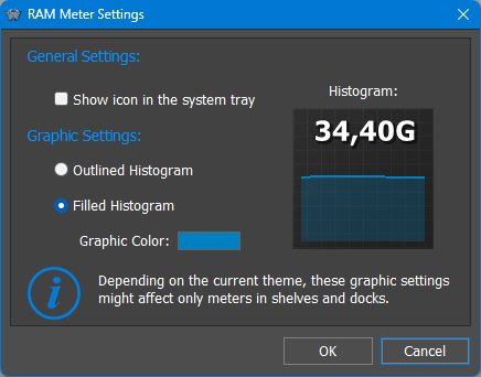
18.7 RAM Meter module
The RAM Meter shows current memory usage and related memory statistics.
Iconic versus desktop RAM display
The RAM Meter can be used as a compact iconic meter for at-a-glance memory pressure or as a desktop widget that, depending on the theme, can show top memory-using processes. Histogram-style displays are useful for seeing memory trends over time, while bar-style displays are better for quick current load checks.
18.8 Net Meter module
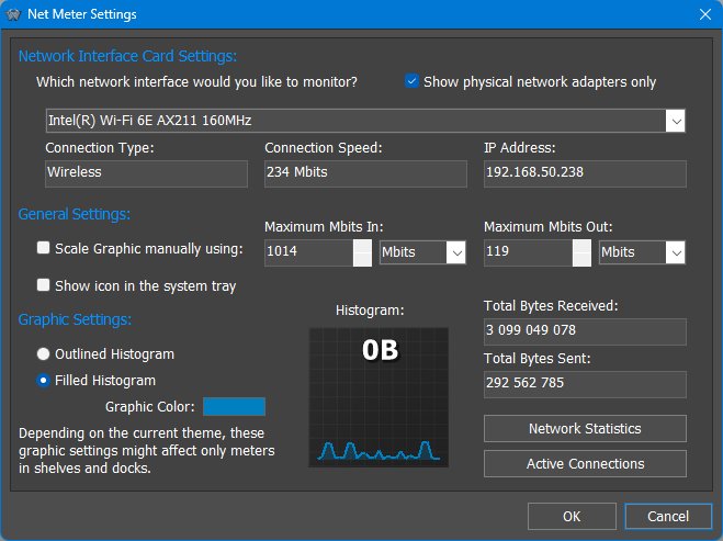
The Net Meter module monitors bandwidth usage through a selected network adapter. It shows incoming and outgoing traffic and is normally used to monitor Internet activity, but it can also be used to watch any available network interface.
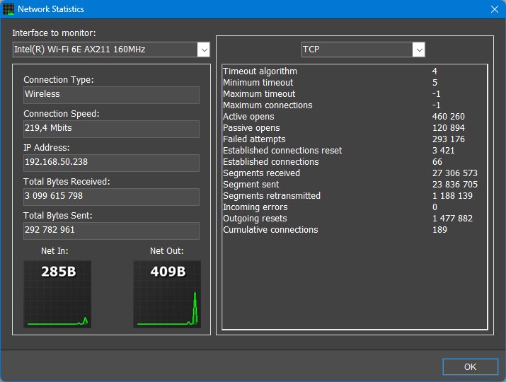
The Network Statistics panel displays protocol statistics for the network interface currently being monitored, including TCP, IP, UDP, ICMP In and ICMP Out information.
The Active Network Connections panel displays current TCP and UDP connections, together with information about each connection and the process that owns it. It can be accessed from the Net Meter context menu, and can also be opened by double-clicking the desktop Net Meter module.
The connection list can be sorted in ascending or descending order by clicking the column headers. Columns can be resized by dragging the vertical edges of the column headers, and multiple connections can be selected with the SHIFT or CTRL keys.
New connections appear in green and terminated connections appear in red, making changes easier to follow while the panel is open. Right-clicking a connection opens a context menu with commands to show information about the process, close the connection, terminate the owning process, perform a WHOIS lookup on the remote host, or copy connection information to the clipboard.
The Active Connections panel is resizable, remembers its last size, and can be minimized or left running on the desktop without interfering with other Winstep items.
What the Net Meter is useful for
The Net Meter is useful both as a bandwidth gauge and as a network diagnostic tool. It can show how much data is moving through a selected adapter, provide TCP/IP statistics, and help identify which applications are currently using the Internet or local network. This can be useful when diagnosing unexpected traffic, checking whether a program is communicating over the network, or investigating suspicious background activity.
18.9 Email Checker module
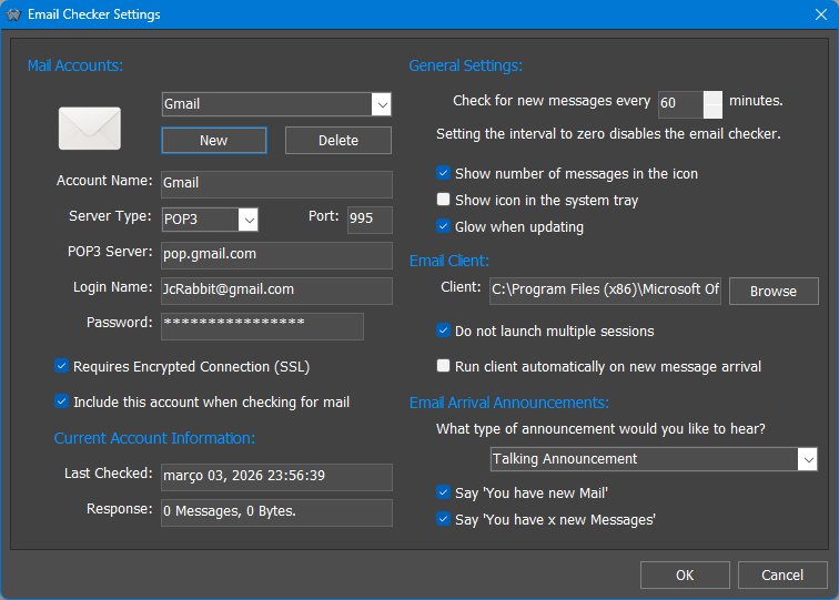
The Email Checker module monitors one or more POP3 or IMAP mail accounts and reports the number of pending messages. It can show new-mail status visually, optionally place an icon in the Windows notification area, launch a configured mail client, and announce new mail using installed voice files.
What the Email Checker reports
The Email Checker is a monitor, not a full email client. It asks the configured POP3 or IMAP server how many messages are waiting and reports that count. It can also report the total size of pending messages when that information is available from the server.
Because the module only asks the server how many messages are pending retrieval, it does not know which of those messages the user has already read if they remain on the server. It keeps its own counter so it can notify the user when the server count increases. The notification reports the total number of messages still on the server, not only the number of messages that arrived since the previous notification.
The internal counter is reset when the number of messages on the server becomes lower than the stored count, which usually means mail has been retrieved, or when the user launches the configured email client from the module.
What the Email Checker is useful for
The Email Checker is useful for traditional POP3 or IMAP mail accounts that still allow the authentication methods supported by the module. It can provide a compact new-mail indicator inside a Dock, Shelf or desktop module, announce new mail by voice, and act as a quick launcher for the user's preferred desktop mail program.
18.10 Weather module
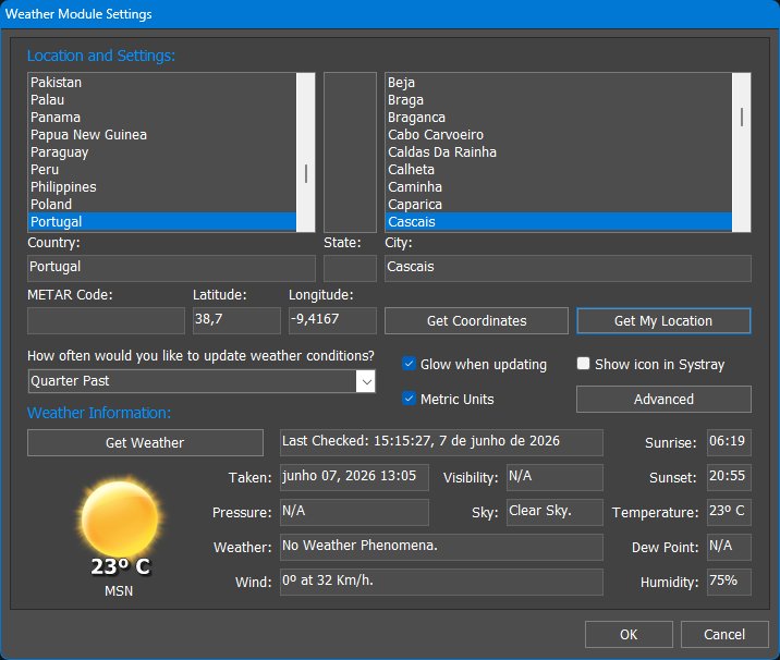
The Weather module displays current weather conditions for a selected location. Modern versions use geographic coordinates and provider fallback logic so the selected location, local time, sunrise/sunset, and day/night icons can be handled accurately.
Location and forecast behavior
The Weather module is designed to configure itself automatically on first run using GeoIP location detection, while still allowing the user to change the location manually. Modern versions use latitude/longitude and multiple weather providers, improving worldwide coverage, local time handling, sunrise/sunset calculations, and day/night icon correctness.
Coordinate-based weather and fallback providers
Modern WorkShelf weather handling is coordinate-based rather than tied to legacy provider-specific weather codes. Locations are stored and matched using latitude/longitude coordinates, and the module can use backup feeds if the primary provider is unavailable. Timezone and daylight-saving rules are applied to the selected location, improving local forecast dates, observation timestamps, sunrise/sunset values, and day/night icon selection.
18.11 Battery Monitor module
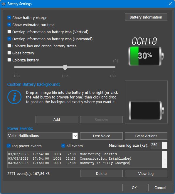
The Battery Monitor shows battery or UPS charge, estimated runtime, and power state. It is especially useful on laptops and systems connected to a supported UPS.
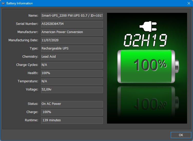
The Battery Information dialog shows hardware and status details such as name, serial number, manufacturer, manufacturing date, battery type, chemistry, charge cycles, health, temperature, voltage, power status, charge level, and estimated runtime.
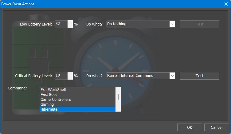
The Battery Events dialog lets users define what should happen at low and critical battery thresholds. Actions can include doing nothing or running an internal command, making this panel important for laptop and UPS safety behavior.
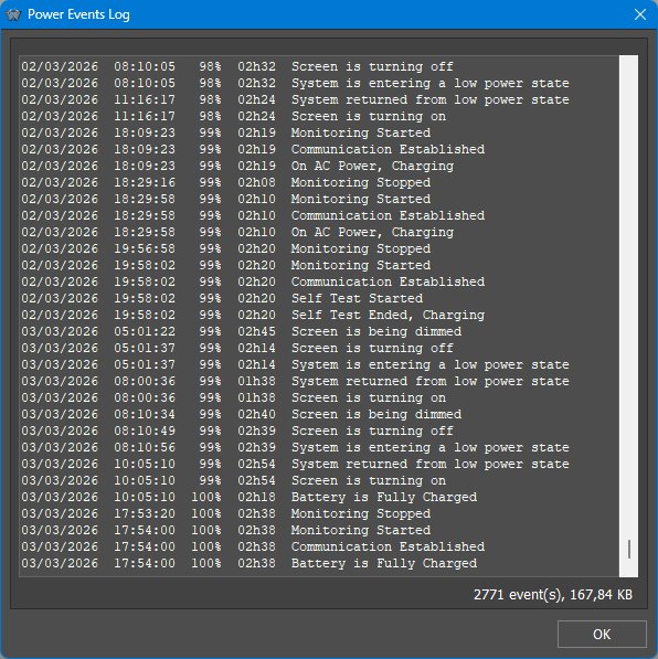
The Power Log records battery and power events such as monitoring start/stop, communication with a UPS, AC power/charging state, full charge, screen dim/off events, low power state entry, and return from low power state.
Power event actions and UPS use
The Battery Monitor is especially important for laptops and systems connected to a UPS. It can show current charge or estimated runtime, display detailed battery information, log power events, and issue voice or sound notifications for power status changes.
The Power Event Actions dialog is one of the most important parts of this module. At low or critical battery thresholds, the module can do nothing, display a warning, play a sound, run a program, or execute an internal command such as Sleep or Hibernate. This is useful for laptops, but it is also useful for UPS setups: if one UPS powers multiple computers but only one PC is connected to the UPS data cable, that monitored PC can run a program or batch file to shut down the other computers over the network.
18.12 Moon Phase module
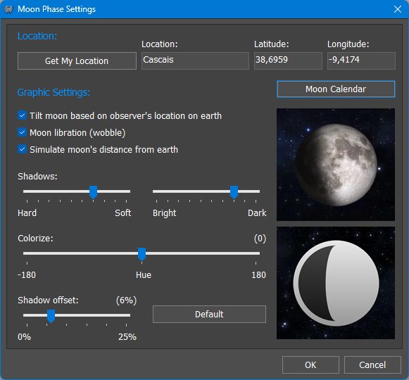
The Moon Phase module displays the current phase of the Moon. It can be shown as an iconic module or, in desktop widget form, as a larger animated moon display. The module can also open the Moon Calendar, which shows moon phases, phase dates, astronomical information, moonrise and moonset times, zodiac information, and animated changes over time.
The Moon Phase module is available in two main iconic styles: Realistic and Cartoon. Additional customization may be available through the module style, theme resources, alternate full moon images, animated icons, and the module's graphic settings.
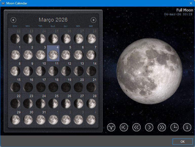
The Moon Calendar shows a month view with moon phases and phase dates. Clicking a day shows the phase, tilt, and relative distance from Earth for that date. The forward and back buttons move one day at a time, while the rewind/current-day button returns the calendar to the current day.
Pressing the Play button animates the calendar through time, making it possible to watch the Moon change phase, tilt, wobble, and apparent distance as the days pass.
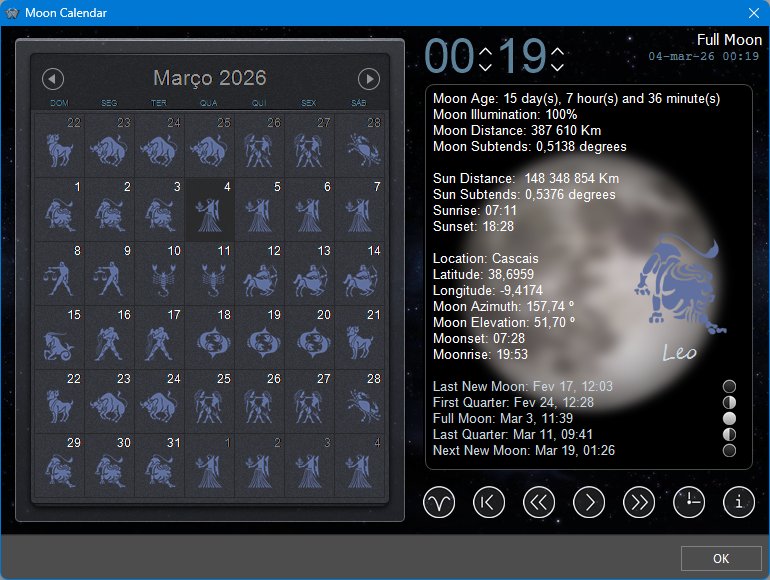
The Information view shows detailed astronomical data for the selected date, including moon age, illumination, distance, apparent size, sun and moon data, moonrise and moonset times, and upcoming lunar phase dates. The Time button allows the same information to be calculated for a specific hour and minute.
When the information panel is open, clicking the small phase moons jumps directly to the date of the selected phase. The Zodiac view changes the calendar display to show the zodiac sign associated with the Moon on each day.
Why location matters
The Moon does not look exactly the same from every place on Earth. For example, the Moon appears inverted between the Northern and Southern hemispheres. The Moon also wobbles slightly as it orbits Earth and is not always at the same distance. The Moon Phase module uses the selected latitude and longitude to calculate the apparent tilt, sky position, rise and set times, and other location-dependent information for the selected date and time.
What the Moon Phase module is useful for
The Moon Phase module is useful both as a decorative moon display and as a practical lunar calendar. It can show the current moon phase at a glance, animate the Moon through time, jump directly to important lunar phases, display moonrise and moonset information, and provide detailed astronomical data for a selected date and location.
18.13 Disk Meter module
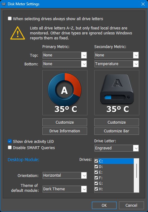
The Disk Meter module monitors selected drives and can show capacity, free space, drive activity, temperature, health and other drive information, depending on the drive, controller, available SMART data, and selected module style.
The Customize Icons dialog lets users assign or adjust the graphics used by the Disk Meter for specific drive types or states. This allows the Disk Meter to better match the current Dock, Shelf or desktop theme.
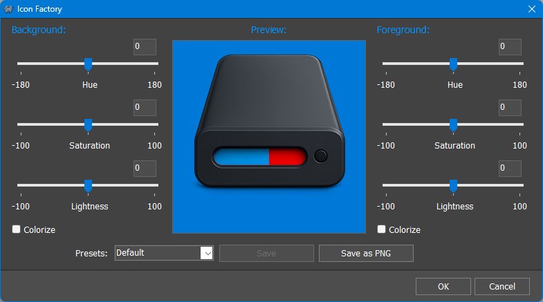
The Disk Information dialog shows detailed drive and volume information such as volume name, serial number, file system, drive type, total size, used and free space, sector and cluster information, SMART availability, interface, health, temperature, and model information when available.
Iconic and desktop Disk Meter behavior
The Disk Meter is a good example of the difference between iconic and desktop modules. The iconic version is designed for compact monitoring of one selected drive, with overlays or indicators for used/free space, activity, temperature or health information depending on the selected style. The desktop version can monitor multiple fixed drives at once and show richer capacity, activity and health information.
The Disk Information dialog provides a more complete view when the compact icon is not enough. Modern Disk Meter styles can display used/free space, read/write activity, drive model information, temperature, and SSD wear or health information where this data is available through SMART.
What the Disk Meter is useful for
The Disk Meter is useful for keeping an eye on drive capacity, activity and health from a compact module or larger desktop display. It can show when a drive is filling up, whether a drive is being accessed, and, when supported by the hardware, temperature and health information that may help identify problems early.
18.14 Wanda module
Wanda is the fortune-cookie/fish module. It can display short sayings from local files, optionally retrieve or use different collections, and animate the fish on the desktop.
What Wanda is for
Wanda is intentionally different from the system-monitoring modules. It is a fun desktop companion that displays fortune-cookie style messages, can use custom cookie files, and in desktop form can swim around and react to the mouse pointer.
Desktop Wanda behavior
In desktop form Wanda can be more than a static fish graphic. It can swim around the desktop and can be configured to react to the mouse pointer, including trying to swim away from it. Different fish types can be selected, making Wanda one of the more playful and personalizable modules.
Like other modules, Wanda can also be used in iconic form inside a Dock or Shelf, or as a larger desktop module when the user wants the animation and fortune-cookie behavior to be visible on the desktop.
19. Internal Commands
Internal Commands are special built-in commands that can be added as shortcuts to Docks, Shelf tabs, Drawers, Grid Stacks, Launch Pads, NextSTART menus, hotspots, the Winstep taskbar, and other supported Winstep objects. They perform Winstep actions, Windows actions, media actions, power actions, and utility tasks without requiring an external program shortcut.
Internal Commands can turn Winstep objects into personal command panels: one click to open Preferences, empty the Recycle Bin, show the Windows Start Menu, capture the desktop, open the Alarm Manager, switch Power Saving Mode, control media playback, power off the monitor, or run shutdown, sleep and restart actions.
To add one, right-click a Dock, Shelf tab, Drawer, Grid Stack, Launch Pad or compatible menu and choose Insert New Item, then Internal Command. Internal Commands are normally grouped into categories such as Application, Desktop, Media, Disc, Misc, System, and Shutdown.
19.1 Internal Command groups
Internal Commands are organized into groups to make them easier to find when inserting a new command. The table below summarizes the main groups and the kind of commands they contain.
| Command group | Examples | Purpose |
|---|---|---|
| Application | Preferences, Help, Version Info, Check for Updates, Backup Settings, Restore Settings, Exit, Restart | Control or maintain the Winstep application itself. |
| Desktop | Show Desktop, Hide All, Hide/Show Desktop Icons, Reset Reserved Screen Space, Minimize All Windows, Restore All Windows | Manage the Windows desktop, desktop icons, WorkShelf objects, and window arrangement. |
| Media | Media Player, Media Play, Media Pause, Media Stop, Media Next, Media Previous, Media Mute, Volume Up/Down | Play audio with the built-in Media Player or send media-control commands. |
| Disc | CD Control | Monitor removable optical media and open/close a drive tray where supported. |
| Misc | Alarm Manager, Capture Desktop, Language Bar, Lookup IP Address, Sleep Timer | Expose useful Winstep tools or convenience functions as clickable items. |
| System | Control Panel, Task Manager, Windows Settings, Power Options, Device Manager, Display Properties | Open Windows system panels and configuration dialogs. |
| Shutdown | Lock Computer, Log Off, Sleep, Hibernate, Restart Windows, Shutdown Windows | Perform session, power, and shutdown actions. |
19.2 Highlighted Internal Commands
Most Internal Commands are self-explanatory and are listed in the complete command table at the end of this chapter. The following commands are highlighted because they are especially useful, have their own settings panels, interact with other Winstep features, or need more explanation than a simple one-line description.
19.3 Alarm Manager
The Alarm Manager Internal Command opens Winstep's alarm and reminder system. It is more than a simple reminder list: it can show reminders, play audio files or playlists, run applications, and run other Internal Commands, which makes it useful as a lightweight task scheduler.
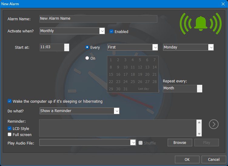
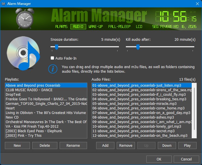
What the Alarm Manager is useful for
The Alarm Manager can be used for reminders, wake-up alarms, medication or break reminders, running a backup command, opening a program at a specific time, or starting a work routine. Because alarms can optionally wake the computer from sleep or hibernation and can use LCD-style full-screen reminders, it can be used both as a reminder system and as a simple personal automation tool.
19.4 Auto-Backup Settings
Auto-Backup Settings creates a backup of the current Winstep application settings in the Backups folder. Each backup is given a unique name, so existing backups are not overwritten.
This command is especially useful when combined with the Alarm Manager. You can create an alarm that runs Auto-Backup Settings on a regular schedule, for example once a month, so WorkShelf automatically creates periodic backups of your settings.
When Winstep Xtreme is installed, the command also instructs NextSTART, if it is currently running, to back up its settings as well. This gives you a recovery point if a configuration becomes damaged, or if you accidentally delete docks, shelves, drawers, modules, or other settings you later want to restore.
Automatic backups are not enabled by default because backup files are cumulative and older backups are not deleted automatically. Different users may also prefer different backup schedules, so WorkShelf leaves the schedule under your control.
19.5 CD Control
The CD Control Internal Command monitors a removable or optical drive. It can show at a glance what type of media is inserted and can open or close the drive tray when the hardware supports it.
19.6 Capture Desktop
Capture Desktop saves a screenshot of the desktop as a JPG or PNG file using an automatically generated filename. It is useful as a quick screenshot tool that can live directly on a Dock, Shelf, menu, Launch Pad, Grid Stack, Drawer, or hotspot.
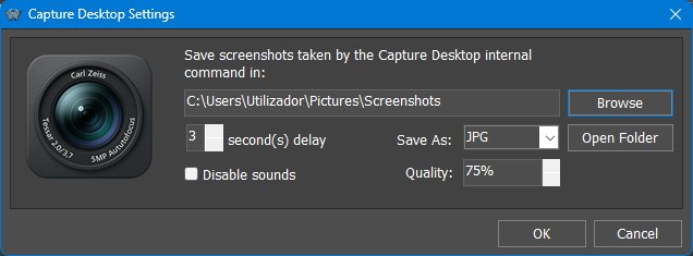
What Capture Desktop is useful for
Capture Desktop can become a one-click "save a screenshot to my screenshots folder" button. Because it is an Internal Command, it can be placed exactly where the user wants it instead of requiring a separate screenshot utility.
19.7 Check for Updates
The Check for Updates Internal Command launches the Winstep update check on demand. It complements the automatic Update Manager, which normally checks for updates periodically and helps download and install them when accepted.
Registered users are warned if the update being offered requires a newer license key than the one currently installed. Because it is an Internal Command, Check for Updates can be placed exactly where the user wants it: on a Dock, Shelf, menu, Launch Pad, hotspot, taskbar item, or other supported Winstep object.
19.8 Fast Boot
Fast Boot toggles the application's Fast Boot setting. Its purpose is to make the Winstep application available as early as possible after the Windows desktop appears, especially on Windows versions that delay third-party startup applications.
Because Fast Boot is a toggle for an application setting, users can enable it either from Preferences or by adding the Fast Boot Internal Command to a Dock or Shelf. Once enabled, the command item can be removed if the user no longer needs a visible shortcut for it.
19.9 Language Bar
The Language Bar Internal Command provides quick access to the current language/input settings and keyboard layouts. It can be placed in a Dock, Shelf, menu, or other supported Winstep location so users can switch input methods without relying on the standard Windows language bar.
19.10 Lookup IP Address
Lookup IP Address displays the system's public Internet IP address and GeoIP-derived location information, including latitude and longitude where available. The same general GeoIP concept is also used by WorkShelf to help determine the initial Weather module location.
What Lookup IP Address is useful for
Lookup IP Address is useful for quick diagnostics. It can show public IP-related information without opening a browser or command prompt. Users investigating network activity may also use it together with the Net Meter module and the Active Connections panel.
19.11 Media Control commands
The Media Control Internal Commands provide playback and volume shortcuts that can control compatible media players or Winstep's own built-in Media Player. These include Media Play, Media Pause, Media Stop, Media Previous, Media Next, Media Mute, Media Volume Down, and Media Volume Up.
19.12 Media Player
Media Player is an Internal Command, not a module. It provides a quick, unobtrusive way to play audio without opening a full media player application.
Clicking the Media Player item starts playback. Clicking it again opens a compact media control bar from which the user can pause, stop, skip tracks, adjust volume, and configure playback. When the control bar is open, the mouse wheel can adjust volume.
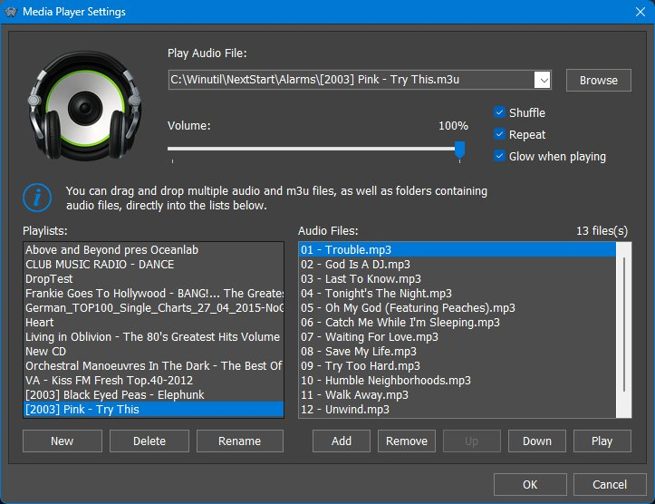
What Media Player is useful for
Media Player is intended for quick playback from a Winstep item without opening a full media player. It is also useful together with the Alarm Manager, where alarms can wake the computer and play a playlist as a wake-up alarm.
19.13 Power Saving Mode
Power Saving Mode toggles Winstep power saving between off, Normal, and Ultra. This Internal Command is the manual counterpart to the automatic Power Saving Settings available from the Advanced tab of Preferences.
Power Saving Mode is especially useful on laptops and tablets because animations, meter polling, live indicators, and frequent module updates consume CPU time and therefore battery power. Users can switch modes manually with this Internal Command, or allow WorkShelf to enable power saving automatically under conditions such as battery power, Windows Battery Saver, screen standby, or full-screen applications.
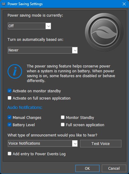
Normal Power Saving behavior
Normal mode reduces polling rates and disables non-essential animations while keeping the desktop responsive. Typical changes include slower module refreshes, reduced clock updates, disabled cosmetic animations, disabled smooth scrolling, slower network/statistics refreshes, reduced running-indicator refreshes, disabled dock/shelf/sub-dock animations, and reduced animated icon behavior.
| Normal mode change |
|---|
| Modules update once every 2 seconds instead of every second. |
| Clock module updates once per minute. |
| Analog clock stops displaying the seconds hand. |
| Clock stops synchronizing with Internet Time servers. |
| Clock stops announcing the time and/or playing the tick sound. |
| Wanda stops the swimming animation. |
| Wanda preview in the Wanda Settings dialog stops animating. |
| Rotating globe style of the Email Checker module stops rotating even if there is mail. |
| Smooth gauge needle animations are disabled. |
| Battery module charging animation is disabled. |
| Flip calendar day switching animation is disabled. |
| Moon module refreshes once per hour instead of every 3 minutes. |
| Moon preview animations in the Moon Module Settings dialog are disabled. |
| Star background in the Moon Calendar dialog stops moving. |
| Intermediate frames used to smooth moon animation in Play mode are disabled. |
| Moon phases/zodiac signs rotation animation in the Moon Calendar dialog is disabled. |
| Alarm Manager top header updates the time only every minute. |
| Alarm reminders update the time only every minute. |
| Battery preview in the Battery Settings dialog stops animating. |
| Glow animation in the Battery module Info dialog is disabled. |
| Text animation in the About tab of Preferences is disabled. |
| User interface slide animation is disabled. |
| Theme preview fade in/out animation is disabled. |
| Module preview animations in Preferences are disabled. |
| Network data in the Net Meter Settings dialog updates once every 2 seconds. |
| Network Statistics dialog updates once every 2 seconds instead of every second. |
| Network Active Connections dialog updates once every 2 seconds instead of every second. |
| Most Active Programs History dialog refreshes once every 2 seconds. |
| Performance data about running processes is retrieved once every 2 seconds. |
| Running indicators on docks refresh once every 2 seconds. |
| Shelf smooth scrolling is disabled. |
| Smooth icon shifting while dragging items over a Dock or Shelf is disabled. |
| Shelf hide and expand animations are disabled. |
| Sub-dock opening animations are disabled. |
| Dock hide and show animations are disabled. |
| New item rise animations are disabled. |
| Item removal animations are disabled. |
| Thumbnail/icon change fade in/out animations are disabled. |
| Animated icons set to animate permanently animate only on mouseover. |
| Animated icons no longer finish the animation when the mouse pointer moves away. |
| Water Ripple effect is disabled. |
| Rain Drop effect is disabled. |
| Rain Drop effect audio is disabled. |
| Menu and sub-menu opening animations are disabled. |
| Smooth text scrolling is disabled; scrolling text in desktop modules scrolls once per second. |
| Fast System Tray Refresh is disabled. |
| Pulsating icon effect on icons when audio is playing is disabled. |
| Flashing Pause symbol overlay when Media Player is paused becomes fixed. |
| Slide animations in the Effects Panel are disabled. |
| Effect slide animation in Effects tabs when clicking arrows is disabled. |
| Pause between effect repetitions in Effects tabs becomes 1200 ms instead of 600 ms. |
| Disk Meter stops refreshing drive activity LEDs. |
| Disk Meter previews in the Disk Meter Settings dialog stop animating. |
| Glow animation in the Disk Meter module Info dialog is disabled. |
Ultra Power Saving behavior
Ultra mode includes all Normal mode changes and adds more aggressive reductions:
| Ultra mode addition |
|---|
| All Normal power saving measures also apply. |
| Modules update every 4 seconds instead of every second. |
| Network data in the Net Meter Settings dialog updates once every 4 seconds. |
| Network Statistics dialog updates every 4 seconds instead of every second. |
| Network Active Connections dialog updates once every 4 seconds instead of every second. |
| Most Active Programs History dialog refreshes once every 4 seconds. |
| Performance data about running processes is retrieved once every 4 seconds. |
| Running indicators on docks refresh once every 4 seconds. |
| Animated icons no longer animate, not even on mouseover. |
| Launch Effect is disabled. |
| Mouseover effects combined with Magnify on docks are disabled. |
| Mouseover effects on the Shelf are disabled. |
| Pause between effect repetitions in Effects tabs becomes 2400 ms instead of 600 ms. |
19.14 Sleep Timer
The Sleep Timer Internal Command uses the Sleep tab of the Alarm Manager. It is designed for users who want to fall asleep while listening to audio: a full-screen clock display appears, then volume and brightness gradually decrease until the timer ends.
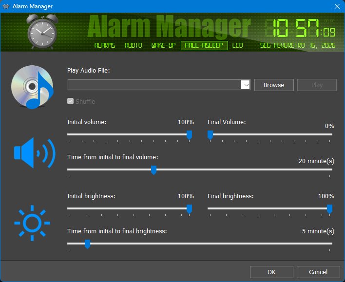
When the timer ends, the display closes. The Sleep Timer therefore complements the wake-up/alarm features: Alarm Manager can start or remind; Sleep Timer helps wind down.
19.15 Command arguments and item settings
Some Internal Commands need arguments or have their own settings panels. For example, CD Control needs to know which drive to monitor, Capture Desktop has image format and delay settings, and Media Player uses playlist/audio settings. These are configured through the item's Properties dialog or through the command's own settings panel where available.
Because Internal Commands are still WorkShelf/Nexus items, they can also use normal item-level features such as labels, icons, tooltips, hotkeys, item positioning, and per-item customization.
19.16 Complete Internal Command list
The highlighted commands described above are only a selection of the most useful or more complex Internal Commands. Many other commands are simple one-click shortcuts to Windows panels, Winstep actions, desktop actions, media controls, shutdown/power operations, or application maintenance commands.
The table below lists the Internal Commands available from the Winstep Internal Commands reference. Some command names are application-aware; in WorkShelf or Winstep Xtreme documentation, [Application] means the current Winstep application.
| Command | What it does |
|---|---|
| Action Center | Opens the Windows Action Center panel. |
| Accounts | Opens the Windows Accounts settings page. |
| Activate All | Activates all Winstep objects and brings them to the foreground. |
| Add New Hardware | Opens the Windows Device Manager dialog. |
| Add New Printer | Opens the Windows Add Printer dialog. |
| Add-Remove Programs | Opens the Windows Programs and Features dialog. |
| Alarm Manager | Opens the Winstep Alarm Manager dialog. |
| Apps | Opens the Windows Apps settings page. |
| Auto-Backup Settings | Opens the automatic backup settings for Winstep application settings. Can be combined with Alarm Manager to schedule periodic settings backups. |
| Backup [Application] Settings | Backs up the application settings. |
| Bring [Application] Forward | Brings all application-related objects to the foreground. |
| CD Control | Shows inserted media type and opens or closes the selected optical drive tray when supported. |
| Capture Desktop | Saves a screenshot of the desktop as a JPG or PNG file. |
| Cascade Windows | Cascades all open windows. |
| Check for Updates | Checks whether a newer version of the application is available. |
| Clear Recent Documents | Clears the Windows Recent Documents list. |
| Connect to the Internet | Initiates a dial-up connection. |
| Control Panel | Opens the Windows Control Panel. |
| Date & Time Properties | Opens the Windows Date and Time dialog or settings page. |
| Devices | Opens the Windows Devices settings page. |
| Disconnect Modem | Terminates a dial-up connection. |
| Display Properties | Opens the Windows Display Properties or Personalization dialog. |
| Ease of Access | Opens the Windows Ease of Access settings page. |
| Empty Recycle Bin | Empties the contents of the Recycle Bin. |
| Exit Winstep Xtreme | Exits all Winstep Xtreme applications after confirmation. |
| Exit [Application] | Exits the application after confirmation. |
| Fast Boot | Toggles Fast Boot, allowing the application to start as early as possible after the Windows desktop appears. |
| Game Controllers | Opens the Windows Game Controllers dialog. |
| Gaming | Opens the Windows Gaming settings page. |
| Hibernate | Hibernates the computer. |
| Hide All | Hides all docks, fades out open desktop modules, and collapses the Shelf. |
| Hide Desktop Icons | Hides all desktop icons. |
| Hide Taskbar | Hides the Windows taskbar. |
| Hide/Show Desktop Icons | Toggles the visibility of desktop icons. |
| Hide/Show Taskbar | Toggles the visibility of the Windows taskbar. |
| Internet Options | Opens the Windows Internet Properties dialog. |
| Keyboard | Opens the Windows Keyboard Properties dialog. |
| Language Bar | Displays and switches current language and input methods. |
| Lock Computer | Displays the Windows login screen. |
| Log Off | Logs off the current user after confirmation. |
| Lookup IP Address | Shows the external IP address and geographical location information. |
| Media Mute | Mutes or unmutes the sound volume. |
| Media Next | Skips to the next track when supported. |
| Media Pause | Pauses the current track or video when supported. |
| Media Play | Starts or resumes media playback when supported. |
| Media Player | Runs the built-in Winstep Media Player. |
| Media Previous | Skips to the previous track when supported. |
| Media Stop | Stops media playback when supported. |
| Media Volume Down | Lowers media volume when supported. |
| Media Volume Up | Increases media volume when supported. |
| Minimize All Windows | Minimizes all open windows. |
| More Themes | Opens the Winstep Themes page in the default browser. |
| Mouse Properties | Opens the Windows Mouse Properties dialog. |
| Multimedia Properties | Opens the Windows Sound dialog. |
| My Computer | Opens My Computer / This PC showing disk drives. |
| Network & Internet | Opens the Windows Network & Internet settings page. |
| Network Neighbourhood | Opens the Windows Network Neighborhood / Network location. |
| Network Properties | Opens the Windows Network Connections dialog. |
| ODBC32 Data Admin. | Opens the Windows ODBC Data Source Administrator dialog. |
| Peek Desktop | Uses Aero Peek to preview the desktop where supported. |
| Personalization | Opens the Windows Personalization settings page. |
| Phone | Opens the Windows Phone settings page where available. |
| Power Management | Opens the Windows Power Options dialog. |
| Power Off Monitor | Powers off all monitors. |
| Power Options | Opens the Windows Power Options settings page. |
| Power Saving Mode | Toggles Winstep power saving mode: None, Normal, or Ultra. |
| Printers | Opens the Windows Printers dialog or settings page. |
| Privacy | Opens the Windows Privacy settings page. |
| Quick Exit Winstep Xtreme | Exits all Winstep Xtreme applications without confirmation. |
| Quick Exit [Application] | Exits the application without confirmation. |
| Quick Log Off | Logs off the current user without confirmation. |
| Quick Restart Windows | Restarts Windows without confirmation. |
| Quick Shutdown Windows | Shuts down the system without confirmation. |
| Recycle Bin | Shows the contents of the Recycle Bin. |
| Regional Settings | Opens the Windows Regional Settings dialog. |
| Restart [Application] | Exits and restarts the application without confirmation. |
| Restart Windows | Restarts Windows after confirmation. |
| Reset Reserved Screen Space | Resets edge areas reserved so maximized windows do not overlap Winstep objects. |
| Restore All Windows | Restores all minimized windows. |
| Restore Wallpaper | Restores the wallpaper used before a Winstep theme changed it. |
| Restore [Application] Settings | Restores the application settings. |
| Run | Opens the Windows Run dialog. |
| Search | Opens the Windows Search dialog or search interface. |
| Search Settings | Opens the Windows Search settings page. |
| Show Desktop | Hides all open windows, equivalent to pressing Win+D. |
| Show Desktop Folder | Opens the contents of the desktop in a Windows folder. |
| Show Desktop Icons | Shows desktop icons if previously hidden. |
| Show Fonts | Opens the Windows Fonts dialog or settings page. |
| Show Taskbar | Shows the Windows taskbar if previously hidden. |
| Show Tip of the Day | Opens the Tip of the Day dialog. |
| Show Volume Control | Opens the Windows Volume Mixer control. |
| Show Windows Side by Side | Shows all open windows side by side. |
| Show Windows Stacked | Stacks all open windows. |
| Show/Hide Desktop Modules | Toggles visibility of desktop modules in Winstep Xtreme. |
| Shutdown Windows | Shuts down the system after confirmation. |
| Sleep | Makes the computer enter Sleep mode. |
| Sleep Timer | Opens the full-screen sleep timer alarm. |
| Sounds | Opens the Windows Sound dialog. |
| Start Flip3D | Invokes Windows Flip3D where supported. |
| Start Menu | Opens the Windows Start Menu. |
| Start Screen-Saver | Runs the configured screen saver. |
| System | Opens the Windows System/About settings page. |
| System Properties | Opens the Windows System Properties dialog. |
| Task Manager | Opens Windows Task Manager. |
| Task View | Opens the Windows Task View / Virtual Desktop manager. |
| Telephony Properties | Opens the Windows Phone and Modem dialog. |
| Time & Language | Opens the Windows Time & Language settings page. |
| Version Info | Opens the Version Info dialog for the application. |
| WinAmp Preferences | Opens WinAmp Preferences if WinAmp is running. |
| WinAmp Show Equalizer | Opens the WinAmp Equalizer if WinAmp is running. |
| WinAmp Show Playlist | Opens the WinAmp Playlist if WinAmp is running. |
| Windows Help | Shows the Windows Help dialog where available. |
| Windows Settings | Opens the Windows Settings app. |
| Windows Update | Opens the Windows Update settings page. |
| [Application] Help | Opens the Help file for the current Winstep application. |
| [Application] Preferences | Opens the Preferences screen of the current Winstep application. |
20. Themes, appearance, and effects
20.1 Theme loading details
Theme loading can affect more than colors and backgrounds. Themes can include fonts, module artwork, sound schemes, voice schemes and object-specific images. Theme options let you decide whether the current wallpaper, sound scheme, module icons, module themes or NextSTART integration should change when a new theme is applied.
Because desktop module sizes and shapes vary from theme to theme, automatic desktop-module alignment is useful after changing themes: it helps keep modules visible and avoids overlaps or partly off-screen widgets.
20.2 Theme options and integration
Theme changes may also change the icon used by some iconic modules, normally the Clock and Recycler, when the selected theme provides alternate images for those modules. This can be disabled with the Allow themes to change module icons option in the Theme Options dialog.
20.3 Theme colorization presets

Theme colorization is not limited to the underlying colorization method such as tinting or hue shifting. The Theme colorization controls can also decide where the color comes from. Available choices include No Colorization, Colorize, Colorize with dominant color of desktop background, and Colorize with Windows Accent color.
Manual colorization is useful when the user wants a specific theme color. Dominant-background colorization helps the theme blend automatically with the current wallpaper. Windows Accent colorization follows the accent color selected in Windows, making Winstep objects feel consistent with the rest of the desktop.
20.4 Theme colorization in practice
Theme colorization can be used in two layers: the method used to alter theme graphics, and the source of the color. Methods include approaches such as shifting hues, tinting, or toning monochrome bitmaps. The color source can be manual, derived from the dominant color of the desktop background, or taken from the Windows accent color.
Dominant-background and Windows-accent modes are especially useful for users who change wallpapers or Windows themes often and want Winstep objects to follow the rest of the desktop automatically. Manual colorization is better when building a stable custom theme around a fixed color palette.
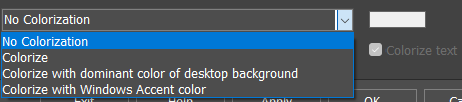
20.5 Effects as feedback, not only decoration
Effects should be documented as interaction feedback as well as visual polish. Mouseover effects tell the user which item is under the pointer, launch effects confirm that an item was activated, attention effects draw the eye to a task that needs input, and delete/remove effects provide feedback when an item is removed.
The Effects Panel preview helps users choose effects visually before applying them. Users who prefer minimum motion can choose simpler effects or disable them, while users who want a more expressive desktop can combine effects where supported.

21. Performance and Resource Usage
Winstep applications are highly visual and highly customizable. Most visual features can be enabled, disabled, or adjusted, so you can choose the balance between appearance, responsiveness, and resource usage that works best for your system.
On modern systems the default settings should work well for most users. If you are using an older computer, a low-power laptop, a system with integrated graphics, or a very heavily customized setup, the following suggestions can help reduce CPU and memory usage.
Visual effects and animation
Modules and live information
Modules use resources only when they are active. If a module is not present on the Dock and is not otherwise active, its related background work is not performed. For example, if the Net Meter module is not active, Nexus does not need to keep measuring network activity for that module.
Remove modules you do not use regularly. This reduces the number of items that must be updated and can also stop the background collection of information that only exists to support that module.
Startup and Fast Boot
After a full Windows restart, the system is busy loading Windows, services, drivers, security software, startup applications, and background tasks at the same time. This can make any startup application appear slower than it really is, especially on systems using mechanical hard drives.
If Nexus or another Winstep application seems slow to appear immediately after boot, wait until Windows has finished loading and then start it manually as a comparison. Systems using SSDs usually feel much more responsive during startup because random disk access is much faster than on mechanical hard drives.
General advice
If performance or battery life matters, start by disabling the features you do not personally need: animated icons, reflections, heavy effect combinations, blur-behind, water/fluid effects, and unused modules. You can then re-enable the features you miss most, one at a time, until you find the right balance for your system.
22. Questions and Support
You can download the latest version of Winstep Xtreme from https://www.winstep.net
For questions and support just e-mail us at support@winstep.net or visit the Winstep Forums at https://forums.winstep.net
23. Acknowledgements
Special thanks to:
- John T. Folden for being the initial inspiration engine for Winstep.
- Jody Holmes for his friendship, help and bandwidth provided, plus setting up and hosting the old Winstep IRC server and mirror.
- Paul Cobbs for all the help testing stuff and helping me with the graphics.
- Gary Waugh for writing most of the initial draft of this User Guide, and for always being there.
- Ric Sharma for his great NeXT related suggestions and insight, and for all that bug testing and Moderator work.
- Daniel Seiden, Stephane and Basiclink for their incredible work setting up the very first Winstep web site and Forums.
- Thomas Bradford, Jen, Barb, Kim Valentine, Marina, Peter and all the other wonderful people at BMT Micro for always going above and beyond the call of duty.
- Tim Dagger for the old default Recidivist Theme and for all those other nice themes. s.
- Renato C. Veras Jr. aka Treetog for all his help and incredible graphical work.
- And finally but not least, many thanks to all the wonderful people who dwell on the Winstep forums. Thank you for all the great suggestions and help testing Winstep applications - we owe it all to you.